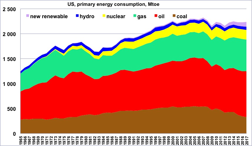
Primary energy consumption in the US, wood excluded, 1965 to 2017, in million tons oil equivalent
(one ton oil equivalent = 11600 kWh).
“New Renewable” = all renewable energies except wood and hydroelectricity.
One will notice that so far the maximum was in 2007, that is one year before the subprime crisis.
Author’s compilation on primary data from BP Statistical Review, 2018
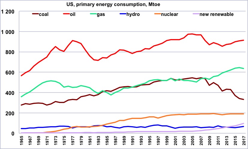
Same as before, but with one curve per energy.
One will notice that the recent increase for gas goes along with a decrease of about the same magnitude in coal, which suggests that most of the extra gas supply is used to replace coal in electricity generation.
Author’s compilation on primary data from BP Statistical Review, 2018
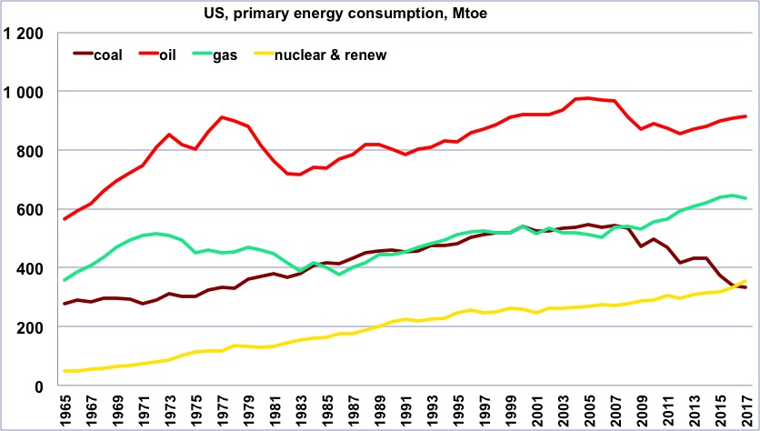
Same as before, but with a curve that totals all “non fossil” production (“non fossil” is anything except coal, gas and oil, and is therefore the sum of nuclear and renewables).
Author’s compilation on primary data from BP Statistical Review, 2018
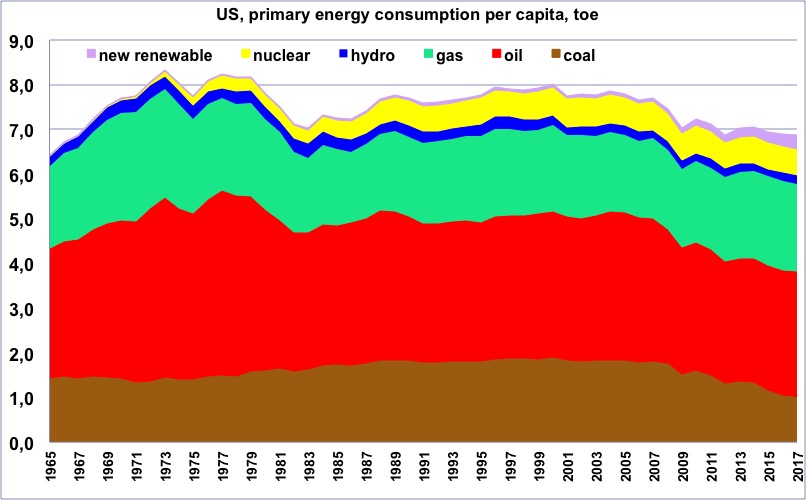
Primary energy consumption per capita in the US, wood excluded, from 1965, in tons oil equivalent.
(one ton oil equivalent = 11600 kWh).
One will notice that the maximum happened in 1973, and for a very long period the value has remained about constant, before a second decrease starting in the mid-2000’s, that is before the subprime crisis. “New Renewable” = all renewable energies except wood and hydroelectricity.
Author’s compilation on primary data from BP Statistical Review, 2018
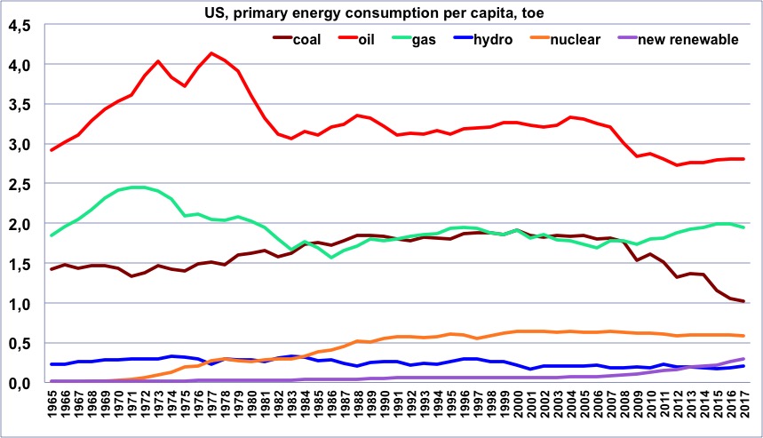
Same as before, but with one curve per energy.
Author’s compilation on primary data from BP Statistical Review & World Bank, 2018
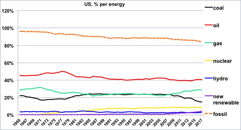
Share of each energy (wood excluded) in the US consumption since 1965, and share of the fossil fuels.
One will notice that the share of oil has remained very stable between the early 80’s and 2017, and this has also been the case for coal and gas between 1985 and 2005.
Author’s compilation on primary data from BP Statistical Review, 2018
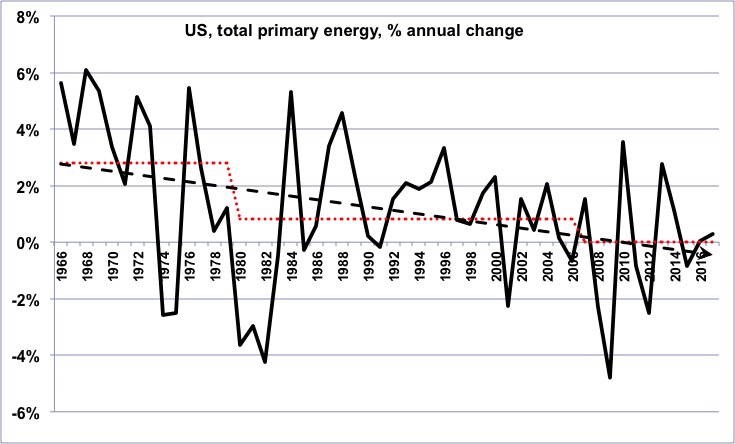
Annual change of the primary energy consumption in the US (wood excluded) since 1965.
In the long term, the growth rate has been declining, then has turned into a growing decline rate (for those that are not afraid, it means that the second derivative of the US energy consumption has been negative on average for the last 50 years).
Author’s compilation on primary data from BP Statistical Review, 2018
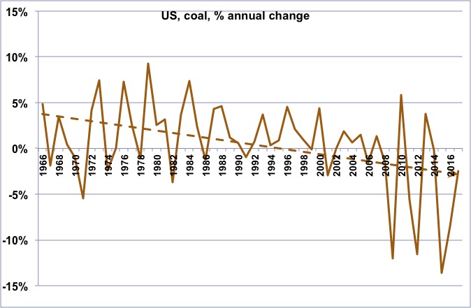
Annual change of the coal consumption in US since 1965.
The long term trend is a continuing decline, which is a kind of surprise for a country that claims the largest proven reserves in the world.
Author’s compilation on primary data from BP Statistical Review, 2018
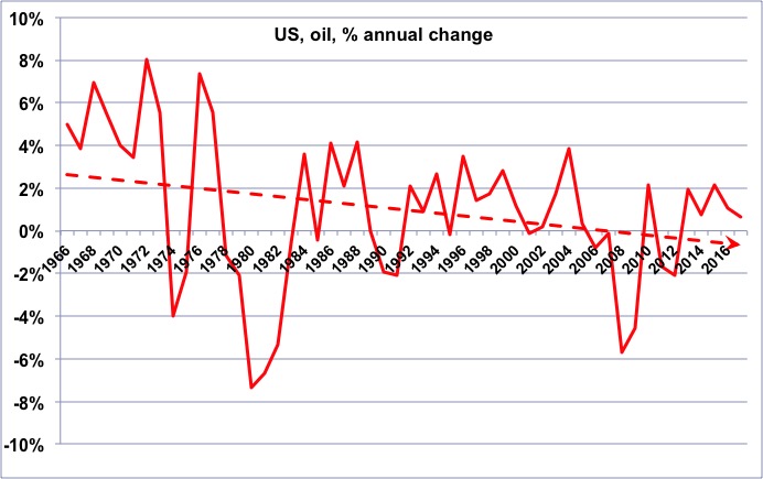
Annual change of the oil consumption in the US since 1965.
As for energy as a whole, we have turned from a declining growth rate to an increasing decline rate. The decrease of oil consumption in the US has contributed as much to the decrease of imports than the rise of shale oil.
Author’s compilation on primary data from BP Statistical Review, 2018
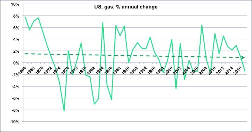
Annual change of the gas consumption in the US since 1965.
The recent increase of the growth rate, due to non conventional gas, is clearly visible.
Author’s compilation on primary data from BP Statistical Review, 2018
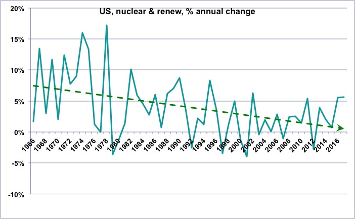
Annual change of the “non fossil” (wood excluded) consumption in the US since 1965.
One will notice that the growth rate of these “non fossil” energies is globally declining, which means that the “new renewables” (wind, photovoltaic, biogas, biofuels, geothermal, etc), which do increase, nevertheless fail to allow for a growth rate that was that of nuclear and hydro a couple of decades ago.
Author’s compilation on primary data from BP Statistical Review, 2018
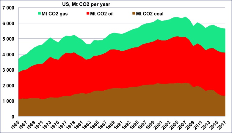
CO2 emissions coming from fossil fuels in the US since 1965, in million tonnes.
Following the decrease of energy consumption that started in 2007, CO2 emissions have peaked the same year so far.
Author’s compilation on primary data from BP Statistical Review, 2018
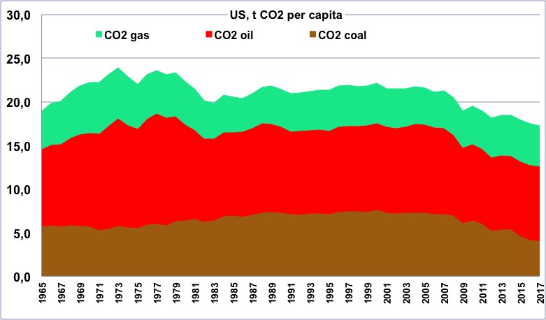
CO2 emissions per capita coming from fossil fuels in the US since 1965, in tonnes.
One will notice that the maximum happened just before the first oil shock.
Author’s compilation on primary data from BP Statistical Review & World Bank, 2018
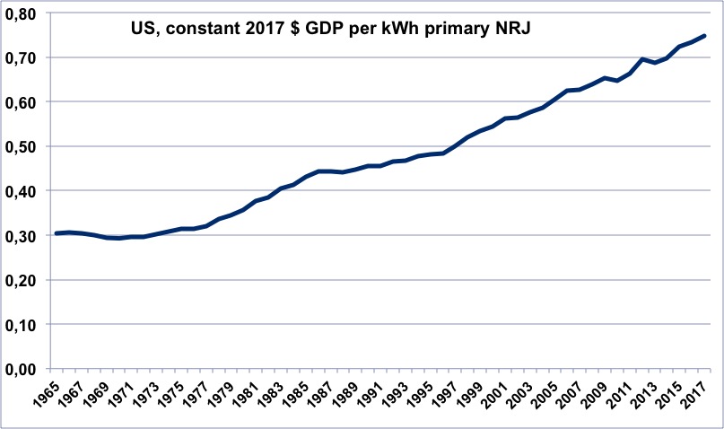
Evolution of the energy efficiency of the US since 1965 (constant dollars of GDP per kWh of primary energy).
When the value is increasing, it means that the economy is becoming more efficient.
One will notice that the “counter-shock”, when oil prices fell to very low levels, in 1985, corresponds to a halt in the increase.
Author’s calculation on primary data from BP Statistical Review, 2018, and World Bank, 2018
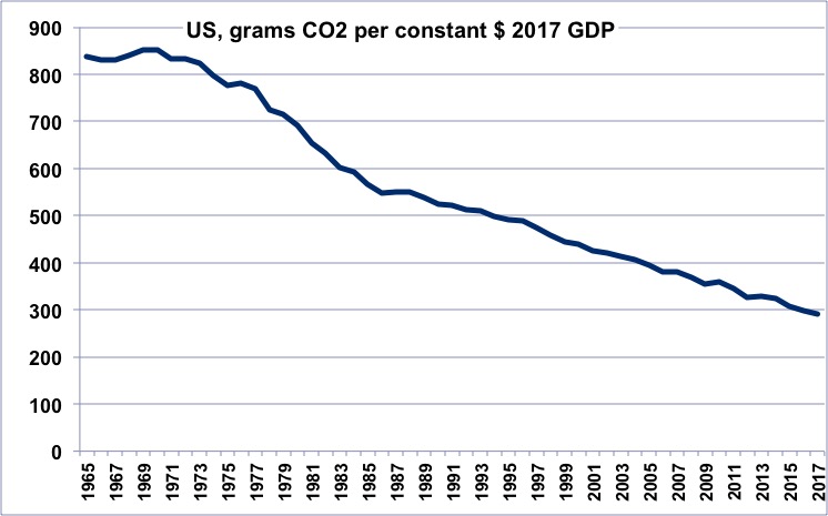
CO2 efficiency of the US economy since 1965 (grams of CO2 per constant dollar of GDP).
When the value is decreasing, it means that the economy is emitting less per unit of GDP. The present value is about twice what it is for Europe.
Author’s calculation on primary data from BP Statistical Review, 2018, and World Bank, 2018
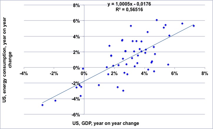
For the 1965-2017 period, annual change of the US GDP (horizontal axis) vs. annual change of the US energy consumption.
The regression means that the first 2% of annual growth can be obtained with a constant energy consumption, then any additional 1% of the growth rate of the GDP comes with a 1% growth rate of the energy consumption.
NB: “decoupling” would mean that the dots always stay in the lower right part of the chart.
Author’s calculation on primary data from BP Statistical Review, 2018, and World Bank, 2018
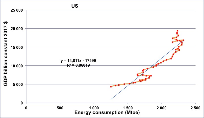
US energy consumption (horizontal axis) vs US GDP (in constant billion dollars) for the period going from 1965 to 2017 (the orange line begins in 1965, at the lower left, and then the dots follow a chronological order going roughly up and right).
One will notice that the curve goes through a series of “turns to the left” in 1974 and 1979 (which means that energy slows down before the GDP), with a recession that follows an “energy contraction” in both cases. After 2006, following a new energy contraction, there has also been a recession for a couple years, as for other Western countries.
Author’s calculation on primary data from BP Statistical Review, 2018, and World Bank, 2018
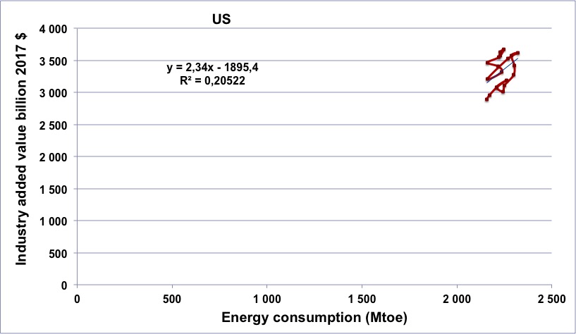
US energy consumption (horizontal axis) vs US industrial output (in constant billion dollars) for the period going from 1997 to 2016 (the brown line begins in 1997, at the lower left, and then the dots follow a chronological order).
The correlation is even stronger than for GDP and energy, because there is no “dematerialization” that can take place in the industry
Author’s calculation on primary data from BP Statistical Review, 2018, and World Bank, 2018
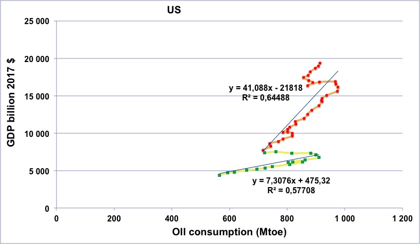
US oil consumption (horizontal axis) vs US GDP (in constant billion dollars) for the period going from 1965 to 2017.
Green dots with yellow line: 1965 to 1982.
Red dots with orange line: 1983 to 2017.
One can see that after 1974 and 1979, the oil consumption strongly decreased, along with a slowdown of the GDP growth. After 1983 the “line” is kind of steeper, which reflects the fact that the economy asks for less oil to produce one $ of GDP (but it does not mean that the economy is less dependent on oil).
After 2006 there is a decline of the GDP that follows a decline in oil consumption, before the first rises again…. thanks to an oil supply that rises again.
Author’s calculation on primary data from BP Statistical Review, 2018, and World Bank, 2018
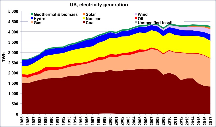
Electricity generation in the US from 1985 to 2017, in billion kWh.
Source: BP Statistical Review 2018
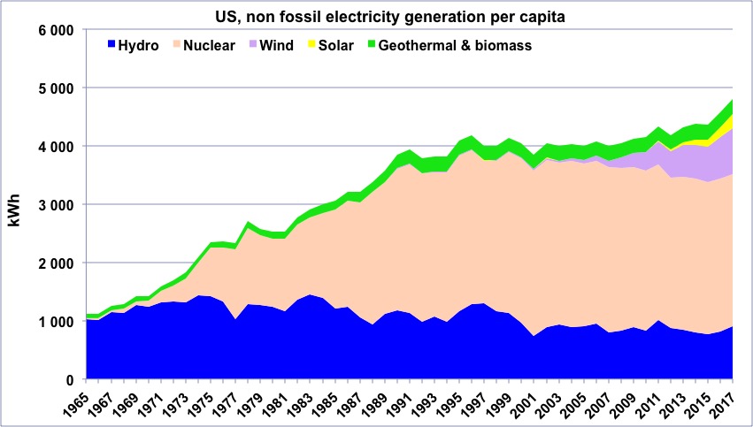
“Non fossil” electricity generation per capital in the US since 1965 (the average electricity consumption per capita is roughly 15000 kWh per year).
“Geothermal biomass” gathers geothermal and electricity generation from biogas and wood (biogas represents the largest fraction). This “non fossil” generation represents 30% of the total generation in the US.
Author’s compilation on data from BP Statistical Review
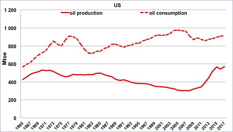
Oil production (solid line) and consumption (dotted line) in the US since 1965, in million tonnes.
Despite an important domestic production (28% of the world total in 1965, 14% in 2017), US has imported oil at least since 1965. The surge of the production since the mid-2000’s, due to shale oil, did not suffice to end imports.
Author’s compilation on data from BP Statistical Review
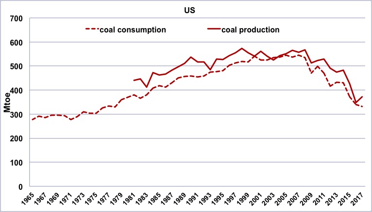
Coal production (solid line, since 1980) and consumption (dotted line, since 1965) in the US, in million tonnes oil equivalent (1 tonne oil equivalent of coal ≈ 1,5 to 3 tonnes of coal, depending on its quality).
Coal consumption is mainly reflecting coal production, as it is the case for most significant coal consumers. As coal is mostly used for electricity production, the decrease of the consumption of the last decade is due to the replacement of this fuel by gas.
Author’s compilation on data from BP Statistical Review
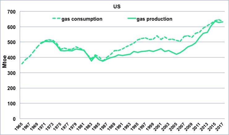
Gas production (solid line, since 1970) and consumption (dotted line, since 1965) in the US, in million tonnes oil equivalent (1 tonne oil equivalent of gas ≈ 1000 m3).
Since the beginning of this series, the consumption in the US has been either equal or slightly over the domestic production. The rise of “shale gas” has therefore boosted the domestic consumption (mostly to produce electricity), but not favored exports.
Author’s compilation on data from BP Statistical Review