As soon as the price of the barrel wobbles a little, which is definitely the case in this holy year 2005, a recurrent debates grow again, which is the discussion on what is the real influence of the price of the barrel on “developped” economies. Those who think that there is a strong dependancy of the economic growth to the price of the barrel consider that ministries and state secretaries might well make pompous speeches, just as trade union leaders: once the price of the barrel is what it is, all is said, and any corrective action initiated by any government to preserve jobs or the famous “growth” (that might very well be only a sexy concept !) has a marginal influence.
This “strong dependancy” point of view, if it proves valid, also means that trade union leaders are mistaken regarding their true “ennemies” when they vituperate against the bosses’ unions, or God knows what minister or political leader when the unemployement rate is rising. The real culprit is actually the price of oil !
Those that consider that the dependancy is weak have of course an exactly opposite conception of the way things work: the price of the barrel is of marginal influence on the expansion of human activity, the true determinants of the strenght of the “economic growth” being the policies followed by the governments.
To know who is – maybe – right, isn’t the best way to investigate what story the statistics tell ? This little page offers a comparison over 20 years of the respective evolutions of the price of oil (in constant 2004 dollars, and on average over the year), the unemployement rate in the OECD, and the economic growth in the same zone. If the “strong dependancy” point of view is correct, it must then be possible to find a correlation between the oil price and the other economic indicators, that remains valid for the full period and the whole zone, beyond national differences in the way to handle the economy and the various leaders in office during these two decades.
Before we go on, we must recall that statistical series often have the very bad idea to be prone to what is called “inhomogeneities”: suddently, the same phenomenum is accounted for in a different way, or has always been accounted for in different ways depending on the country. Unemployement is a good example of this: some countries call “unemployed” someone that didn’t work at all during the last month, while some others still consider unemployed someone that worked less than so many hours during the month.
As a result, it is not always as easy as it seems to have long and homogeneous series, and that might hinder comparisons. The rest of the discussion is based on statistics that begin in 1979, which is the year, as a matter of fact, where oil price peaked for the 20th century in constant 2004 dollars, as the graph below shows (but the highest ever for all times, in constant 2004 dollars, was reached in … 1864 !). And it is possible, of course, to have major economic crises with the price of oil remaining low, as it was the case in 1929, but it is true that then transportation didn’t play the role it plays today in the economy.
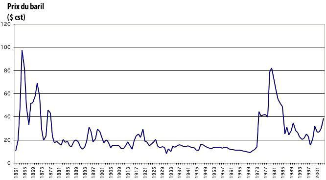
Oil price in constant 2004 dollars per barrel from 1861.
Even with 60 dollars per barrel, we remain far below the 20th century maximum, that was over 80 dollars (2004 dollars) per barrel in 1980.
Source : BP Statistical Review, 2005
Comparison of raw data
A first way to perform the comparison is to put on the same chart the values for the economic growth, the unemployement rate, and the average price of the barrel for the year. As these values are very different (the economic growth rate or the unemployement rate are expressed with several %, when the oil price is several tens dollars), we will perform first a “normalization”: we multiply by 100 then divide by the value of the year 1979 the whole series. The output of this little process is a new series with the value of the year 1979 which is always equal to 100, and then the values increase or decrease reflecting the exact trend of the original series, but with numeric values that “wander around” 100 whatever series we address, what allows comparisons on an unique graph with a single scale.
This first processing yields the following figure:
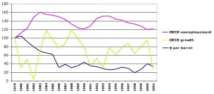
Compared evolutions of the normalized values (100 in 1979) of the economic growth in the OECD zone, the unemployement rate for the OECD zone, and the price of oil in constant 2004 dollars (average over the year).
If there are correlations, they are not obvious, and in particular it is not east to spot a clear correlation between the price per barrel and the economic growth, and even between the price per barrel and the unemployement rate.
Source of data : oil price, BP Statistical Review, 2005 ; unemployement and economic growth in the OCDE zone: OECD.
This simple comparison thus doesn’t allow to spare the two possible points of view on the dependancy of occidental economies on the price of the barrel. As a raw comparison is by far the favourite exercise done by you and me when we have several series, and most of all by far the favourite exercise performed by many economists discussing the point, it is a little annoying !
But we might now add another processing that will allow to get a clearer view: we will not report the normalized values, but the normalized evolution from the lowest to the highest values for the 1979-2003 period, for unemployement, oil, and the “weakness of growth”. In other words, for each of these series, we will do the following:
- for the oil price and the unemployement rate, the year of the 1979-2003 period when the value is the lowest will get the new value 0,
- for these two series, the year of the 1979-2003 period when the value is the highest will get the new value 100,
- to represent the “weakness of growth” in the OECD zone, we will associate to the year of strongest growth the value 0, and the value 100 to the year of weakest growth,
- then for all the other years we will affect the normalized difference between the value of the year and the lowest for the two first series (oil and unemployement), and the normalized difference between the value of the year and the highestfor growth (by “reversing” the values for growth, we will get a new curve that will climb to the higher of the scale when growth is weaker).
All this pain will bring us new curves where the lowest of the 1979-2003 period will receive the value 0, the highest will receive the value 100, and the curve will oscillate between these two extremes elsewhere, reflecting the true trends. And as we should not stop here our “curve manipulation” (maths allowing to manipulate curves: that’s the good side of it !), we will add a little time shift for two series:
- for the “weakness of growth” of the OECD zone, we will shift by one year, which means that the value represented for the year1985 will be instead that of the year 1986,
- for the unemployement rate of the OECD zone, we will shift by 3 years, which means that the value represented for the year1985 will be instead that of the year 1988.
- for the oil price, which is our reference series, there is no time shift.
Was it worth all the pain ? Looking at the new graph that we get, we might think that yes…
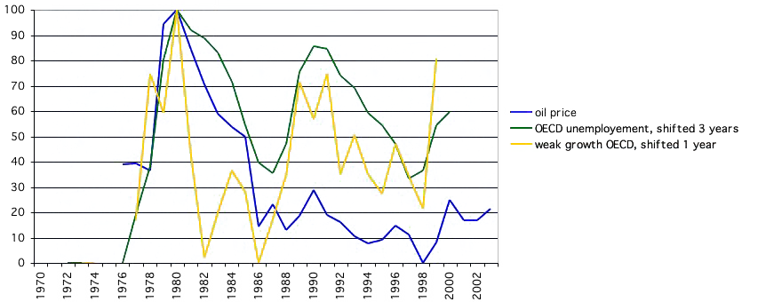
Result of the processing described above for the price of oil (constant 2004 dollars from 1979), compared – in a normalized way – to the”weakness of growth” of the following year, and the unemployement rate 3 years later.
The highest for unemployement – for the period – was reached in 1983, 3 years after the highest for oil in 1980, then a new high arrives in 1993, 3 years after a “moderate peak” for oil in 1990, and at last a new high happens in 2003, 3 years after a relative high for oil in 2000.
Rendez-vous in 2008/2009 to see if it still “works” in the future ?
Indeed this graph suggests a strong suspicion of a correlation between:
- the price of oil in constant dollars,
- the “weakness of growth” of the following year,
- the unemployement rate 3 years later (and NOT instantly !).
To show even better these correlations, we might use not the values for the year, but a mobile 3 year mean, which leads to this ultimate graph.
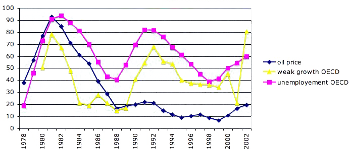
Same as above but with 3 year mobile means (except for the last two years: 2 year mean then value of the year): the value of the year N actually represents the mean from N-1 to N+1.
The correlation between the oil price for the year N and the “weak growth” the following year for the OECD zone then becomes spectacular. The correlation between the oil price for the year N and the unemployement year 3 years later for the OECD zone seems also pretty “strong” : when the price of oil goes up or down, the unemployement rate does grosso modo the same 3 years later (on average), but with a magnitude that remains variable.
Of course, the above graph has no predictive value yet, because correlations are observed a posteriori, and as long as a “physicial” law is not established otherwise, no definite prediction can be made by simply extrapolating what has been observed. In particular, if oil was the sole possible cause for the evolution of the unemployement rate, there would be not only a good correspondance for the trends, but also for the magnitudes, which is clearly not the case for the above graph.
If it has no predictive value (bis), the graph above seems still to support the idea that occidental economies see their fate depending more on what’s happening below the ground of Saudi Arabia, Iran and Russia, than in the halls of the ministries in Washington, Tokyo or Berlin. Of course, if such a strong correlation is valid in the future, it is very bad news:
- Given the rise of the price of oil in 2005, it means that we (we = occidental countries, on average) have already signed for a rise of the unemployement rate somewhere between 2007 and 2009 (we’ll see in 2 or 3 years !),
- More generally, as world oil production is bound to decline “someday”, it is hard to see how we could prevent the oil price to go through the ceilling then, as long as we consider that it is strictly impossible to be happy without a car per adult and a central heating per house,
- If this correlation between the price of oil and the unemployement rate 3 years later remains valid in the future, it is hard to envision how we will avoid high unemployement rates in the future as a consequence of the unavoidable rise of the price of the barrel, at least over several years.
- As high unemployement rates bring social distress that fuel extremist movements (because in democraties there must always be a culprit, Tocqueville already wrote it in 1840 !, and of course the culprit cannot be ourselves, and our will to possess 40 m2 of house heated and cooled, and one tonne of car – at least – per adult able to drive), one might wonder whether our dependancy on oil is not the first step of the comeback of dictators in what is presently called “occidental democraties”. Before a decrease in the oil production leads us to starvation, it mainly puts us at risk of loosing jobs then democraty ; the 20th century examples (Germany, Russia, Chile, Italy, North Korea, China…) show that getting a dictator – that might bring starvation among other consequences – is a much more serious risk than not getting enough to eat, at least as long as the climate system has not changed too much as a result of fossil fuel use. The future will tell…
If such a fear is somewhat sound, I am not sure that the judgement of history will be very kind with all of us that refuse the voluntary cure to prevent – if it is still possible – such an outcome, which bears a very simple name: a raise of the taxes. Between a progressive “deconsumption” of hydrocarbons, which is of course full of inconvenients, and a dictatorship (that incidentally generally brings a much faster “deconsumption” !) resulting from a strong destabilisation of the economy, it is not sure that our descendants will forgive us to have given them the latter because we refused the first !
At last, if the correlation discussed above is strong, all trade unions and political parties that are not in office can always shout loud at those who are in office when the unemployement rate strives: the true one to blame will be Mother Nature, stupid enough not to have endowed humanity with enough oil for eternity, without climate change of course…. What if we look directely at the correlation between the world oil output and the world GDP per capita ? Well, just ask !
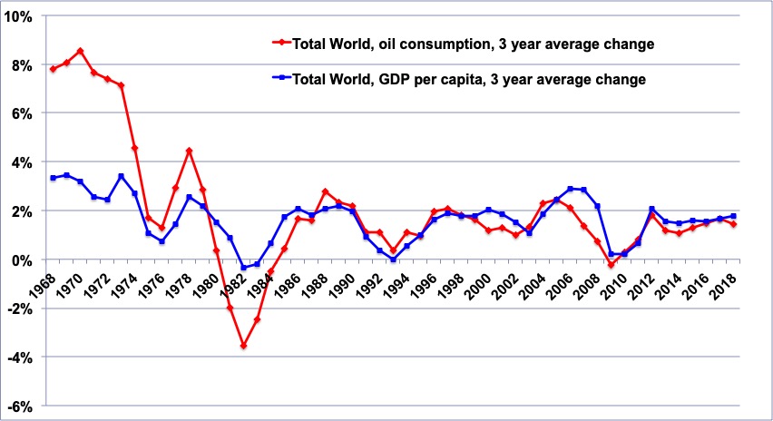
The violet curve gives a 3 year running mean for the variation of the volume of oil produced worldwide (source BP Statistical Review). The blue one gives the 3 year running mean for the variation of the world average of the GDP per capita (source World Bank).
It is easy to see that the two curves behave about the same way after 1986, with the GDP following oil production and not the opposite, and before 1986 the sign of the variation was alike but the magnitude greater for oil than for GDP. This suggest that the dependancy of our economic system on oil has increased and not decreased !
Sources : Mondial Ban for GDP, BP Statistical Review for oil production.
This does suggest that oil – in volume, not in price – has something to do with the GDP.
And then, isn’t it about time that serious studies be initiated on the following question : how can we maintain jobs – and thus keep stable democraties – in a context of long lasting “degrowth” ? Today, everybody prefers to believe that economic growth relies on our sole good will (which is another way to consider that no limits might come from the physical world, a bold hypothesis !), and therefore that the only good question is – and will always be : “what is the good recipe to have everlasting growth ?”. Let’s suppose, instead, that we come back to Earth, and accept this brutal fact that everlasting human expansion is not possible because of the laws of physics: shouldn’t we then get ready to manage with the least damage possible an unavoidable “degrowth”, that seems to be likely for the 21st century whatever hypotheses are made, rather than becoming all red and shouting “I don’t want to”, which is closer to our present behaviour ?