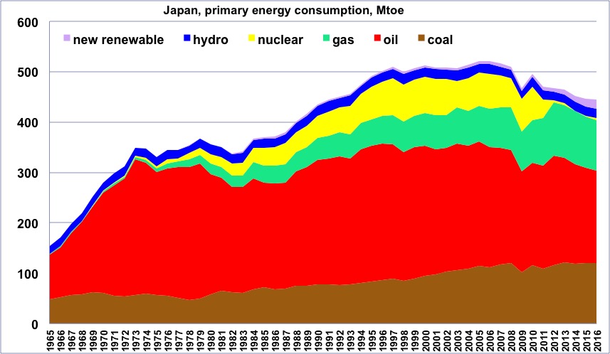
Primary energy consumption in Japan, wood excluded, 1965 to 2014, in million tons oil equivalent.
(one ton oil equivalent = 11600 kWh).
One will notice that the maximum happened in 2005, after a rather long flat period, corresponding to the deflation that took place in this country. “New Renewable” = all renewable energies except wood and hydroelectricity.
Author’s compilation on primary data from BP Statistical Review, 2015
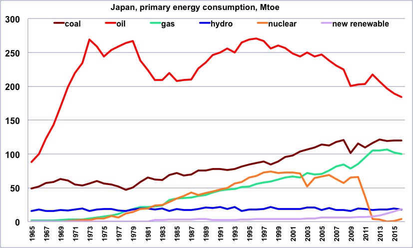
Same as before, but with one curve per energy.
One will notice that oil started declining in the mid-90’s, and nuclear in at the end of the 90’s. The sharp decrease of nuclear after Fukushima is clearly visible, as is the corresponding rebound of oil, gas and coal.
Author’s compilation on primary data from BP Statistical Review, 2015
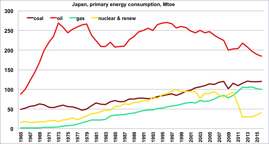
Same as before, but with a curve that totals all “non fossil” production (“non fossil” is anything except coal, gas and oil, and is therefore the sum of nuclear and renewables).
Author’s compilation on primary data from BP Statistical Review, 2015
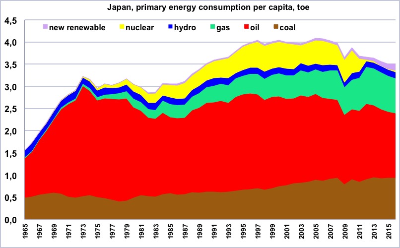
Primary energy consumption per capita in Japan, wood excluded, from 1965, in tons oil equivalent.
(one ton oil equivalent = 11600 kWh).
“New Renewable” = all renewable energies except wood and hydroelectricity.
One will notice that the maximum happened in 2005, and for a very long period the value has remained about constant.
Author’s compilation on primary data from BP Statistical Review, 2015
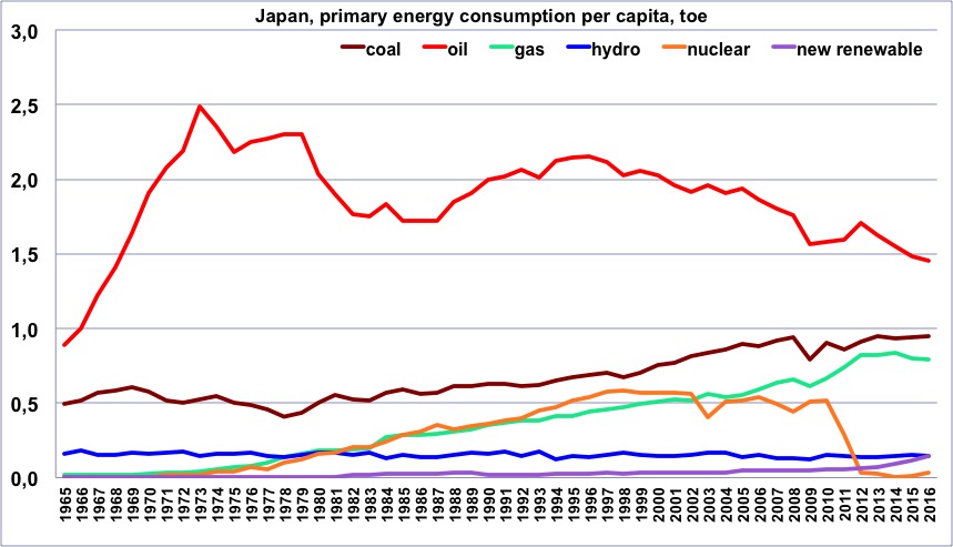
Same as before, but with one curve per energy.
Author’s compilation on primary data from BP Statistical Review & World Bank, 2015
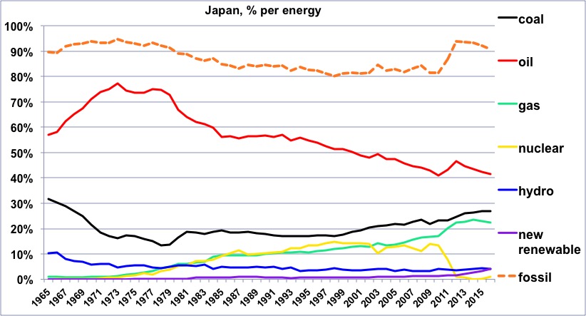
Share of each energy (wood excluded) in the Japanese consumption since 1965, and share of the fossil fuels.
One will notice that the share of fossil fuels is basically the “reverse” of the share of nuclear, both during the slow decrease (of the share of fossil) after the oil shocks, and during the post-Fukushima era.
Author’s compilation on primary data from BP Statistical Review, 2015
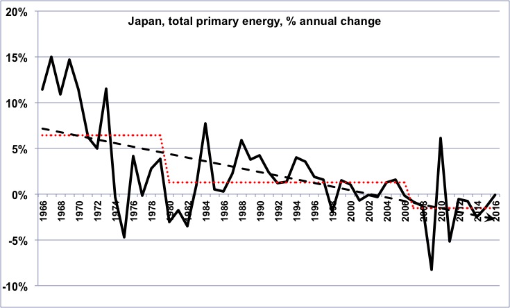
Annual change of the primary energy consumption in Japan (wood excluded) since 1965.
In the long term, the growth rate has been declining, then has turned into a growing decline rate (for those that are not afraid, it means that the second derivative of the Japanese energy consumption has been negative on average for the last 45 years).
Author’s compilation on primary data from BP Statistical Review, 2015
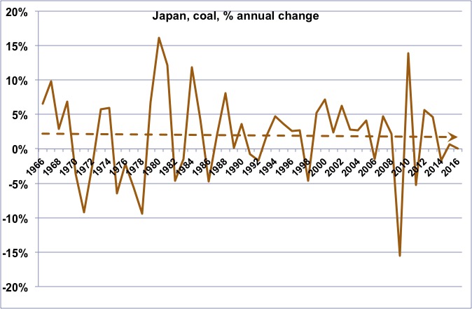
Annual change of the coal consumption in Japan since 1965.
The long term trend is a slow decline of the growth rate that nevertheless remained positive.
Author’s compilation on primary data from BP Statistical Review, 2015
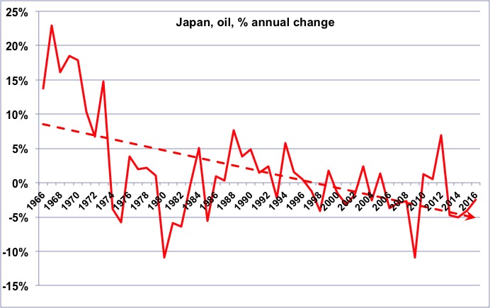
Annual change of the oil consumption in Japan since 1965.
As for energy as a whole, we have turned from a declining growth rate to an increasing decline rate, with a significant exception in 2011 and 2014, because part of the nuclear phased out after Fukushima was compensated with oil.
Author’s compilation on primary data from BP Statistical Review, 2015
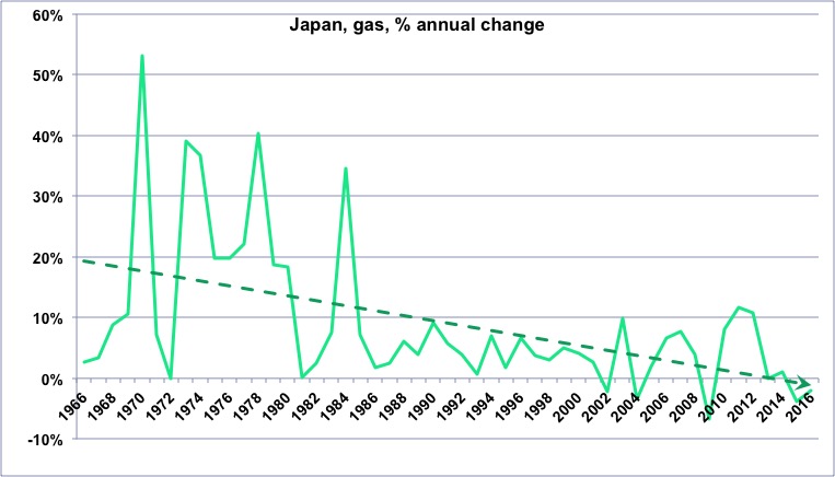
Annual change of the gas consumption in Japan since 1965.
Though declining, the annual change has remained a growth, with a visible rebound after Fukushima.
Author’s compilation on primary data from BP Statistical Review, 2015
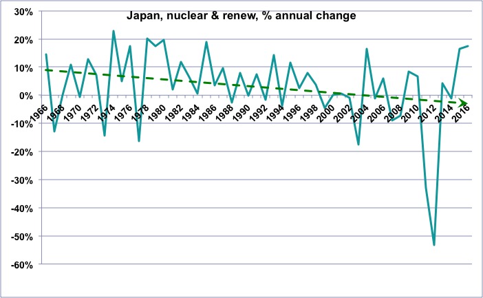
Annual change of the “non fossil” (wood excluded) consumption in Europe since 1965.
One will notice that the growth rate of these “non fossil” energies was globally declining before Fukushima. 2011 and 2014 give an idea of the magnitude of the decrease when nuclear is phased out rapidly.
Author’s compilation on primary data from BP Statistical Review, 2015
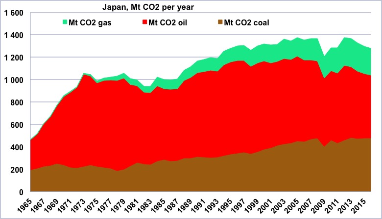
CO2 emissions coming from fossil fuels in Japan since 1965, in million tonnes.
One will note the rebound due to switching partially from nuclear to fossil fuels, with the result that, countrary to all other OECD countries, Japan is presently close to its historical maximum regarding CO2 emissions.
Author’s compilation on primary data from BP Statistical Review, 2015
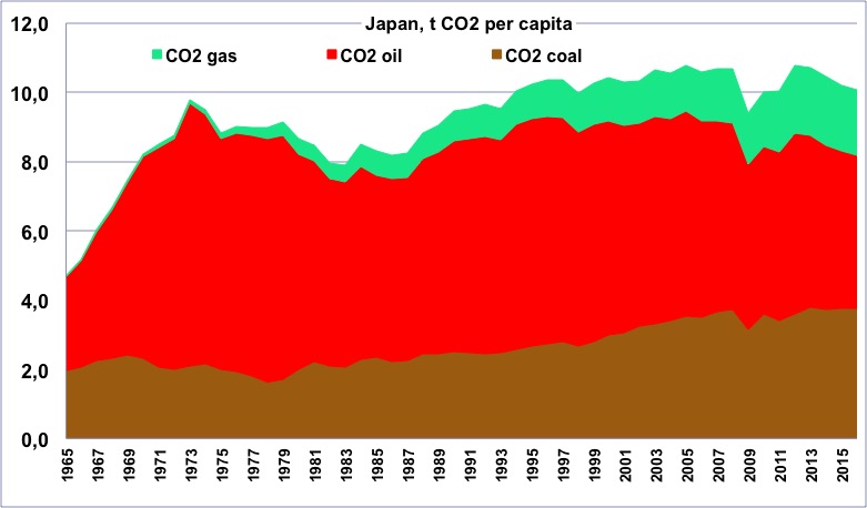
CO2 emissions per capita coming from fossil fuels in Japan since 1965, in tonnes.
One will notice the share of oil, and the fact that the total is still close to the historical maximum
Author’s compilation on primary data from BP Statistical Review & World Bank, 2015
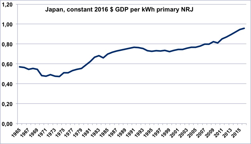
Evolution of the energy efficiency of Japan since 1965 (constant dollars of GDP per kWh of primary energy).
When the value is increasing, it means that the economy is becoming more efficient. This ratio has globally remained almost the same since 1990, with even a decrease during the stagflation period (suggesting that it is more difficult to invest to improve this ratio when the economy is not growing).
It was nevertheless very high in 1990 (at the time almost twice was it was for Europe).
The increase in 2011 and 2014 is of course one of the consequences of the suddent shutdown of many power plants that “forced” savings.
Author’s calculation on primary data from BP Statistical Review, 2015, and World Bank, 2015
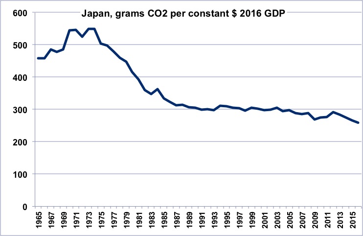
CO2 efficiency of the Japanese economy since 1965 (grams of CO2 per constant dollar of GDP).
When the value is decreasing, it means that the economy is emitting less per unit of GDP.
A rapid decrease after the oil shocks results has been followed by a long flat period (no improvement) during the stagflation, and a little adverse evolution in the recent years (increase of electricity generated with fossil fuels).
Author’s calculation on primary data from BP Statistical Review, 2015, and World Bank, 2015
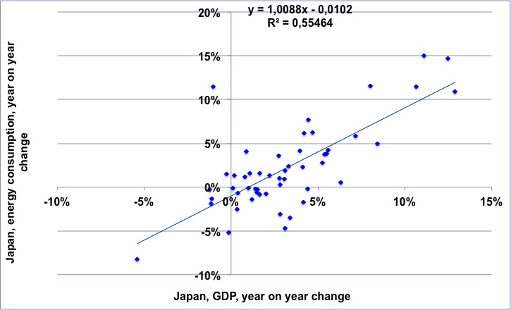
For the 1965-2014 period, annual change of the Japanese GDP (horizontal axis) vs. annual change of the Japanese energy consumption.
The regression means that for a 1% growth rate of the GDP there is a slightly below 1% growth rate of the energy consumption.
NB: “decoupling” would mean that the dots would always be in the lower right part of the chart.
Author’s calculation on primary data from BP Statistical Review, 2015, and World Bank, 2015
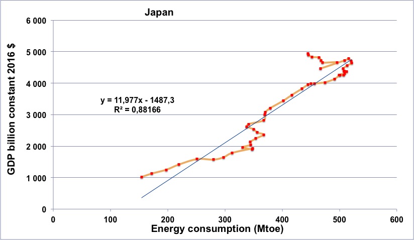
Japanese energy consumption (horizontal axis) vs Japanese GDP (in constant billion dollars) for the period going from 1965 to 2014 (the orange line begins in 1965, at the lower left, and then the dots follow a chronological order going roughly up and right).
One will notice that the curve goes through two “turns to the left” in 1974 and 1979, as for the other OECD countries, but the arch after 2006 is more pronounced than in most Western countries.
Author’s calculation on primary data from BP Statistical Review, 2015, and World Bank, 2015
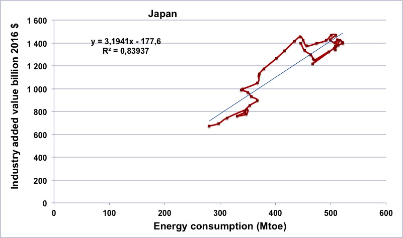
Japanese energy consumption (horizontal axis) vs Japanese industrial output (in constant billion dollars) for the period going from 1970 to 2014 (the brown line begins in 1965, at the lower left, and then the dots follow a chronological order).
The pattern shows two different structures: from 1970 to 1991 (up and left) the dots follow almost a straight line (with the 1974 and 1979 events clearly visible), and then a very unusual thing takes place : the energy consumption increases while the industrial output decreases, before a “turn to the left”that reveals a significant energy constraint.
Author’s calculation on primary data from BP Statistical Review, 2015, and World Bank, 2015
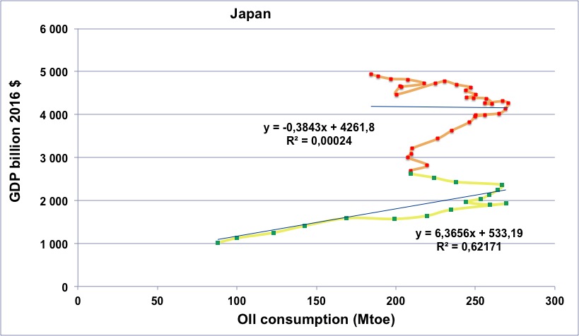
Japanese oil consumption (horizontal axis) vs Japanese GDP (in constant billion dollars) for the period going from 1965 to 2014.
Green dots with yellow line: 1965 to 1982.
Red dots with orange line: 1983 to 2014.
From 1970 to 2010, the GDP has almost tripled with no increase in oil consumption, a pattern that recalls that of Germany and France. The “turn to the left” begins in the mid-90’s, and the recession in 2007. The evolution which is singular is a growth of both GDP and oil during the last 3 years, a consequence of the rapid shift of a fraction of electricity generation to oil.
Author’s calculation on primary data from BP Statistical Review, 2015, and World Bank, 2015
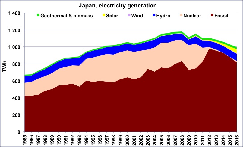
Electricity generation in Japan from 1985 to 2014, in billion kWh.
Source: BP Statistical Review 2015
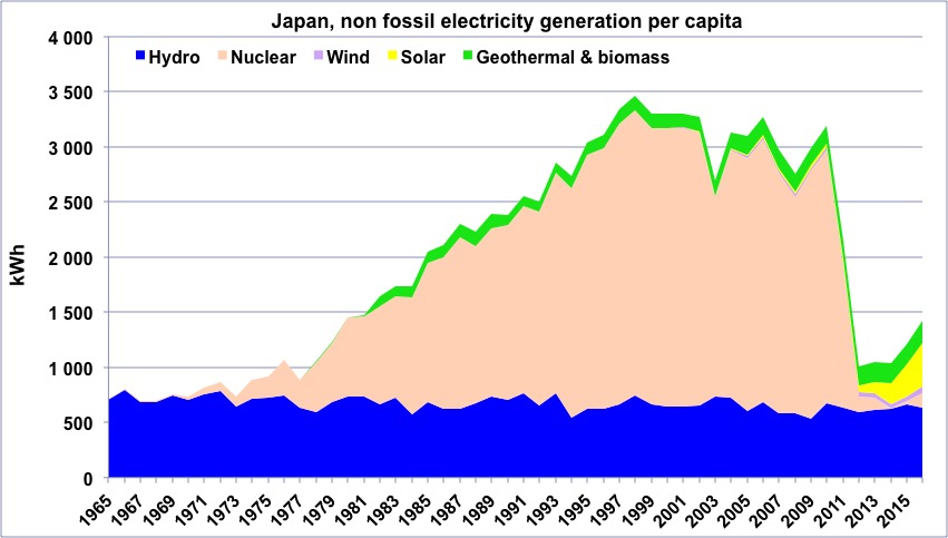
“Non fossil” electricity generation per capita in Japan since 1965.
The suppression of nuclear post Fukushima led to a decrease of the “non fossil” fraction from 35% to 12%.
Author’s compilation on data from BP Statistical Review