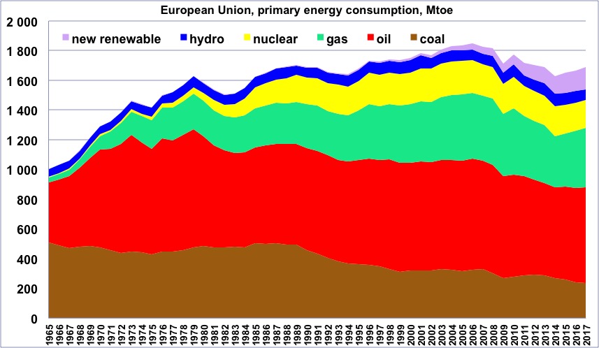
Primary energy consumption in Europe, wood excluded, 1965 to 2014, in million tons oil equivalent (one ton oil equivalent = 11600 kWh).
One will notice that the maximum happened in 2006, that is one year before the economic crisis that begun in 2007. “New Renewable” = all renewable energies except wood and hydroelectricity.
Author’s compilation on primary data from BP Statistical Review
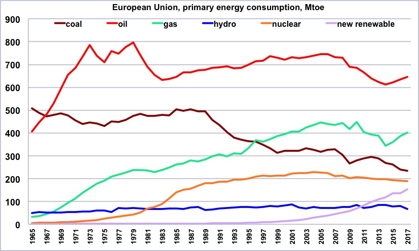
Same as before, but with one curve per energy.
One will notice that oil started declining in 2006, and gas in 2005, though at a slower rate.
Author’s compilation on primary data from BP Statistical Review
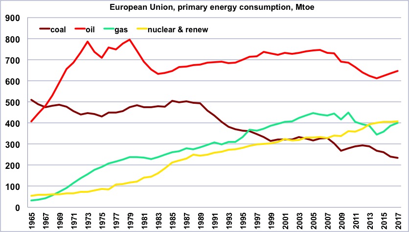
Same as before, but with a curve that totals all “non fossil” production (“non fossil” is anything except coal, gas and oil, and is therefore the sum of nuclear and renewables).
Author’s compilation on primary data from BP Statistical Review
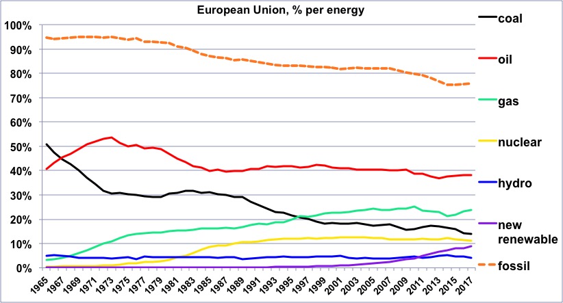
Share of each energy (wood excluded) in the European consumption since 1965, and share of the fossil fuels.
One will notice that the share of oil has remained very stable between the early 80’s and 2006.
Author’s compilation on primary data from BP Statistical Review
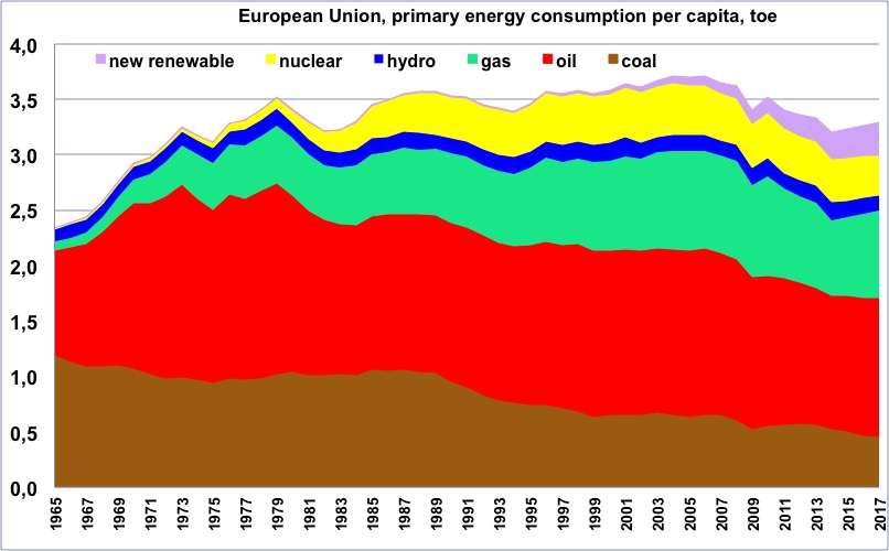
Primary energy consumption per capita in Europe, wood excluded, since 1965, in tons oil equivalent (one ton oil equivalent = 11600 kWh).
One will notice that the maximum happened in 2004. “New Renewable” = all renewable energies except wood and hydroelectricity.
Author’s compilation on primary data from BP Statistical Review and World Bank
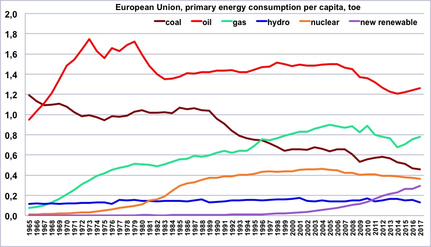
Same as before, but with one curve per energy.
Author’s compilation on primary data from BP Statistical Review & World Bank
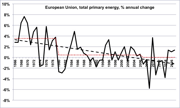
Annual change of the primary energy consumption in Europe (wood excluded) since 1965.
In the long term, the growth rate has been declining, then has turned into a growing decline rate (for those that are not afraid, it means that the second derivative of the European energy consumption has been negative on average for the last 45 years).
Author’s calculation on primary data from BP Statistical Review
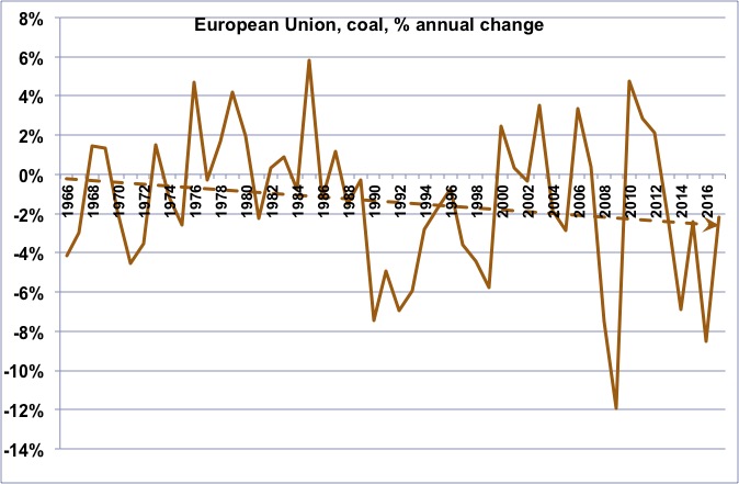
Annual change of the coal consumption in Europe since 1965.
The long term trend is a continuing decline, even though a kind of “rebound” is visible since 1990.
Author’s calculation on primary data from BP Statistical Review
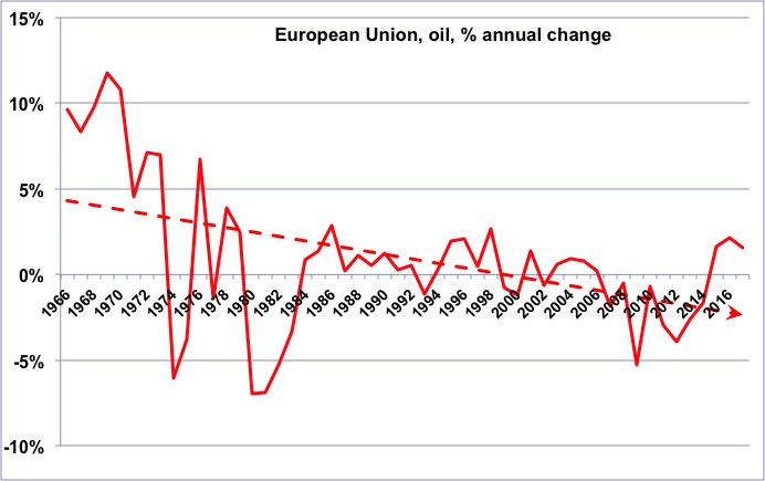
Annual change of the oil consumption in Europe since 1965.
As for energy as a whole, we have turned from a declining growth rate to an increasing decline rate.
Author’s calculation on primary data from BP Statistical Review
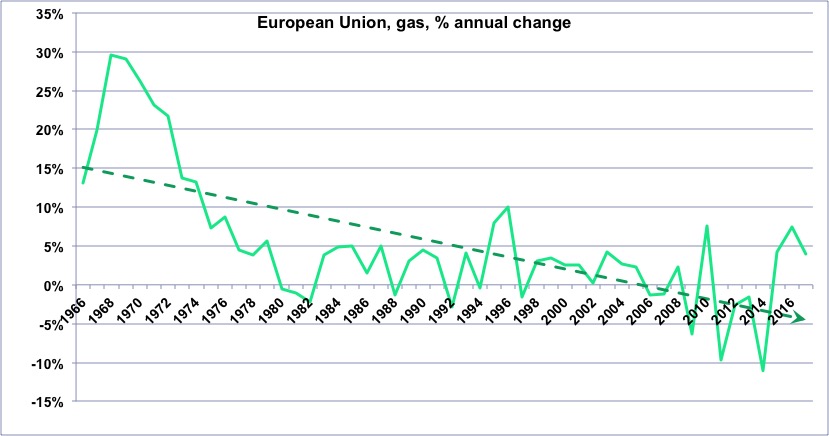
Annual change of the gas consumption in Europe since 1965.
Author’s calculation on primary data from BP Statistical Review
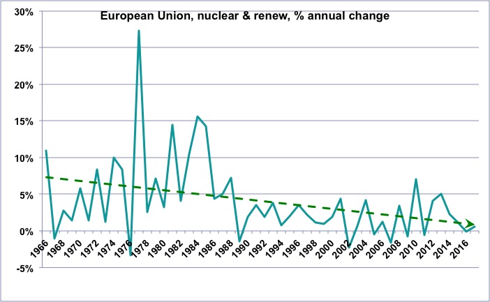
Annual change of the “non fossil” (wood excluded) consumption in Europe since 1965.
One will notice that the growth rate of these “non fossil” energies is globally declining, which means that the “new renewables” (wind, photovoltaic, biogas, biofuels, geothermal, etc), which do increase, nevertheless fail to allow for a growth rate that was that of nuclear and hydro combined a couple of decades ago.
Author’s calculation on primary data from BP Statistical Review, 2015
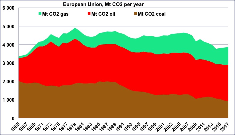
CO2 emissions coming from fossil fuels in Europe since 1965, in million tonnes.
(Europe is therefore emitting a little less than 4 billion tonnes of CO2 coming from fossil fuels in 2017). One will notice that the maximum happened just before the second oil shock.
Author’s calculation on primary data from BP Statistical Review, 2015
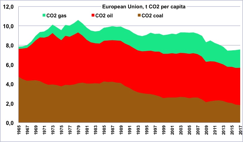
CO2 emissions per capita coming from fossil fuels in Europe since 1965, in tonnes.
One will notice that the maximum happened just after the second oil shock.
Author’s calculation on primary data from BP Statistical Review & World Bank, 2015
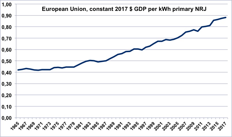
Evolution of the energy efficiency of the European economy since 1965 (constant dollars of GDP per kWh of primary energy).
When the value is increasing, it means that the economy is becoming more efficient.
Author’s calculation on primary data from BP Statistical Review and World Bank
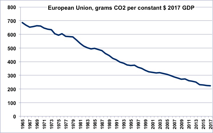
Evolution of the CO2 efficiency of the European economy since 1965 (grams of CO2 per constant dollar of GDP).
When the value is decreasing, it means that the economy is emitting less per unit of GDP.
Author’s calculation on primary data from BP Statistical Review and World Bank
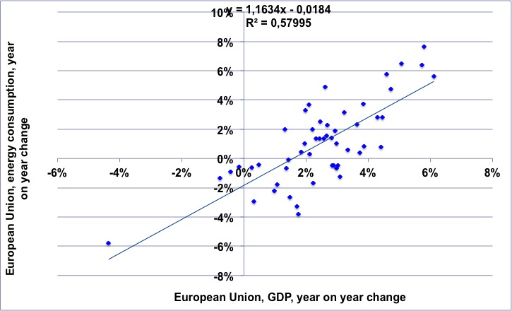
For the 1965-2017 period, annual change of the European GDP (horizontal axis) vs. annual change of the European energy consumption.
This regression shows first that over the period there has been approximatively 1.5% of economic growth with no extra energy consumption, and then that each additionnal % fof GDP growth requires an additional % of energy growth.
NB: “decoupling” would mean that the dots are always be in the lower right part of the chart.
Author’s calculation on primary data from BP Statistical Review and World Bank
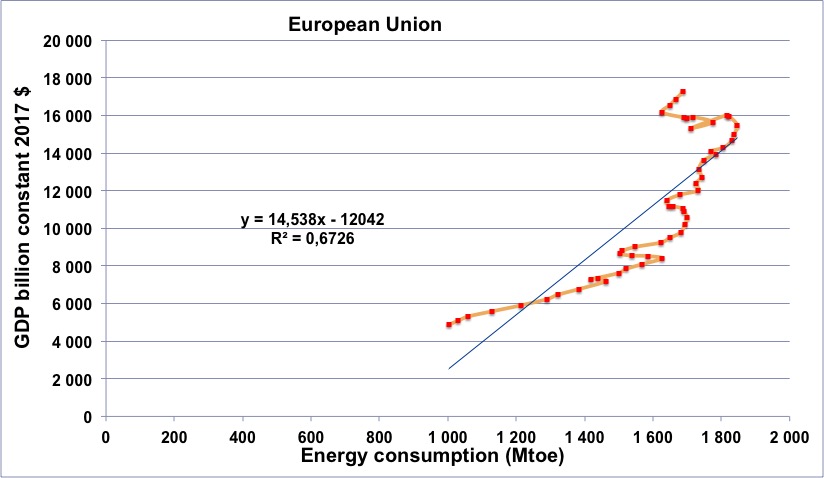
European energy consumption (horizontal axis) vs European GDP (in constant billion dollars) for the period going from 1965 to 2014 (the orange line begins in 1965, at the lower left, and then the dots follow a chronological order going roughly up and right).
One will notice that the curve goes through a series of “turns to the left” in 1974, 1979, 1990 (first Gulf War), and after 2006, with a decrease of the GDP for several years in the last case.
Turning to the left means that first the energy supply decreases, than the GDP changes, which excludes the possibility that the energy consumption decreases as the sole result of an economic crisis coming from some other reason.
Author’s calculation on primary data from BP Statistical Review and World Bank
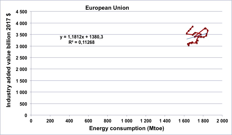
European energy consumption (horizontal axis) vs European industrial output (in constant billion dollars) for the period going from 1991 to 2017 (the brown line begins in 1991, at the lower left, and then the dots follow a chronological order going first up and right).
One will notice that the curve shows a sharp “turn to the left” after 2006, with a decrease of the Industrial output for several years. Turning to the left means that first the energy supply decreases, then the industrial output changes.
Author’s calculation on primary data from BP Statistical Review and World Bank
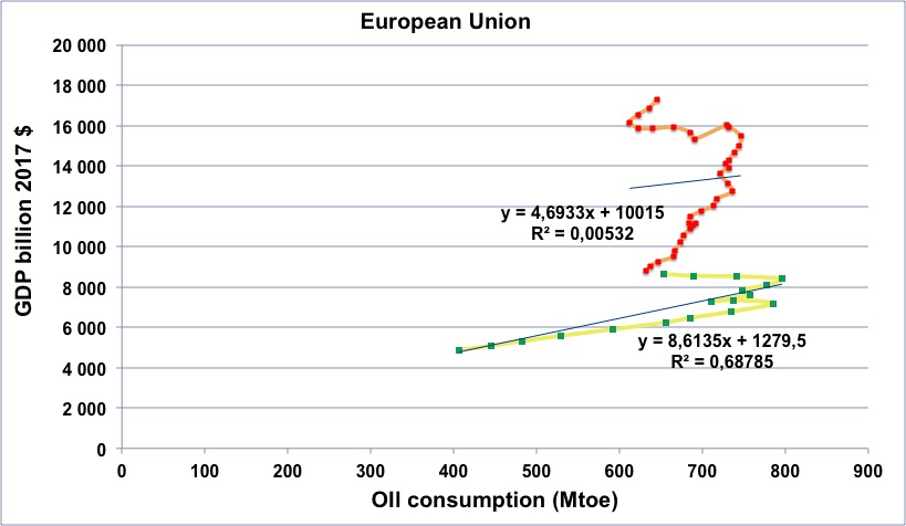
European oil consumption (horizontal axis) vs European GDP (in constant billion dollars) for the period going from 1965 to 2017.
Green dots with yellow line: 1965 to 1982.
Red dots with orange line: 1983 to 2017.
One might note the decrease of oil consumption after 1974 and 1979, but with no decrease of the GDP at the time. After 1983 the slope becomes different, which reflects an increased efficiency of the economy (but it does not mean that the dependancy has decreased: there is still a strong link between oil and GDP in Europe).
The upper arch, corresponding to the period 2006 – 2014, and the fact that it “turns left”, means that first there is less oil, and then less GDP (the last probably being a consequence of the first). If the decrease of the oil consumption was only a result of an economic downturn, the line should “turn right” (or reverse along the line).
Author’s calculation on primary data from BP Statistical Review and World Bank
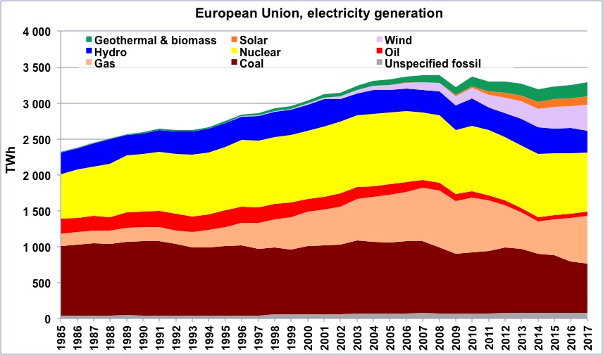
Electric output in Europe from 1985, in billion kWh.
Author’s compilation on data from BP Statistical Review
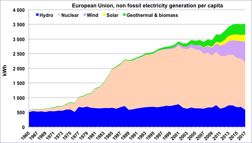
“Non fossil” electricity generation per capital in Europe since 1965.
“Geothermal biomass” gathers geothermal and electricity generation from biogas and wood (biogas represents the largest fraction). This “non fossil” generation represents a little more than half of the total generation in Europe.
Author’s compilation on data from BP Statistical Review
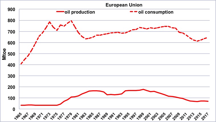
Oil production (solid line) and consumption (dotted line) in the European Union since 1965, in million tonnes.
The peak of the North Sea (which supplies almost all the oil produced in Europe, but on the graph above Norway, which is not part of the Union, is missing) in 2000 is clearly visible on this graph, with a marked decrease thereafter. The sharp rise in the price of oil after 2007 has led to production that has not declined in recent years, due to increased investments, but this does not change the underlying trend. We can also clearly see the rebound in consumption after 2014 thanks to the US “shale oil” that has replenished the world market. However, Europe remains a massive importer.
Author’s compilation on data from BP Statistical Review
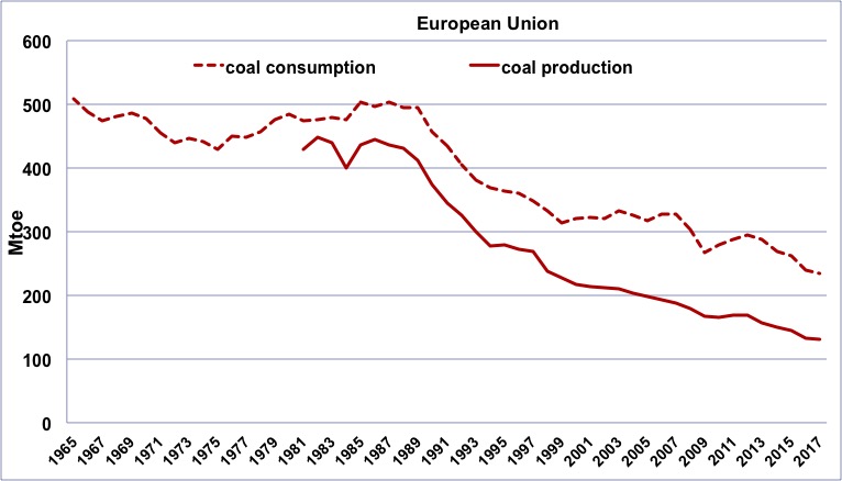
Coal production (solid line, since 1980) and consumption (dotted line, since 1965) in the European Union, in million tonnes oil equivalent (1 tonne oil equivalent of coal ≈ 1,5 to 3 tonnes of coal, depending on its quality).
It can be seen that the decline in consumption follows the decline in domestic production, which began in 1982, long before climate change became a central issue. Europe now imports half of its coal consumption (most of the coal is used to produce electricity).
Author’s compilation on data from BP Statistical Review
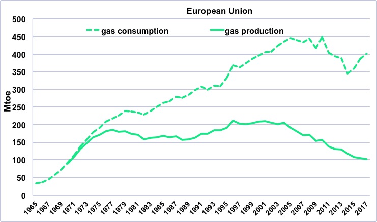
Gas production (solid line, since 1970) and consumption (dotted line, since 1965) in the European Union, in million tonnes oil equivalent (1 tonne oil equivalent of gas ≈ 1000 m3).
The peak of the North Sea (which supplies almost all the gas produced in Europe) in 2005 is clearly visible on this graph, which does not include Norway (which is not part of the European Union), and which is the largest producer in the area. As with coal, importing gas is not a simple operation, and therefore the European consumption is more or less inclined to follow the decline in domestic production.
Author’s compilation on data from BP Statistical Review