Energy is, by definition, the transformation of the world that surrounds us. The economic counterpart of these flows is the GDP, that roughly evolves as the energy supply in the world. But the GDP is also the cumulated revenues of all the economic agents of a country, and thus what allows to pay people (that have a job or not). Therefore, if the energy supply decreases, it becomes harder to keep the same GDP, which in turn makes it impossible to increase jobs with a constant revenue per job, and makes it even more impossible to increase jobs and the average revenue per job at the same time. It will be even more true if the energy supply decreases for external constraints, which is now the case for Europe.
In democraties, there are a couple of things that can be found for sure in the electoral promises. As far as I remember, a lowering unemployment is one of them, and the increase of our purchasing power is generally following not far behind. Our purchasing power is nothing else than the amount of goods and services that we can get with what we have earnt. For it to increase there are only two possibilities (basic arithmetics): either the average price of goods and services decreases, or our revenues increase.
That’s why democraties are generally favourable to competition, seen as a way to get lower prices for the end consumer, and equally favourable to encouraging wage increases, as they are the main part of the revenues for the population, and also the most “noble” for voters. Indeed, the other part of revenues comes from capital (rents, dividends, capital gains on real estate or shares, etc), and voters – and therefore elected people – do not praise this type of money as they do for what is seen as the counterpart of hard work (salaries).
Energy is also more and more frequent in political debates, and therefore in electoral promises in democraties, where most of the energy is consumed.
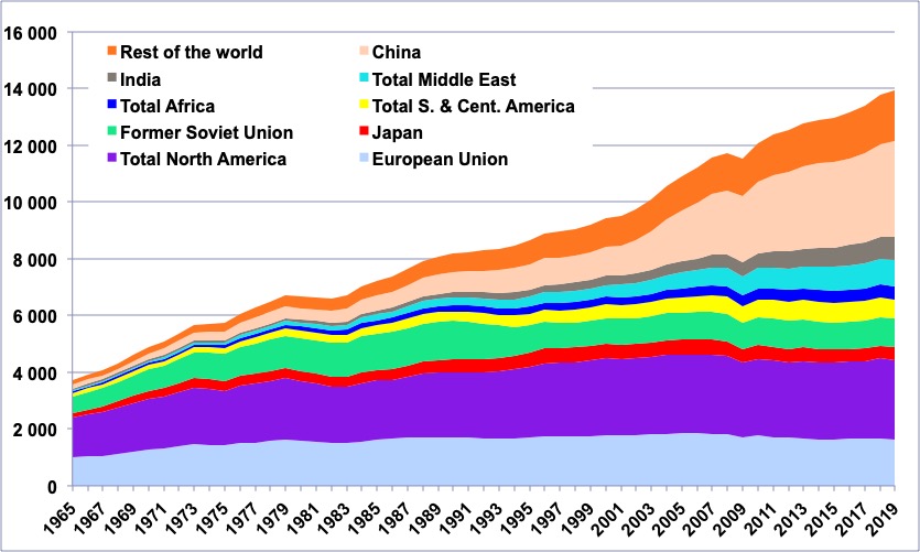
Primary energy consumption – wood excluded – per zone or major country.
Apart from China, which uses 20% of the world total, and various countries that weight much less in the total, all the rest comes from democraties (even if some of them are criticized for not being democratic enough by other ones, and vice-versa!).
Source : BP Statistical Review 2013
We will now use a very powerful weapon to assess whether it is possible to promise to the voter more jobs, more purchasing power, and energy savings all at the same time. This atomic weapon is… the rule of three! To begin, let’s call “jobs” the number of jobs in a given country or group of countries, and state that… this item is equal to itself (which shouldn’t raise many objections!).
Jobs= Jobs
Then we will multiply and divide, on the right hand side, by the GDP. Let’s recall that the GDP is nothing else, for any country (or group of countries) that the cumulated revenues of all the economic agents of the zone.
Jobs= \frac{Jobs} {GDP}\times{GDP}
The item Jobs/GDP then designates the number of jobs that correspond to a given amount of revenues in the country. We have just written:
\text{\scriptsize{Jobs}}=\text{\scriptsize{Jobs per unit of GDP} }\times \text{\scriptsize{GDP}}
When jobs/GDP increases, it means that there are more jobs for the same amount of revenues, and thus… that each job enables less revenues on average. If the share of wages and other income is not modified, it means that people are paid less on average. It highlights a very simple way to get more jobs when the GDP is not increasing: pay less those who have a job. It’s the way a number of countries, like the US, Germany, UK or Sweden have fought – with success – to lower unemployment during the past years.
Note that the reverse, that is GDP/jobs, is the average revenue per job holder, and, after taxes, it corresponds to the purchasing power per worker.
We will now introduce energy, and divide and multiply by energy on the right hand side.
Jobs= \frac{Jobs} {GDP}\times \frac{GDP} {NRJ}\times{NRJ}
The item GDP/NRJ is the energy efficiency of the economy : it increases when, with the same amount of kWh (that is the same amount of physical flows enabled) it is possible to create more euros (or dollars, or yens, or renminbi) of added value (because the GDP is also, by construction, the cumulated added values produced by all the economic agents of a country or zone).
Let’s recall that our economic system is only a big machine that transforms natural resources into goods and services that seem more valuable to us than the primary resources they derive from. The difference of value between the initial resources (that are actually free) and the final objects and services is precisely… the added value.
In other terms, each time the economist sees added value somewhere, a transformation will have taken place (the one that we often call “production”), that the physicist will be able to measure with kWh of energy. And the more added value an economic system can create with a given amount of energy (which is equivalent to a given amount of physical flows), and the more efficient it is.
If we state with words what we have just written, it writes as below:
\text{\footnotesize{Jobs}}=\text{\footnotesize{Jobs per unit of GDP} }\times \text{\footnotesize{GDP per energy unit}}\times \text{\footnotesize{Energy}}
This simple equation hs actually allowed to link together the three items mentionned at the top of this page:
- the number of jobs (left term),
- the reverse of the revenue per working person (left term of the right part),
- the energy efficiency (which increases when there are energy savings per GDP unit),
- and the energy supply of the country.
And now, the interesting part begins!
Before the oil shocks: it’s magic
The first conclusion that can be drawn from the equation above is that if the available energy increases, then the number of jobs increase, provided the energy efficiency doesn’t decrease, and the revenues per worker do not increase too fast. It is exactly what happened between the end of the Second World War and thefirst oil shock (1974):
- the available energy increased by 5% per year on average (and it took place in industrialized countries: Northern America, Europe, Soviet Union, Japan).
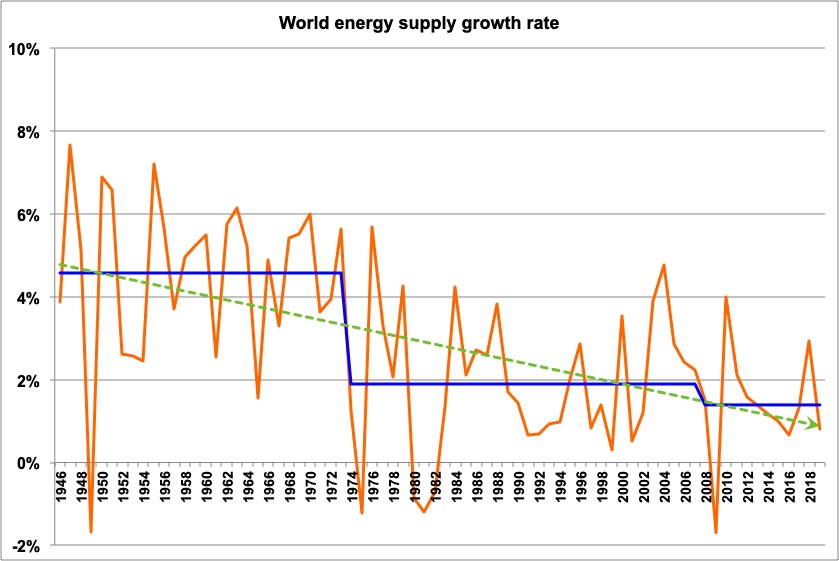
Change of the energy supply in the world since 1945.
The orange curve gives the yearly change, the blue bar the average values for 1945-1973 and 1974-2012.
One will easily notice that the average growth rate has been divided by more than 2 after the first oil shock.
The light line gives the trend of the growth rate for the whole period.
Source : Shilling et al, 1977, and BP Statistical Review, 2015
- Meanwhile the GDP per individual has increased by 3% per year on average. As long as there is no significant unemployment rate, and the fraction of inactive (retired, students, etc) does not change too fast, the revenue per worker and the revenue per person evolve about the same way.
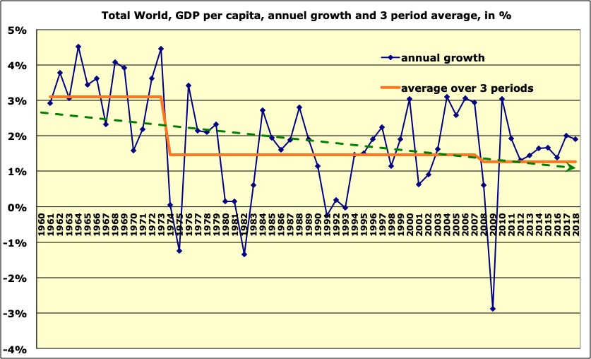
Annual change of the GDP per capita (world average) since 1960 (blue), and decadal mean (red). before the first oil shock the average was comprised between 3% and 4%.
Source: World Bank 2015
- and the energy efficiency has been slowly rising, or constant
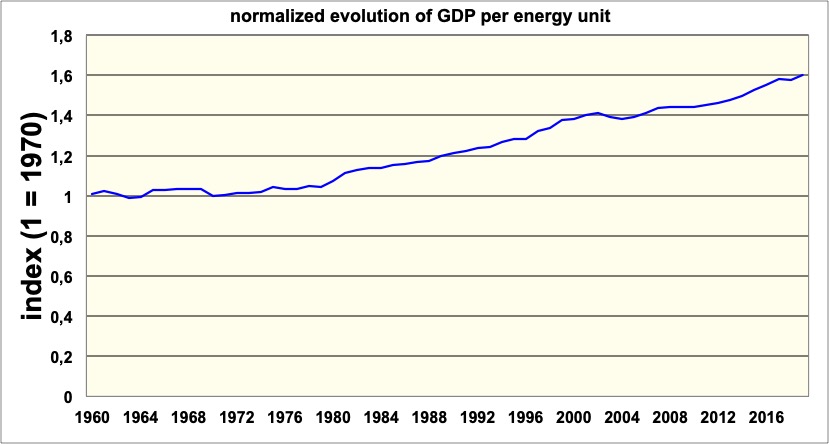
Evolution of the GDP produced with a given amount of energy, normalized to 1 in 1970 (world average).
Between 1960 and 2012 this ratio has gained 40%, which means that with the same amount of energy it has been possible to generate roughly 0,8% extra GDP each year.
Sources: Shilling et al, 1977, BP Statistical Review, 2015, and World Bank, 2015
Over the period, we therefore had energy growing (+5% per year), energy efficiency growing (roughly 1% per year), and even though the revenues per worker also increased (by 3% to 4% per year, which means the the term Jobs/GDP decreased by 3% to 4% per year), the number of jobs could increase by 1% to 2% per year (which results from the composition of the three previous rates in the equation above). It was magic!
After the oil shocks: Midas gets tired
The conventional way to remember the oil shocks is that there has been a sharp increase in the oil price, then followed a couple years later by a sharp decrease, and that was it. Actually what happened then is the economic stranslation of a decrease in the growth rate of oil supply, and as oil was then (and still is) the first primary energy in the world, it translated – and still translates – into a decrease of the growth rate of the energy supply.

Annual change of the growth rate of the energy supply of the OECD countries since 1966 (the value for 1966 represents the change between 1965 and 1966).
The average for the 1966-1973 period is a yearly growth of 5,2%, while it is only 0,9% for 1974-2012. The downward trend of this growth rate (that eventually turned into a contraction rate) is clearly visible.
Source: Primary data from BP Statistical Review 2015
Therefore the item NRJ in the above equation lost went from 5% to 1% of average annual growth after 1974, while the revenues per worker went on increasing by 2% to 3% per year (therefore the term jobs/GDP decreased by 2% to 3% per year). And at last the energy efficiency went on increasing by 1,5% per year (in the OECD countries).
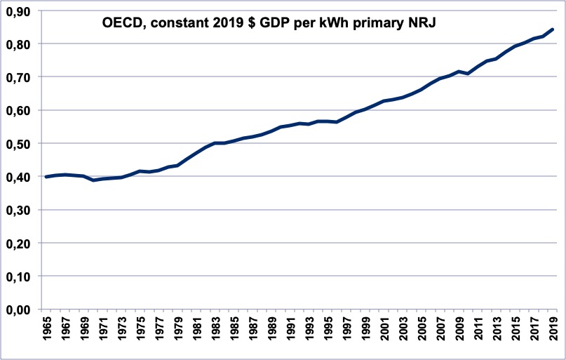
Constant $ of GDP per energy unit in the OECD countries from 1965 to 2014.
From 1974 to 2014 it increased by 1,5% per year on average.
Source: BP Statistical Review 2015 and World Bank 2015.
The composition of the growth rates above (NRJ +1% per year, Jobs/GDP -2% to -3% per year, GDP/ NRJ +1,5% per year) lead to a number of Jobs that remains globally stable. But if the population increases (which is the case), then a constant number of jobs means an employement rate that decreases (unless all the population increase is absorbed by inactive such as retired and students).
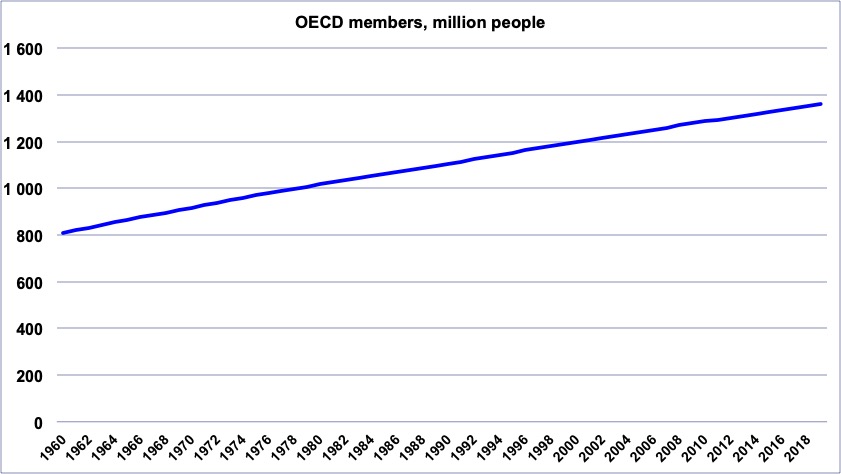
Population of the OECD since 1950.
Source: World Bank 2015
Of course, the fraction of the population that has a job can decrease for other causes than unemployment:
- this fraction decreases when people become “active” older (because studies last longer; let’s recall that students are inactive and not taken into account to calculate unemployment rates),
- this fraction decreases when people retire earlier (retired are also out of the statistics of unemployment),
Since 1974, most of the OECD countries went through the two evolutions described above: longer studies, earlier retirement. Therefore the active population did not increase as fast as the population as a whole, which enabled to maintain an increase of the wages for the people at work even though the GDP was increasing much slower than before. But….
And tomorrow?
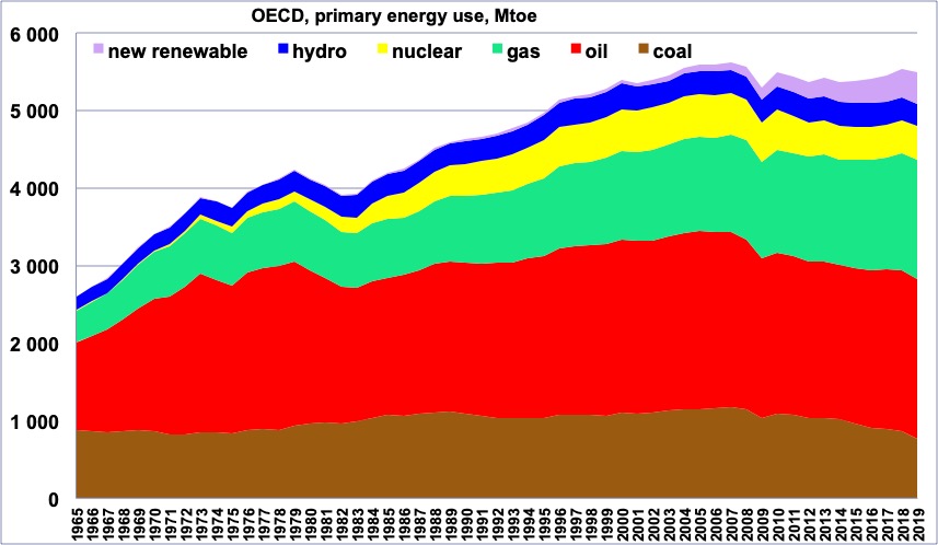
Even though the media of some European countries are focused on nuclear or some renewable energies, most of what we use in the OECD is fossil fuels (more than 80%).
The above graph clearly shows that since 2005 the available energy has begun to decrease in the OECD. The first reason is the halt in the growth of the world oil supply, that began in 2005, and leaves a growing humanity with an identical, or almost, amount of oil.
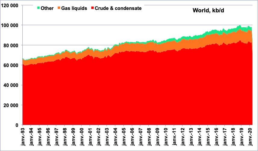
World liquid consumption since 1965 (conventional oil + tar sands and extra-heavy + gas liquids + biofuels), in million tonnes oil equivalent.
Since 2005 the world total is almost not increasing (the residual increase almost fully comes from gas liquids and biofuels), and the breakdown by zone changes, with the share of “old industrialized countries” going down.
Source; Energy Information Agency, 2015
If we turn to gas and coal, the increase takes place mostly outside OECD (and for coal China represents almost all the increase).
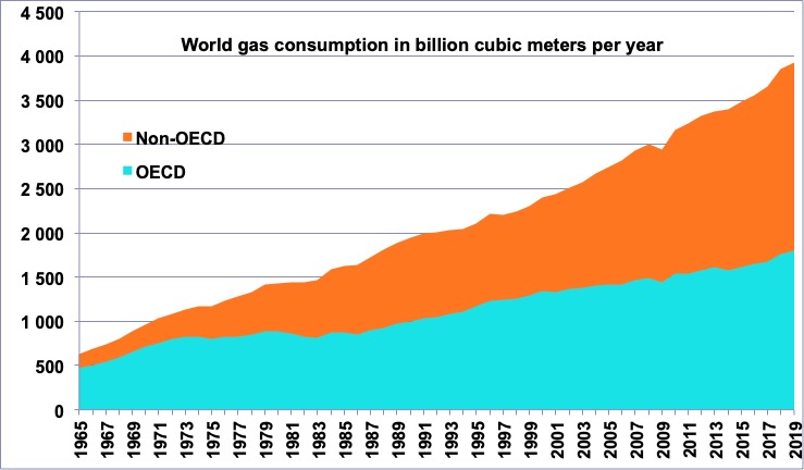
World gas consumption by zone since 1965, in million tonnes oil equivalent.
OECD is increasing slightly, but non-OECD increases much faster.
Source: BP Statistical Review 2015
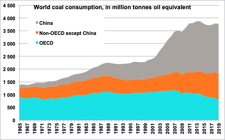
World coal consumption by zone since 1965, in million tonnes oil equivalent.
OECD is flat, but the increase is China is spectacular, because of the rapidly rising use of electricity.
Source: BP Statistical Review 2015
And later ? The peak for world liquids is expected within 5 to 15 years, that will impact OECD countries – and Europe – as everywhere. Gas will have a hard time compensating for the difference (especially in Europe), because it is not as convenient to transport and use. Coal will also be a partial “solution” in Europe, because it is even less convenient to transport than gas (and most of the reserves are outside Europe), and is even less convenient to use for transportation. Nuclear is globally not fashionable, and therefore does not benefits from massive investments, and at last new renewables remain marginal when looking at figures.
The above trends suggest that the global energy supply of OECD countries is bound to decrease for a while, notwithstanding shale gas. If, on top of that, Europeans phase out nuclear in the coming decades, the decrease will be larger.
Actually, this would be nothing new when looking at the trend for the past 45 years: the decrease of the growth rate, turning it into a “decrease rate”, has begun a longtime ago!
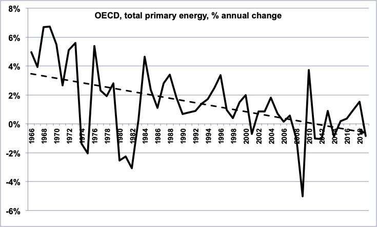
Annual change of the growth rate of the energy supply of the OECD countries since 1966 (the value for 1966 represents the change between 1965 and 1966).
Primary data from BP Statistical Review 2015
Actually, when looking individually at each energy in the OECD zone we get exactely the same trend, as follows:
- it is true for oil
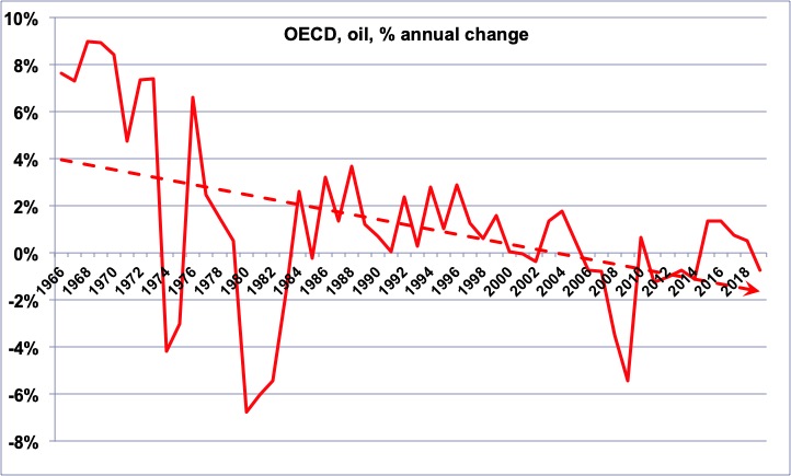
Annual change of the growth rate of the oil supply of the OECD countries since 1966 (the value for 1966 represents the change between 1965 and 1966).
We see that the decrease of the growth rate – that now has turned into a decrease rate – had begun before the first oil shock, and what happened after these shocks is basically that the trend (thin line) resumed after a short period of severe decrease.
Primary data from BP Statistical Review 2015
- it is true for gas
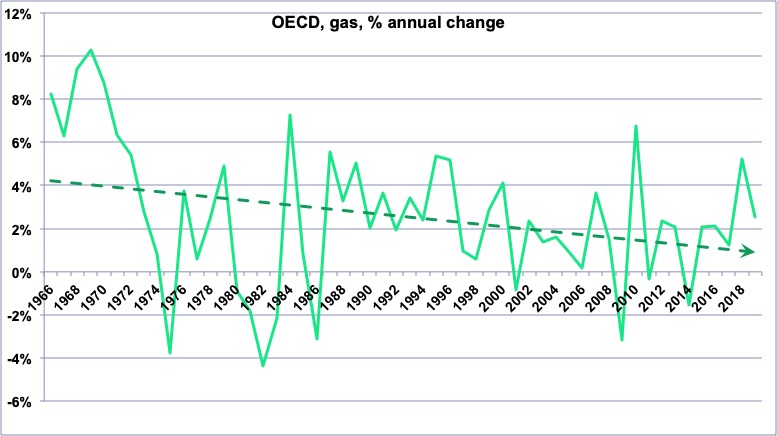
Annual change of the growth rate of the gas supply of the OECD countries since 1966 (the value for 1966 represents the change between 1965 and 1966).
We see that the growth rate follows a path much alike what it is for oil, with a decreasing trend for the half century (thin line). It is hard to spot the “shale gas revolution” in this curve! (the US is of course part of the OECD)
Primary data from BP Statistical Review 2015
- it is true for coal
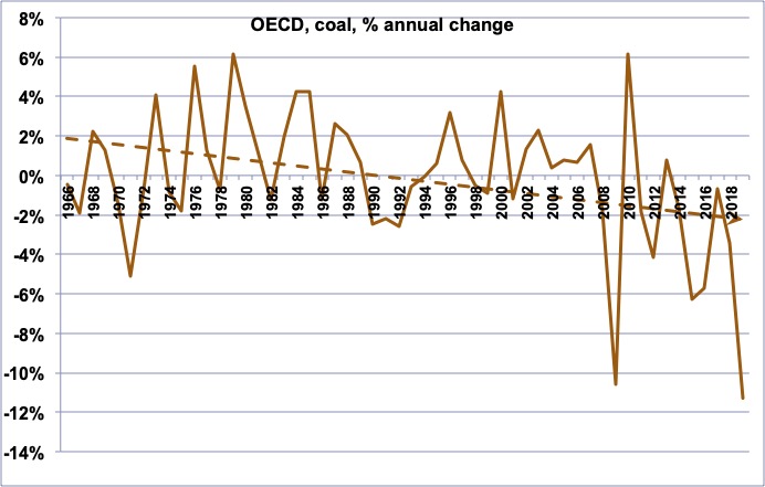
Annual change of the growth rate of the coal supply of the OECD countries since 1966 (the value for 1966 represents the change between 1965 and 1966).
Even though this ensemble has large resources, the consumption has been growing less and less, and now it is rather a (small) decrease.
Primary data from BP Statistical Review 2015
- it is true for hydroelectricity
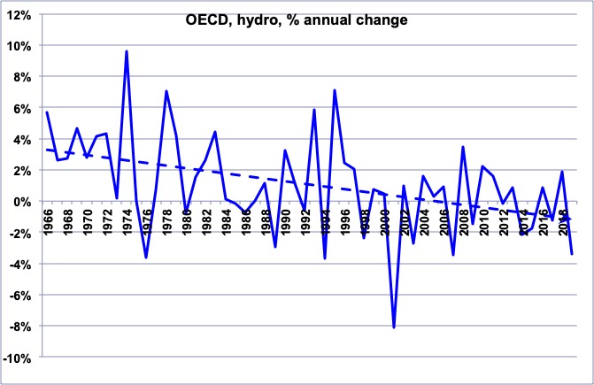
Annual change of the growth rate of the hydroelectricity supply of the OECD countries since 1966 (the value for 1966 represents the change between 1965 and 1966).
In spite of a “growth of the growth” for the recent years, the trend for the half century is clearly a decrease of the growth, as for the other energies
Primary data from BP Statistical Review 2015
- and it is true for nuclear!
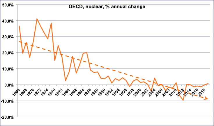
Annual change of the growth rate of the nuclear supply of the OECD countries since 1966 (the value for 1966 represents the change between 1965 and 1966).
As this energy is the youngest of all those examined so far, it is normal that it went through very high growth rates at the beginning that decline afterwards, however the last 20 years clearly show a “slow growth then decline”, particularly with the decisions of Japan and Germany.
Primary data from BP Statistical Review 2015
Of course, any reader of the paper will object that the “new renewables” grow fast, but it is not enough to change the global picture.
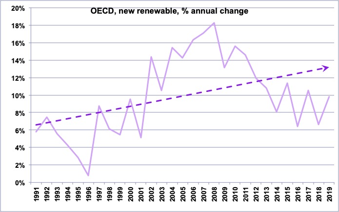
Annual change of the growth rate of the “new renewable” supply of the OECD countries since 1991 (the value for 1991 represents the change between 1990 and 1991).
The growth rate is increasing, but…
Primary data from BP Statistical Review 2015
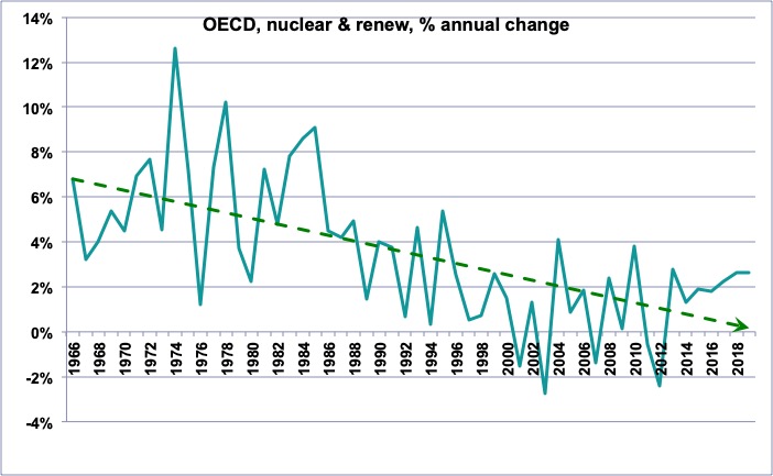
Annual change of the growth rate of the nuclear and renew supply of the OECD countries since 1991 (the value for 1991 represents the change between 1990 and 1991).
…it is not enough to get the same trend on all the “non fossil” energies since 1965.
The decrease of the growth rate for hydroelectricity and the turning away from nuclear are much more significant than the growth of new renewables.
Primary data from BP Statistical Review 2015
Here we are, with an energy supply in the OECD countries which is probably bound to decrease. In this context, to increase the number of jobs (which allows to decrease unemployment, or at least not to increase it) we must have the products of Jobs/GDP by GDP/NRJ that increases faster than the decrease of NRJ. It means that we must increase:
- either Jobs/GDP (which means, as explained above, a decrease of the average income per working person),
- either GDP/NRJ, which is the energy efficiency of the economy.
If we want to achieve a constant Jobs/GDP (which means a constant revenue per working person), then GDP/NRJ must strongly increase to allow for a growth of Jobs while NRJ decreases. Here is an example : if the NRJ supply decreases by 2% per year (something close to what we should achieve for fossil fuels), and we want the number of jobs to increase by 1% per year, without decreasing the average paycheck, then the term GDP/NRJ must increase by 3% per year.
Jobs= \frac{Jobs} {GDP}\times \frac{GDP} {NRJ}\times{NRJ}

Two other conclusions (not minor) can be derived from this equation :
- All other terms remaining equal, increasing GDP/NRJ creates jobs. It’s perfectly normal: increasing the energy efficicency means creating more physical flows with a same energy unit, and from there giving “something to do” to more people,
- All other terms remaining equal again, substituting an energy by another one (NRJ remains identical) doesn’t allow to increase the overall number of jobs (because if NRJ remains identical, as well as Jobs/GDP and GDP/NRJ, then Jobs remains identical). In such a case there are only transfer effects: the jobs created here (and highlighted by the advocates of the new energy) replace jobs destroyed elsewhere (that remains out of the vision of the same advocates).
For a change of energy to impact jobs, we need to have at the same time at least one of the following items:
- this change also impacts the energy efficiency of the economy (for example a given process is converted to electricity, and it happens that it results in a increase of GDP/NRJ).
- this change allows to pay the workers of the rising energy less than the workers of the decreasing one (then what is really changed is Jobs/GDP while NRJ remains constant in value, while changing in nature).
- this change allows to switch from an imported energy to a domestic energy (then the jobs that contribute to the “energy production” are within the country instead of being outside the country, and it also modifies the trade balance, but the rest remains unchanged).
As a result, replacing nuclear power by domestic electric renewables does not change the total amount of jobs in a country, unless the workers in the renewable sector are paid less than the workers in the nuclear energy sector. It only changes the breakdown of jobs by sector.
And a last conclusion that this equation suggests is that achieving at the same time more jobs and better salaries when the energy supply is bound to decrease is going to be a little complicated… and maybe politicians should avoid to promise it, and voters avoid to believe it, to avoid some kind of collective hangover!
