Article published in the french journal “Le Débat” – September 2012
The “energy transition”, many see it as a technical debate, furthermore often limited to electricity in Europe: nuclear or not, shale gas or not, wind or not… – without understanding that energy is actually the blood of industrial societies (that include all Western countries, and actually all emerging countries also). What counts is not its price, but the available volume: energy is now what drives our economic activity far more than work or capital. European countries have entered a phase where they will have access to less and less oil and gas, and this has triggered stagnation or recessions that are bound to last. We must draw accordingly an enthusiastic future while perpetual growth will probably not come back, and phasing out fossil fuels is our N°1 priority.
It has now been a couple of years that, in a number of Western countries, we have seen the expression “energy transition” flourishing in a number of public debates, generally as a consequence of the climate talks that became a serious thing in the early 2000’s. Since then, a number of people have also used this expression – or something close, like “energy concept” in Germany – to designate:
- or (and sometimes “and”!) the progressive phasing out of nuclear power, an objective which is either neutral or antagonistic with mitigating climate change.
We can therefore reasonably assume that all the people who use this expression do not refer to the same objectives or the same means, even though they often share a global idea of making things more “sustainable”. What follows does not pretend to suggest something everyone will accept, for my little experience has told me that this objective is probably far beyond my abilities (!), but it gives a couple personal conclusions based on the very strong, though poorly known, link between energy and the economy of “modern” countries.
Economic growth will become more and more an exception in Europe, starting from now
Before any attribution of causes, it is possible to note that the growth rate of the GDP per capita (world average) has been slowly – and constantly – decreasing since the 1960’s (I don’t have any data for the years before, that’s why I start in 1960!):
- it was +3,5% per year for the decade following 1960,
- it was +2% per year for the decade following 1970,
- it was a little less than +1,5% per year for the last 3 decades (and 0,4% per year on average between 2007 and 2012).
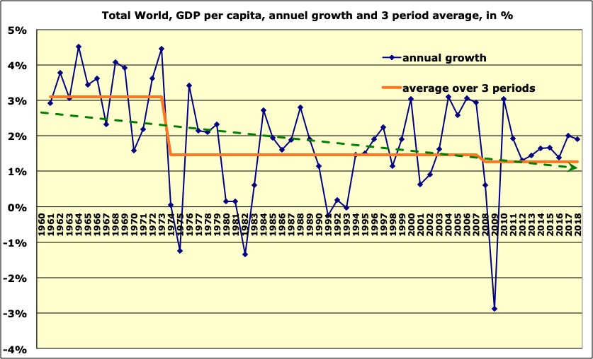
Evolution of the GDP per capita, world average, since 1960.
The red line gives the mean per decade, and the green dotted one the trend over the period.
Source of data: World Bank, 2015
But all the regions have not evolved the same way. The shift of productive activities towards Asia and major emerging countries out of Asia (Mexico, Brazil, etc) has generated an average growth rate of the GDP per capita that was higher than the world mean in these zones, and as a consequence the OECD countries (i. e. old industrialized countries) have experienced a constant decrease of this growth rate over the last 5 decades.
Evolution of the GDP per capita, OECD average, since 1960.
The red line gives the mean per decade, and the green dotted one the trend over the period.
Source of data: World Bank, 2015

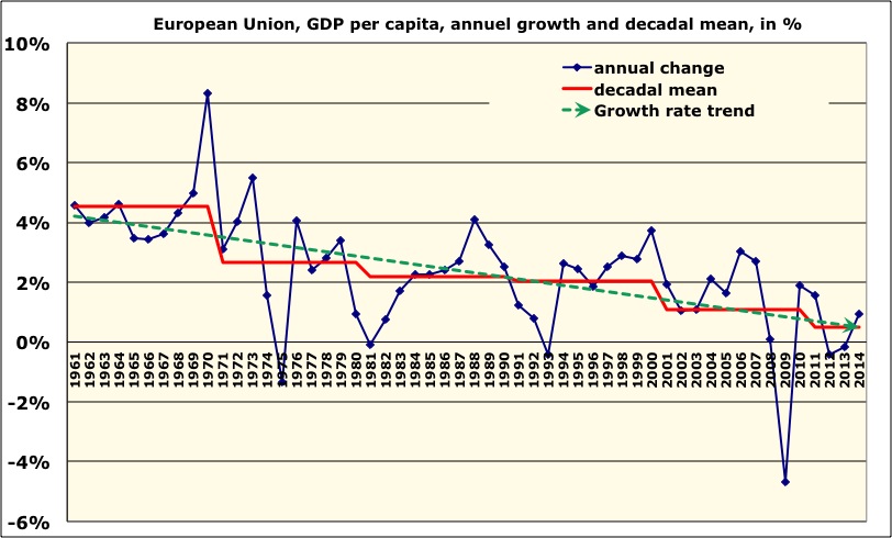
Evolution of the GDP per capita, European average, since 1960.
The red line gives the mean per decade (and the average 2011 – 2014 for the current decade).
Source of data: World Bank, 2015
Since the second oil shock (1980), Europe has never seen again the GDP per capita growing over 2% per year. If we look at Germany, Italy, Spain, France, or a number of Western countries, we will see everywhere the same general shape in “descending stairs” for the growth rate of the GDP per capita over the last 50 years. The exceptions are countries in which financial activities represent a large share of the economy (such as UK or Switzerland), where the growth rate of the GDP per capita went down sooner than in other OECD countries, but then remained at a higher level longer when approaching the end of the last century. But no major old industrialized country has done better than a 1% per year growth on average for the GDP per capita over the first decade of the 21st century.
Why is it that a large proportion of financial activities has changed this evolution? It is because of a convention that could be discussed on how the GDP is calculated. Let’s recall that this indicator represents the agregated market value of all the goods and services available for final consumption. But… when the price of a same consumption good (e. g. a same pair of shoes) rises from one year to the next, this price increase is not considered as a “true” increase of the value of the good, but as inflation (the same good costs more). This price increase is deducted from the value taken into account when calculating the GDP change over the years.
But when the price increase relates to assets (shares, real estate, or… a painting), then it is not considered as inflation but as a true increase of the value of the asset, and this increase directly contributes to the increase of the GDP. For example higher prices for real estate means more money lent by banks, thuis more revenues for banks, that goes into the GDP. It also means higher incomes for real estate agents or brokers for shares, that go into the GDP, higher taxes associated to sales, that finance more public services that go into the GDP, etc. In other words, as long as they last speculative bubbles represent an excellent way to increase the GDP! (with a minor inconvenient: when they burst, then the GDP falls faster, no system is perfect).
Why is it that we can observe this decrease of the growth rate of the GDP per capita since 1960 in every “old” country? The answer lies in the very strong, though poorly known, link between energy and the economy, too often discarded by classical economists who believe in perpetual growth (and who don’t know enough physics, also!). As a result, the most probable evolution for the next decade is that the GDP per capita in Europe – and in a number of other OECD countries – will at best remain constant, and most probably decrease.
And therefore any economic plan that requires, to be completed, that “structural growth” comes back, will actually fail, most likely in the course of a crisis “not anticipated” by all those who just look at the past to guess the future, but perfectly logical when considering the link energy-economy evoked below.
A major consequence for our purpose is that if the investments that have to be made in the energy system to ensure a “transition”, whatever it is, have to be a byproduct of a recovered economic growth, they just won’t happen, or not with the good magnitude.
The slowdown of the economy has a main cause: the slowdown of the energy availability per capita
The “classical economy”, which is dominant today in the analysis that are supposed to help prepare the future, has theorized the human production as an output of capital and work: P = F(K,W). With this vision, the GDP per person should evolve as the available amount of work per person, and the available capital per person. And therefore the GDP must increase if we make access to work easier – for example by lowering taxes on work – or access to capital – for example by boosting credit.
As there is no energy in this equation (and neither any natural resource), the approach does not suggest that the GDP should increase or decrease depending on the amount of available energy (or the amount of available natural resources). Well, looking at figures nevertheless show that it is what is happening.
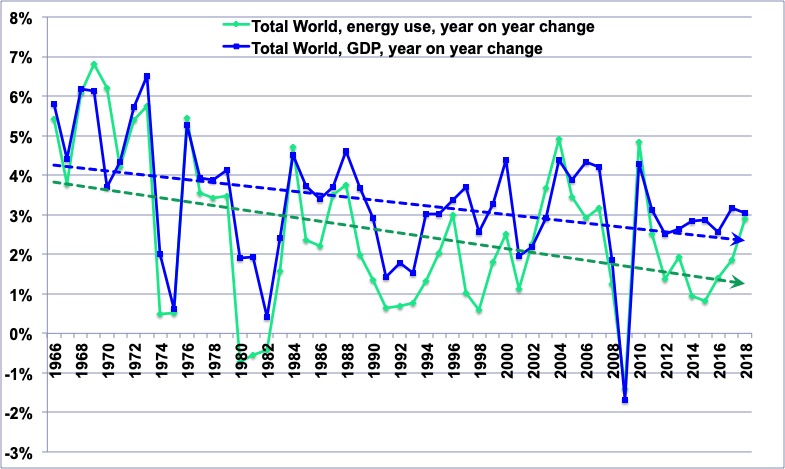
Respective year on year changes, since 1960, of the world GDP (purple curve), and the world energy consumption, excluding wood (dark blue).
It is easy to see that the two evolve almost the same way. Besides in 1980, 1989, 1997, and 2005, the drop in energy supply preceded the drop of the GDP, that came shortly after.
NB: the value for 1965 for the violet curve is not significant (change of series).
Author’s calculation on primary data coming from BP statistical review & various sources before 1965 (energy) and World Bank (GDP).
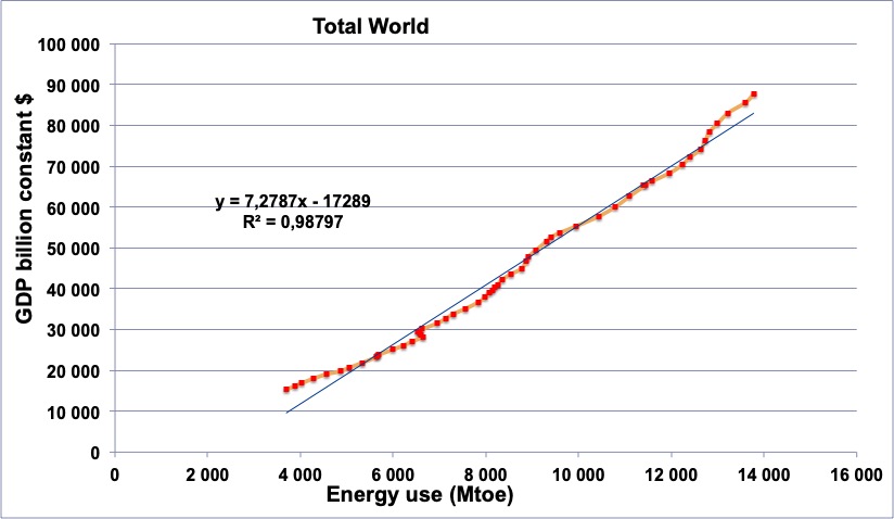
World GDP in constant dollars (vertical axis) plotted against the world energy consumption in million tonnes oil equivalent (horizontal axis), from 1965 to 2014.
The correlation between the two variables is clear.
Author’s calculation on primary information coming from BP statistical review (energy) and World Bank (GDP).
The reader will easily notice that there is a strong correlation between the two in the above graph, and the rest of this note will show:
- that it is actually a cause and consequence relation, the GDP being, at the first order, a function of the available amount of energy (but not of the price),
- and therefore that the evolution of the GDP basically depends, on first approximation, of the evolution of the amount of available energy.
Why is it that energy plays this central role? Because, by definition, energy is the notion, in physics, that characterizes a change in a system. As soon as we heat, cool, move, twist, extrude, laminate, carve, cut, assemble, dissociate, throw, blow, spread, and again, we need energy. The greater the flow created, the more energy is involved.
Well, our economic system is nothing else than the transformation, on a very large scale, of natural resources into “something else” (sand in glass, minerals in cars, tables and knives, oil in clothes, photosynthesis in cereals then cookies, etc). The access to seemingly limitless energy has allowed to increase by tremendous factors all the physical flows that sustain our productive activities, for which the GDP is only an incomplete translation in monetary terms.
In other words, thanks to energy we have been able to use more and more machines that heat, cool, lift, extrude, bend, laminate, move around, mix, twist, excavate, pump, transmit, print, knit, blow, wash, plow, etc, and that are thousands of times more powerful than our arms and legs.
When going from the steelworker of ancient times (that used a mass) to the modern industrial steelworks, or from the old lime oven burning algae the shore to a modern cement plant, the flow of matter manipulated per person has been multiplied by one thousand to one million. Even in the services we can find huge numbers: the engine of a truck (transportation is included in services) is 4000 times more powerful than the muscles of the driver, and an office clerck of the 21st century uses as much energy for his work than what an Westerner used on average in the 1950’s for all his activities (professional and personal). If we had to replace heaters by people just sitting there to release there body heat to make offices habitable in the winter, we would have to divide the office space per person by 20 to ensure a suitable temperature!
Another example: manufacturing a computer requires considerable upstream physical flows – in the mining industries, iron and non-ferrous industries, chemical industries, transportation of intermediate goods, etc – but that happen out of the cities, and most of the time abroad. Even the economy we believe to be “dematerialized” is therefore a fierce consumer of transformed natural resources, and… of energy.
But these flows are out of reach of the senses (sight, smell, hearing, taste, and touch) of the urban population, among which we will find economists and political leaders, that just see laptops coming out of the stores. The latters therefore believe that a “dematerialized” economy is an answer to the constraint on resources, when looking at the flows it requires “elsewhere” shows on the opposite that it can happen only in a world that heavily consumes energy. Without this profusion of energy, we would go back to accounting books on paper !
To reflect this physical reality, we can write a new equation in which the economic output is strictly dependent from energy, such as:
GDP= \frac{GDP} {Energy}\times{Energy}
In this equation, the term “NRJ” is the amount of energy consumed by our productive system (in physical units, such as joules, BTUs or kWh, but not in euros or dollars), and the term GDP/Energy designates the amount of GDP that it is possible to obtain with one energy unit. It is the famous “energy efficiency of the GDP”, and reflects the energy content of the flow it is necessary to create (by laminating, heating, moving, etc) so that the monetary value of this flow (i.e. the product or service created or enhanced from the flow) is equal to one euro (or dollar).
When this term increases, it means that the economy is becoming more efficient, and that we can get more GDP (in practical terms more goods and services) with the same amount of energy, that is more GDP with the same physical flows. But as it is not that easy to melt iron, build homes, heat them, manufacture cars and tables and move goods around with ten times less energy just by wishing it, and as increasing this efficiency often requires to invest massively (in new plants, new buildings, new electric facilities, new cars, etc), this term is evolving slowly. It gained only… 40% in 50 years, that is +0,8% per year (world average).
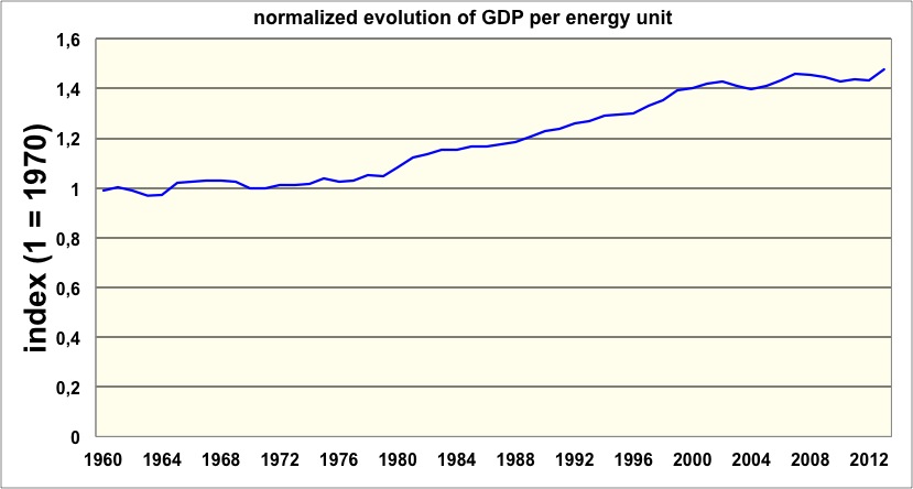
Evolution of the GDP produced with a given amount of energy, normalized to 1 in 1970 (world average).
Between 1960 and 2013 this ratio has gained only 40%, which means that with the same amount of energy it has been possible to generate roughly 0,8% extra GDP each year.
Actually for the 1960 decade the gain has been nil (energy was more and more abundant, with a very high growth rate, and cheaper and cheaper, so there was basically no incentive). Besides, after the 1974 and 2007 oil shocks, we could expect this ratio to grow fast, and it is the reverse that happens first. As abundant capital is required to massively save energy (which means replacing vehicles, buildings, factories or processes, etc), and in the course of a crisis finding capital is harder to find (see below), efforts to save energy are not immediate.
We can also note this amusing information: in an agrarian economy (for example in a subsaharian African country), with no fossil fuels (or almost), a “poor” peasant produces an economic output around one dollar per day, with the sole energy of his body, that doesn’t exceed one kWh per day. The energy efficiency of the GDP is therefore around 1 dollar per kWh, more or less.
In Western countries, the GDP per person is around several tens of thousand dollars per year, and the energy consumption around 50,000 kWh per year: we are therefore also close to 1 dollar per kWh! It means an interesting thing: when industrialization begins, the energy efficiency of the economy doesn’t improve at all, but degrades (what has happened in a number of Asian emerging countries during the last decades). But the above curve does not start from the beginning of industrialization…
Author’s calculations on various sources (energy = Schilling et al, BP statistical Review 2014, Woods Hole Centre; GDP = World Bank, 2014).
From now on, we will move to the GDP per capita, because no individual “sees” the GDP, everyone “sees” the GDP per capita, which directly relates to incomes, purchasing power, and unemployment. Our equation then becomes:
\frac{GDP} {Population}= \frac{GDP} {Energy}\times \frac{Energy} {Population}
The term GDP/Energy has been discussed above. The term Energy/Population represents the amount of available energy per individual, that grew continuously between the beginning of the industrial revolution and 1980, date at which it brutally evolved differently.
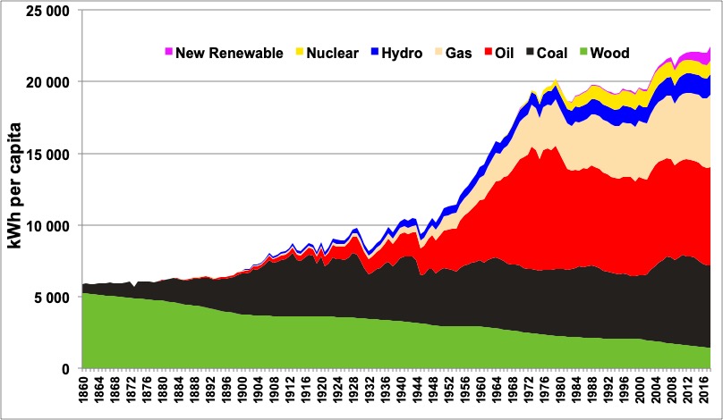
Evolution of the average energy consumption per capita in the world, since 1880, wood included (estimated).
The vertical axis is graduated in kWh
(1 kWh = 0,003 MBTU).
An inhabitant of the planet therefore uses, on average, a little more than 20,000 kWh per year (by comparison the mechanical output of his own body is around 100 kWh per year).
The above diagram clearly outlines three distinctive periods since the beginning of the industrial revolution: for more than a century (1860 to 1979) the amount of energy per capita has been rising strongly, and after the second oil shock in 1979 it remained almost constant until the beginning of the 2000 decade. There has been again a rise during the 2000’s, corresponding to a strong growth in the emerging countries fueled by coal, where it is the first energy used.
Author’s compilation with data coming from the following primary sources: Shilling et al., BP statistical review 2015, United Nations.
The above graph clearly shows that, at the world level:
- fossil fuels dominate – by far – the energy mix (80% of the total),
- the “new renewables” are insignificant (they should increase by 80% per year to compensate a 2% annual decline on the sole oil, and this decline rate is almost here).
- the only significant energies “without carbon” are biomass (10% of the total), hydroelectricity and nuclear (5% each in primary equivalent).
This graph also shows that, after a steady 2,5% growth per year (3% for all energies except biomass) for more than a century (from 1860 to 1980), the term Energy/Population has almost stopped growing in 1980, going down to 0,4% per year for the last 30 years. Actually, the energy supply per capita has decreased in all mature economies, the increase happening almost only in the emerging countries (that have pretty much emerged by now!). Now let’s go back to our equation and try to understand what it means:
- The term Energy/Population went from a 2,5% yearly increase before 1980 to 0,4% after.
- The term GDP/Energy remained around +0,8% per year since 1960.
By the magic of a simple multiplication, in 1980 the GDP per capita – on average for the world – suddenly went from a 3% annual growth to only 1,2% (what can be seen on the first graph of this page). At this time the GDP was basically coming from Western countries (OECD countries represented 85% of the world total in 1980; China only 1 and Brazil 2%), so this evolution of the GDP per capita was in fact that of the industrialized countries.
\frac{GDP} {Population}= \frac{GDP} {Energy}\times \frac{Energy} {Population}

Before 1980
\frac{GDP} {Population}= \frac{GDP} {Energy}\times \frac{Energy} {Population}

After 1980
But these countries had built a redistributive system that was calibrated with spendings per capita increasing by 3% per year, financed with revenues that grew at the same rate, as they were basically a fraction of the GDP. Indeed, no Western country has a significant share of its taxes coming from the accumulated stock – i.e. capital, they all have most of there taxes on flows, such as incomes or consumption spending, and therefore the revenues feeding the public spending per capita naturally evolves as the GDP per capita.
As a result, the public spending (number of civil servants and how much they are paid, investment budgets, etc), that had been designed with a 3% per year growth rate of the revenues (which allows to promise automatic salary increases with years in service, or to plan automatic increases of investments over long periods, etc), had to brutally face a stagnation in revenues, when the increase in speding was extremely difficult to halt.
The two first oil shocks, that marked a halt in the energy availability per capita, triggered in every Western country, irrespectively of the political party in office, a rising public debt.
In all industrialized democracies, so far, the cure of the problem has been… to pray for “the return of the growth Jedi”. As the return of perpetual economic growth would mean the return of a perpetual rise in energy consumption per capita, I let the reader draw his (or her) own conclusions on how likely it is that our prayer is fulfilled!
This evolution has also triggered a rising private debt for households and companies. Why is that so? Because governments generally made access to credit easier to boost investments, thinking that then the GDP would follow (since P = F(K,W)). But with no extra energy to “feed” the machines financed, this plan was ineffective: the GDP did not recover a strong perpetual growth – there was not enough energy for all these factories and transportation means – but the debt remained. With no growth, it will eventually result in inflation or more violent crises.
The energy-economy link is even stronger for oil
Globalization (and urban sprawling) has created a very strong dependency of the economic system to transportation. Well 98% of the world transport system (95% of terrestrial transportation and 100% of marine and aerial transportation) relies on oil. Therefore the coupling of the world economic system to the amount of available oil (and not directly to the price) is very strong, what can be confirmed by plotting both oil production and the GDP per capita on the same graph (below).
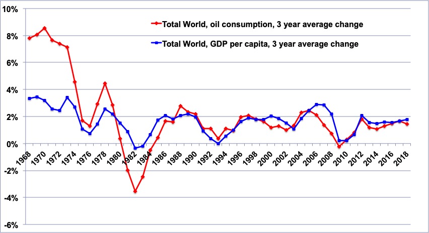
The violet curve gives a 3 year running mean for the variation of the volume of oil produced worldwide.
The blue one gives the 3 year running mean for the variation of the GDP per capita on world average.
The first thing we notice is that before 1986 the magnitude of the variation was greater for oil production than for GDP per capita, when after they became of the same magnitude. This suggest that the dependency of our economic system on oil has increased and not decreased since the first oil shocks, which is consistent with the development of globalization, that heavily relies on international transportation.
The second thing we notice is that in 1998 and 2005 the slowdown on oil production happened before the slowdown on the GDP per capita: it is not because of the crisis that we use less oil, but because oil availability has decreased that we have a crisis.
Author’s calculation on BP statistical review 2015 for oil, and World Bank 2015 for the GDP.
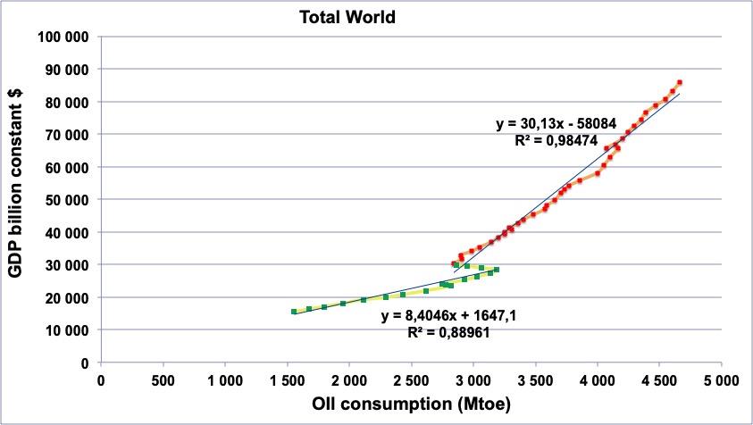
World GDP in constant dollars (vertical axis) plotted against the world oil consumption in million tonnes (horizontal axis), from 1965 to 2014.
Green: data from 1965 to 1982,
Red: data from 1983 to 2014.
The correlation is equally strong for the post 1982 and the pre-1974 periods, which shows that the world economy is not less dependent on oil: the dependency has increased, even though we get “more GDP per barrel” today than before.
Author’s calculation on BP statistical review 2015 for oil, and World Bank 2015 for the GDP.
We can now reasonably assume that the chaining of the events is as follows:
- when oil production does not allow to fulfill the wished demand, the price of oil strongly increases,
- But because of the link:
PIB= \frac{PIB} {Energie}\times{Energie}
,when there is not enough oil, that represents 40% of the final energy consumption in the world, there is “not enough energy”, and then “not enough GDP”,
- In this chaining of events, the price increase of oil and the recession do not result one from another, but are two successive economic consequences of a same lack of liquid energy.
The diffusion of a lack of oil in the global economy derives mostly from a volume effect, not a price effect (if there is “only” a price increase but no limit on the volume, the money spent by a country A is earned by a country B, and a rise of the oil price changes the distribution of wealth, but has a relatively small impact on its size).
It is the reason why, since 1974, all oil shocks have been followed by a recession.
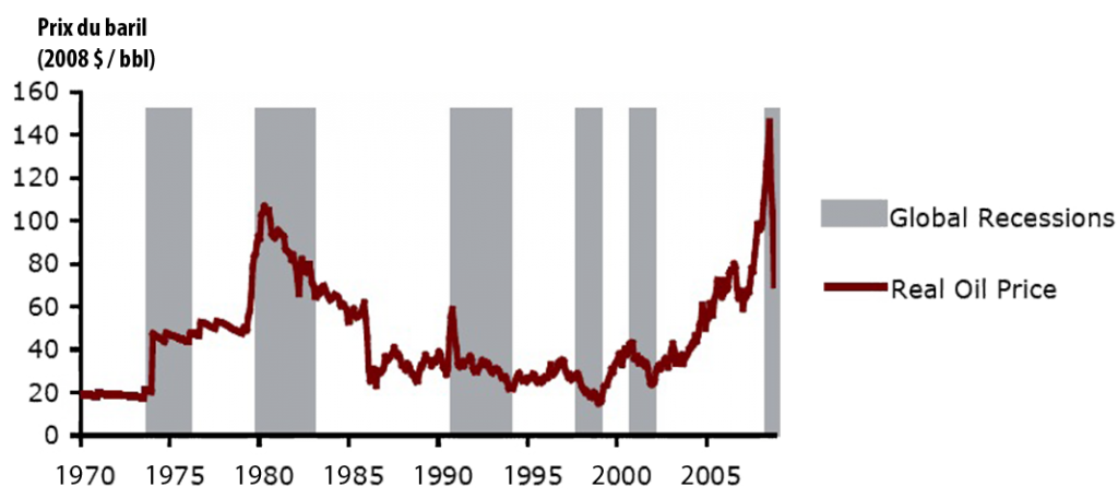
Evolution of the price of oil in constant dollars per barrel, and global slowdowns of the economy (and even true recessions in the US) in grey.
Source: CIBC World Markets, October 2008.
In Europe, the available energy per capita will go on decreasing
Even though the media do not necessarily reflects this reality, all European countries have an energy supply (not only an electric supply!) dominated by fossil fuels (coal, oil, gas). More precisely, almost 2/3 of the European energy comes from oil (36%) and gas (25%).
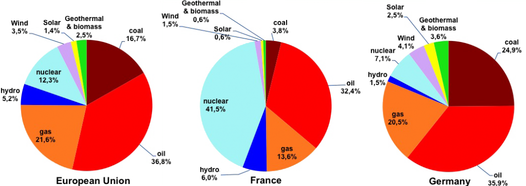
Share of each energy in the primary supply of Europe (left), France (middle), Germany (right) in 2014.
Wind, photovoltaic, geothermal, biogas, and all renewables except wood, biofuels and hydro are in “new renewables”. Wood is not included (7% of the supply in France).
Source BP Statistical Review, 2015
In spite of what the press sometimes says, Germany is no such a renewable champion compared to France: when including wood, both countries have a little above 10% of renewables in the primary energy mix. That’s because the press has a tendency to assimilate renewables and wind and solar, forgetting hydroelectricity that nevertheless provide the first contribution to renewable electricity in the world! (and also in Europe).
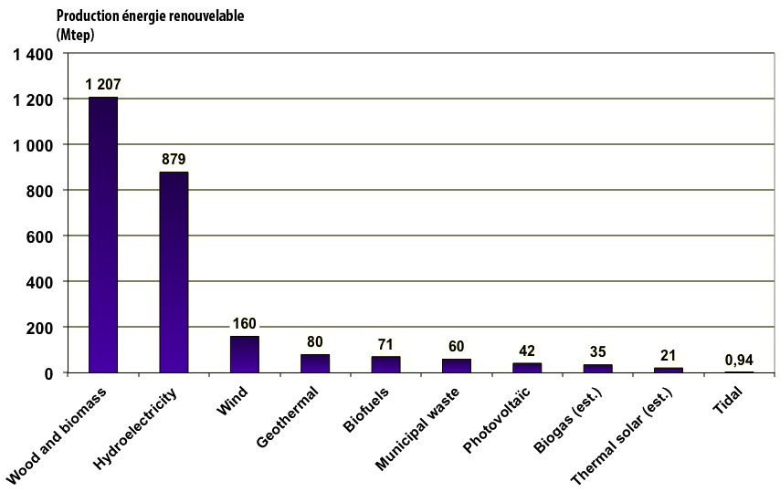
Renewable energy supply in the world in 2014, in million tonnes oil equivalent.
(With this unit the world consumption is around 13,000).
Wood therefore represents 8% of the world total, and hydroelectricity 6% (primary energy equivalent).
Various sources, 2015.
Wind power amounts to only 18% of hydropower, and photovoltaic 5%.
But let’s get back to oil, which represents roughly a third of the primary energy consumed in the world, and more than 40% of the final energy. As it takes 50 to 400 million years to form oil and gas, the amount of oil in the ground has been given once and for all at the beginning of the industrial civilization. Mathematics then tell us that when the overall amount of an extractible resource has a known maximum value, then the annual extraction (i. e. the annual “production”) of this resource can do nothing else than beginning at zero, going through a maximum at some point, before declining to zero again.
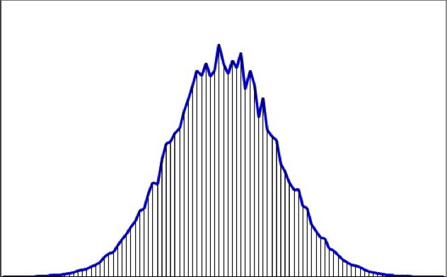
General aspect of a production curve coming from a stock given once and for all.
The horizontal axis represents time, and the vertical one the level of the production. There might be several “bumps” (in mathematical terms, secondary maximums) before the decline, but an absolute maximum and a decline to zero at some point are unavoidable.
The overall amount extracted – or cumulated amount – corresponds to the hashed zone below the curve. In mathematical terms, this surface is named “integral” of the curve. As it is not possible to extract from the ground something that has not been previously discovered, the value of this integral is at most equal to the cumulated discoveries.
This conclusion actually applies to any non-renewable resource, and not only to oil: the production of gas, ores of all kinds, potash, mineral salt, etc, will go through a peak. No chance to skip the implications of a math theorem! There are pending questions, though, which are always the same: that of the date of the peak (which can be very remote or already passed) and that of the level of the peak (which can be close to the present level or way above).
This conclusion also applies to discoveries, for the oil that can be discovered is at most equal to the oil present below the ground. And for discoveries it is actually easy to check that mathematics are valid, because the peak was… 50 years ago!
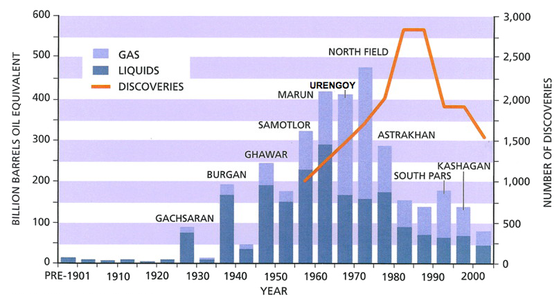
Evolution of the world recoverable oil and gas discoveries since 1900, except US and Canada.
The left axis is graduated in billion barrels oil equivalent, and corresponds to the blue bars, that give the volumes discovered for each 5 year period.
The right axis is graduated in number of fields discovered, and corresponds to the orange curve that peaks 15 years after the volumes discovered.
As the case may be, the name of the largest field discovered in a 5 year period is mentioned above the bar that corresponds to the same period (for example Burgan and Ghawar are giant oilfields, Urengoy, North Field and South Pars giant gas fields).
The reader will notice two things well known of oil geologists but not as much by the general public:
- It’s been 40 years that we have passed the peak of discoveries for gas (and 50 years for oil), and now the discoveries are below production.
- The number of fields discovered each year is the same today than in the 60’s, but volumes are 4 to 5 times lower, which means that the average size of a field discovered is 4 to 5 times smaller than then (which makes exploitation more difficult and costly).
Source: IHS energy, 2006
One can easily see that world oil discoveries have gone through a maximum in the 1960 decade – 50 years ago already! – and that of gas have culminated in the years 1970 (the recent discoveries offshore Brazil – and discoveries that size don’t happen every year – represent 20 to 30 billion barrels of recoverable oil, that is less than 30% of what was discovered every year during the golden age of oil exploration). The above graph also shows that until 1990 the number of fields discovered kept increasing while the volumes where already going down, which means that the average size of each field discovered was rapidly decreasing (which doesn’t help for production costs).
So there will be a peak for oil production. The average lag of 50 years between discoveries and production suggests that the peak will happen around 2020, even when including into “oil” some liquids that are not exactly petroleum products.
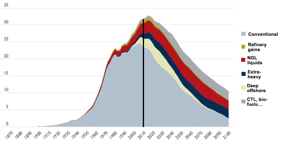
Simulation of the world production of liquids, in billion barrels per year, for ultimate reserves of roughly 3500 billion barrels.
The vertical black line corresponds to 2010.
Oil production in the true sense corresponds to the sum of conventional + deep offshore, and sometimes extra-heavy.
CTL means coal to liquids.
Source: “Transport energy futures: long-term oil supply trends and projections”, Australian Government, Department of Infrastructure, Transport, Regional Development and Local Government, Bureau of Infrastructure, Transport and Regional Economics (BITRE), Canberra (Australia), 2009.
In perfect accordance with was is stated above, the world production of “oil” (conventional oil + extra-heavy and tar sands + gas liquids) has almost stopped growing in 2005.
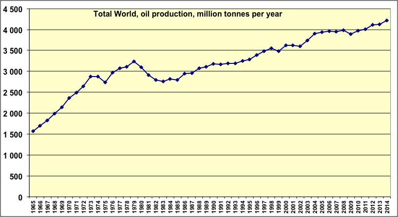
World oil production since 1965, in thousands barrels per day.
This production includes all types of oil (conventional, non conventional) and natural gas liquids (which probably provide most of the remaining growth).
Since 2005 the production increase is close to zero. The apparent growth recovery since 2011 is for a large part due to the contribution of natural gas liquids, that are included in the “oil production” for BP Statistical Review even though it is not oil and not suited to produce car, boat or jet fuel.
Source: BP Statistical Review, 2015
A stable production in a world where the number of consumers increases leads to an obvious result: less and less oil available per consumer. And as emerging countries and oil producers (which are sometimes the same countries) increase their domestic consumption, the amount of oil available for historical importers decrease. It’s the case for Europe (enlarged to Norway), that imports 70% of its oil (the European Union alone imports 90% of its oil!), and that lost 15% of its oil availability between 2006 and 2012.
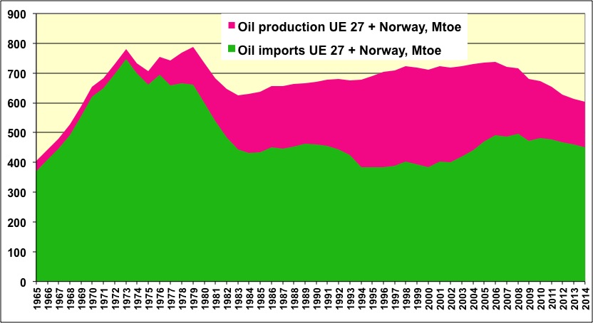
Oil supply in “enlarged Europe” (European Union + Norway), in million tonnes per year.
The pink area represents the domestic production (mainly the North Sea), that peaked in 2000. The green area represents imports, that peaked in 1973, then went through a secondary maximum in 2007, as a result of the quasi-stabilization of the world production since 2005. The European supply (production+imports) is now in decline, and lost 18% between 2006 and 2014 (or 3% per year on average).
Source: BP Statistical Review 2015
The world oil production will not vary much until 2020 (give or take 5 years), then will begin to decline, at a rate that should be around 2% per year (triggering a decline per capita that should be between 3% and 4%, depending on the evolution of the population). Therefore European imports will be more and more constrained. And the North Sea will continue its decline in the future.
A simple conclusion can be drawn from all this: Europe, from now on, will have less and less oil, when it represents a little less than 40% of its primary energy supply (in Europe Greece has the highest share with 60%, then come Portugal, Spain and Ireland with 50%; maybe this and that are linked!). And oil is as much indispensable to transportation in Europe as it is elsewhere.
For gas, which represents a quarter of the European supply, there has also been an inflexion in 2005.
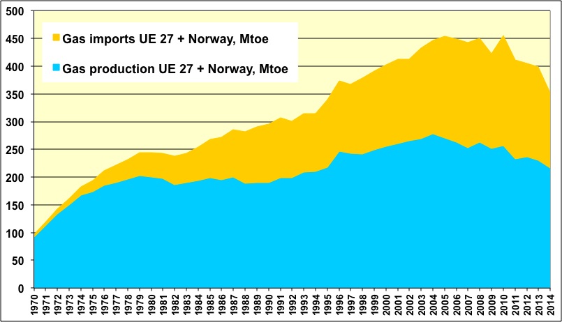
Domestic gas production and imports for enlarged Europe (European Union + Norway) since 1970, in million tonnes oil equivalent per year.
The North Sea, that presently provides 60% of the European consumption, has passed its peak in 2004, and the global amount of gas available for Europeans is now in slow decline (-10% since 2006).
Source: BP Statistical Review, 2015
As we can see above, 60% of the European gas comes from the North Sea, which has entered its decline in 2005.
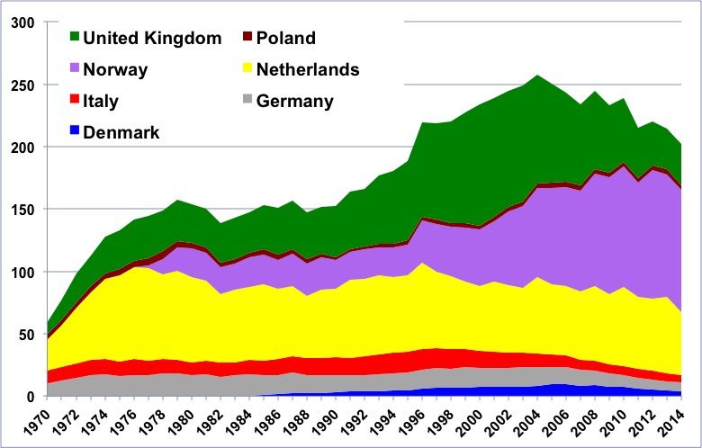
Gas production in Europe in million tonnes oil equivalent, with a breakdown by country.
The decline of the zone has begun in 2005 (mainly because of the sharp fall of the UK production). When Norway passes its peak the annual decline of the zone will probably be over 5% per year (in a decade something like half of the output will be lost).
Source: BP Statistical Review, 2015
When Norway passes its production peak, the North Sea will loose 5% to 10% of its gas each year, that is 12 to 25 million tonnes oil equivalent per year. Can we compensate with imports? Not so easily: gas is not so convenient to transport over long distances (because it is gaseous!), which means, when talking about money, that gas transportation costs 5 to 10 times more per energy unit than oil.
It explains why 65% of the oil production crosses a border between the country where it is produced and the country where it is consumed, when it is the case for only 30% of the world gas production. NGL (liquefied gas) represents only 10% of the world consumption (it requires heavy and costly infrastructure), and Japan alone uses one third of this gas transported by boat.
Let’s go back to Europe: in 2012 Russian gas represents slightly above 20% of the European consumption, that is 100 million tonnes oil equivalent per year (and symmetrically Europe uses 15% of the Russian gas, but 60% of the Russian exports). To compensate a 5% to 10% decline per year of the North Sea, Russian exports to Europe should increase by 12% to 25% each year.
A 12% increase per year means a doubling of the Russian gas exported to Europe in 6 years, and a tripling in 10 years, representing then half of the Russian production. No gas specialist considers this as being plausible. Russian gas exports have remained stable for the last 20 years; the new projects developed bring an extra production that basically compensates the decline of the producing fields… and furthermore they could well supply the Chinese and not at all the Europeans!
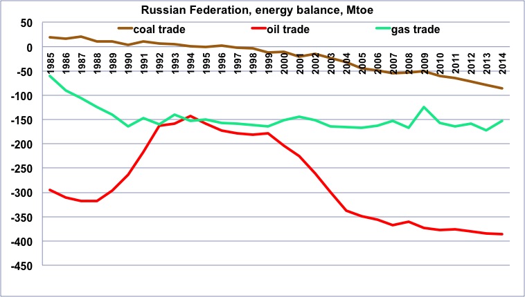
Evolution of the Russian energy balance since 1985, in million tonnes oil equivalent. Negative figures correspond to net exports.
For oil, there has been large variations over the last 20 years, with more than a doubling of exports, but it is not at all the case for gas, which has remained stable around 150 million tonnes oil equivalent per year for the last 20 years. Let’s recall that the European gas consumption is 400 million tonnes oil equivalent per year.
Source: BP Statistical Review, 2015
The other significant countries of the former USSR, that is Turkmenistan and Uzbekistan, represent altogether the Norwegian production, and their output is not bound to be multiplied by 5 in the coming years.
Can we compensate, then, with “shale gas”? Alas, the European reality will probably not meet the hopes that we can see expressed here and there. In the US, shale gas in the true sense is far from being dominant in the production of non conventional gas: its production amounts to 100 million tonnes oil equivalent per year (on a global US gas production of 600). Meanwhile, gas coming from coal seams (firedamp enclosed in deep coal seams, brought to the surface after fracking the seam) represents roughly 50 million tonnes oil equivalent per year, and tight gas (gas coming from reservoir rocks that are almost alike “regular” reservoir rocks, with the difference that pores have stopped being connected and fracking is needed to re-create permeability) roughly 200 million tonnes oil equivalent per year.
In Europe, there is no tight gas reservoirs, and no significant amount of deep coal seams. We do have mother rocks (shales) in France and Poland, but without exploration wells it is impossible to know whether the recoverable amounts are significant or… close to zero (and both can happen). In Poland, after a couple of preliminary drillings, Exxon has decided to give up looking for shale gas (June 2012). Let’s recall that a reserve is a volume for which extraction is certain, and not the result of a hypothetical calculation made with surface observations.
In Poland, still, the National Geology Institute has recently revised a previous estimate of the Energy Information Agency (US), and divided it by… 10! The upper value published by this institute is now several hundred million tonnes oil equivalent of recoverable gas, that could lead to an annual production of several % of the total, or 5% of the present European production.
Indeed, even though there would be reserves, producing shale gas is much more complex than producing “regular” gas. Mother rocks are impermeable, and to create permeability it is necessary to frack the rock, which means installing one well every other km or so. These wells each require a couple hectares, where, as the case may be, forest has to be cleared (or crops become impossible). It is necessary to have a pretty dense pre-existing network of gas pipes – since there is a well every other km – to evacuate the gas extracted. The country must have a whole bunch of drilling companies to constantly drill and maintain thousands of wells. And last but not least, the existing law must allow all these operations to be conducted at a very fast pace, because a non-conventional gas well has lost 50% of its output after one year, and 80% after two years.
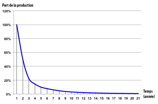
General production profile of a tight gas or shale gas individual well.
The vertical axis is graduated in % of the production of the first year, and the horizontal axis is graduated in years of production. After 3 years the remaining production is a small fraction of the past production.
All these conditions are gathered in the US, which has historically favored the emerging of thousands of small producers though a legal context which is specific to this country. In the US, the owner of any piece of land owns by right any mineral resource located beneath the land. Therefore in this country any land owner can drill his land without asking the permission to anyone, be it for oil, gas, coal, or anything else (the only limit is respecting existing regulations, for example regarding the environment).
Europe is a different place, first of all because the authorization to mine a resource is always granted by the state, no matter who owns the land from which the extraction takes place. Besides, our Old Continent does not possess the network of drilling companies that has been existing for long in the US, and which is necessary to drill everywhere all the time.
As a result, even if we deemed compatible with mitigating climate change to produce existing non conventional gas in Europe, the rise in production would be (very) slow: the result would be to limit the rate of decline but hardly to prevent it, with an annual production that would have a hard time going over several tens of million tonnes oil equivalent (for the whole Europe) after one or two decades.
The most probable is therefore that the production peak in Norway will mean the beginning of an accelerated decline of the gas supply in Europe (at the world level gas production should enter a long plateau around 2020). If, on top, Germany uses part of the residual gas to phase out nuclear power plants, as it intends to do so for the time being (in June 2011 Angela Merkel declared: « If we want to exit nuclear energy and enter renewable energy, for the transition time we need fossil power plants. (…) At least 10, more likely 20 gigawatts [of fossil capacity] need to be built in the coming 10 years »), it will result in an accelerated contraction for the other gas consumptions (among which that of the existing gas fired European power plants).
All this is not for a remote future: the availability in oil and gas has already begun to decline in Europe, as seen above. Even with the rise of the supply coming from “new renewables”, the energy supply in Europe has lost 8% from 2006 to 2012 (below).
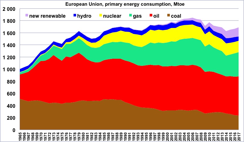
Primary energy consumption in Europe, wood excluded, in million tonnes oil equivalent, with the share of each energy.
“New renewable” = wind, solar, biogas, renewables, waste, etc (all renewables except biofuels, included in oil, wood and hydro).
The decline of the European supply has begun in 2006.
Source: BP Statistical Review, 2015
As this decrease is not chosen, and because of the link exposed above between GDP and energy, the European GDP remained constant between 2007 and 2012, notwithstanding all the promises of growth that flourish everywhere. And it is perfectly logical that 2013 will probably a year of recession of stagnation…
The GDP will probably remain constant or decline in the coming years in Europe
The trend described above for Europe will not change in the coming years: the combined oil and gas supply will decrease, and as it represents 2/3 of our energy supply, the latter will also go on decreasing (replacing 1 by 1 fossil fuels by renewables would require a growth rate that is out of reach). Assuming we could keep the same rate of technical progress in such a case (which is questionable: this progress requires investments that are slowed down when there is a recession), this decrease of the energy supply will translate in, at best, a stagnation, and most probably a negative trend for the European GDP for most of the rest of the decade.
In France, where we had a presidential election in 2012, no growth rather than the 2% per year on which the new president based his promises means 100 billion euros of fiscal and social revenues that will miss. As social spending generally increases when the economy slows down (unemployment, aids of all kind, etc), it means that we will probably increase the public debt by 150 to 200 billion euros in 5 years.
We can illustrate the problem with another calculation: In France we presently use 1 kWh of final energy to obtain one euro of GDP (in 2010, the French GDP was 1900 billion euros and the energy consumption a little above 1800 billion kWh). If a ton of oil becomes unavailable, when we would like to have it to fuel our productive system, it means that we will lack 11 600 kWh of energy (the energy content of a tonne of oil), and therefore, all remaining equal otherwise, we cannot produce roughly 10 000 euros of GDP.
Actually the coupling between oil and GDP is even stronger, and it is closer to 20 000 or 30 000 euros that will miss. It means that if the oil supply in France decreases by 2% per year, that is 1,5 million tonnes per year, with no substitute and no strong adaptation measures, the GDP decreases by 30 to 40 billion euros. It illustrates what it means to have a “involuntary decarbonization”, which actually begun in 2005, since we did not choose to act strongly before. And the more we will wait before phasing out fossil fuels from our economy, and the harsher the recession that will take care of the problem will be.
A couple of conclusions and unavoidable measures to be taken
The above considerations have lead your humble servant to the following conclusions:
- No “energy transition” of an European country can exclude a fast decline of the supply of fossil fuels. Either we deliberately provoke it, while limiting the associated recession (that we will have anyway), or we undergo it, with higher shocks and recessions,
- This “energy transition” will happen in a context of no growth, and most probably in a slow structural recession. If we need growth to implement our plans for this transition, then the only thing we will get is failure and anything but what has been planed.
- In the context of a structural recession, capital will be harder to find.
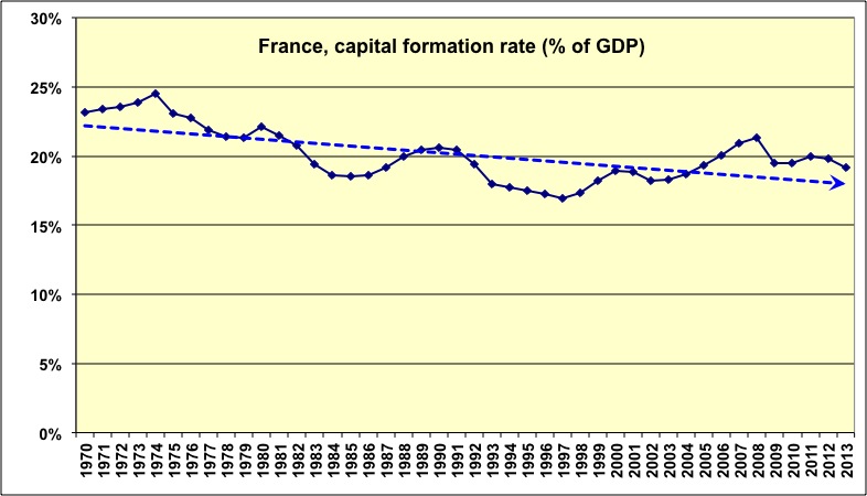
Rate of capital formation in Europe since 1970, expressed as a % of GDP.
Capital formation is the money that economic agents put in their investments, and it is expressed as a fraction of the GDP of the year. What is easy to notice is that during the years that follow oil shocks (1973, 1979, 1990, 2000, 2007) investments decrease, and they do so in accordance with the magnitude of the shock.
In a context of repeated recessions, it is harder to find money for investments which are precisely aimed at avoiding the next shocks!
Source: World Bank, 2014
- As capital will be harder and harder to find, it is necessary to maximize the “fossil fuels avoided per euro invested”:
the first things to be done are those that require the least initial capital per kWh of oil or gas avoided (which is close to minimizing the cost per avoided ton of CO2). Such an analysis (on the investment required to avoid one kWh of fossil fuel) should be done prior to deciding any new infrastructure, any measure of urban planning, any industrial policy, any fiscal reform, any subsidy, any regulation on buildings or cars, and even any plan regarding education (no need to promote jobs that directly or indirectly depend on a growing oil supply!)
- Any money invested in renewable energies to replace nuclear energy is useless to decrease the European dependency on fossil fuels, and therefore useless to avoid future recessions associated to future oil shocks.
Indeed, when capital becomes scarce, investing first in renewable energies to replace nuclear decreases the capital that remains available to invest “elsewhere” to get rid of oil and gas, which will lead to an increase of future economic troubles. These investments aimed at replacing nuclear by renewables are also useless to decrease CO2 emissions, and therefore useless to avoid contributing to an enhanced imbalance of the climate system that Europe will also suffer from. In Germany, the goal is explicitely to neglect the fight against climate change and to benefit the fight against nuclear power (since the German leaders explicitely say that most of the nuclear will be replaced with coal and gas fired power plants). A thorough look at figures show that it is neither justified for environmental reasons, nor for sanitary reasons (coal is by far worse than nuclear, whatever impact is considered or almost, and it is still true for gas).
- In this “transition”, the first priority is to remove oil and gas from residential and commercial heating to replace them by insulation, heat pumps using carbonless electricity (mostly nuclear and hydro), and biomass (in stoves or urban heating). Assuming that in Europe 15% of the oil and 40% of the gas is used for heating, heating with these fuels represent 120 billion euros of annual imports, and roughly 15% of the CO2 emissions of the Union. Nuclear cogeneration could also be deployed (it has already been used in a number of countries). The balance between each component (insulation and change of energy) depends on the building and its initial performances.
- With roughly 200 million homes in Europe, and a little below 100 m2 per home, our continent counts roughly 20 billion m² of residential real estate. If we add 50% to account for other buildings (offices, commercial, schools and hospitals, etc) we jump to 30 billion m2. Reconstructing or refurbishing 80% of this total – it is likely that part of the buildings we have constructed in an era of abundant energy will simply become useless in a different world, no matter how well insulated they are – means finding something like 30 000 billion euros, that will have to be invested mostly in insulation and in the increase of carbonless electricity generation.
- To give an idea, shifting all France to heat pumps and insulation would require an extra 100 TWh of carbonless electricity, when the country presently uses 450 TWh of this fluid. Insulation would allow to decrease the final energy consumption from 700 to 300 TWh, and then a good heat pump provides 3 kWh of heat with 1 kWh of electricity. 100 TWh with nuclear power plants means 12 to 15 GW of extra capacity if it is base load. If it is seasonal electricity (but it depends of what we do otherwise) then the installed capacity should be higher. With wind turbines (that have a load factor 4 to 6 times lower than nuclear) and storage we would need 50 to 100 GW, and with photovoltaic 100 to 200 GW. Of course, if part of the heating is made with biomass we need less electricity. We can assume that for Europe a similar plan would require between 500 and 1000 TWh of carbonless electricity.
- The second priority is to phase out fossil fuels from heavy industries (which produce raw materials: cement, steel, chemistry, non ferrous metals, paper and cardboard). For this we need strong regulations on energy efficiency, extra amounts of carbonless electricity, the development of carbon capture and storage (at least for steel manufacturing and lime calcination), and the setting up of a border tax to protect our continent against “carbon pirates” (other countries that don’t care about CO2 emissions). If we don’t do it, as these industries massively rely on fossil fuels and require lots of electricity, they will go elsewhere (or go bankrupt), where coal and gas remain abundant (both these energies are not convenient to transport).
With less and less heavy industries in Europe, and a decreasing oil supply (therefore less transportation), we will have a hard time keeping the other industries and the goods that they produce. Practically we need to convert processes to electricity (all ovens and boilers can be changed) while deploying nuclear and coal with carbon capture and storage (for Poland and Germany). We also need to dramatically increase “circular economy” and repairing/recycling all we can,
- Assuming that in Europe 10% of the oil, 30% of the gas and 30% of the coal is used for industries, and that 30% of the electricity supply also goes to industries (which means 10% of the gas and 20% of the coal), the industry energy consumption of fossil fuels represents roughly 2500 TWh of final energy, 70 billion euros of annual imports, and 25% of the CO2 emissions of the Union. Assuming one third is gained on energy efficiency, replacing all these fossil fuels by electricity means 1600 extra TWh of electricity, that is 200 GW of extra installed capacity, that is 800 billion euros in nuclear power plants (if it is coal with CO2 capture and storage the amount is about the same).
- Part of these investments can be made by the industries themselves, provided they have a stable regulatory and fiscal frame, including a carbon tax or equivalent (an equivalent would be a rising minimum auction price for quotas), and a border tax.
- The third priority is to increase as fast as possible the mileage (and therefore decrease the size and engine power) of new cars, while keeping them on gasoline for the time being. It is the fastest way to cope with a rapidly declining oil supply, and therefore the easiest way to keep a significant mobility in this context. The rise of electric cars is a longer term goal that will take several decades – at least – to be met, and means the supply of an additional 2000 TWh of carbonless electricity for Europe for an affordable cost. Replacing 150 million cars in Europe means investing 1500 to 3000 billion euros for the cars themselves, and building 250 GW of carbonless baseload power plants (mostly nuclear, which then means 1000 billion euros). On the longer term, it is also necessary to reconstruct all our cities, that have been created for the most part in a period of abundant and almost free energy.
- Even without any growth, making Europe carbon free means providing an extra 4000 to 5000 TWh of electricity without carbon (per year), that will help getting rid of roughly 12000 TWh of final energy provided by fossil fuels. With nuclear it means 2400 billion euros of investment for 60 years (for a little above 600 GW of installed power), without taking into account investments in the grid and/or in storage. With wind turbines (and a necessary storage), the bill rises to 18 000 billion euros for 60 years also, and with photovoltaic (and storage) we would need between 50 000 and 90 000 billion euros for the same period (in the last two cases managing the intermittence costs more than the raw production). Most other renewables (biogas, tidal, etc) are comparable to wind and PV regarding costs. Let’s insist on the fact that these investments will have to be maintained even though we will encounter frequent crises and recessions, precisely because as long as we will remain dependent on fossil fuels we will have crises following one another.
- In any case this “transition” means finding tens of thousands of billion euros in a couple decades, that is more than one thousand billion euros per year (the European GDP is presently around 8 000 billion euros per year). If the return on capital is 2% to 4% per year, which is acceptable for a public entity but rarely for a private actor – and definitely not for a company in the stock market – then it is acceptable to invest 30 000 billion euros to save 600 billion euros of annual imports of oil and gas (in 2011). If the return must be of 10% per year, only 6 000 billion euros can be invested to solve the same problem. With the above figures, we see that spontaneous private investment won’t be enough to finance the “energy transition” at the right speed (phasing out fossil fuels in 40 years).
- Most of the investment must therefore come from public actors. But all European states being broke, there are only two ways to find the amounts needed. The first is to print euros, that would directly go from the central bank to dedicated public national banks (or to dedicated entities in “normal” banks, with a very strict separation from the rest) that would invest this money into the projects required to “decarbonize” Europe. The second way (that can add up with the first) is to use our savings (in France we own 4000 billion euros in liquid assets and 8000 billion euros in real estate).
- If we don’t finance the “good” transition, we will get an economic collapse, and absolutely not perpetual growth sustained by either gas or windmills (physics remains stronger than political promises). Promising the return of perpetual growth will only lead to a faster rise of populist movements all over Europe.
- We need to work much harder on how to promise a bright future that doesn’t need perpetual growth to come true. This goal should use more brain time than today!
- The sooner we move in the direction of massive “decarbonization” of Europe, the higher our chances are to export what we have found (techniques, systems, ways of thinking) elsewhere, since sooner or later everyone will have the same problem, that we will have been the first to address seriously.
Annex: a couple of figures regarding electricity
Electricity can be produced with various means, that do not have the same lifetime, the same capital costs, the same proportion of fuel costs in the total, etc. The table below gives a couple figures on capital needs to produce carbonless electricity (no discounting on capital). As the figure may vary I have chosen median European values.
| Coal | Gas | Hydro | Nuclear | Wind onshore | Wind offshore | Photovoltaic | |
|---|---|---|---|---|---|---|---|
| € per kW of installed capacity | 1 500 | 800 | 3 000t | 4 000 | 1 000t | 3 000 | 3 000 |
| Average load factor (in hours producing at full power per year) | 8 000t | 6 000 | 4 000 | 8 000 | 1 800 | 3 000 | 1 000 |
| € per kW effectively producing all year | 1 643 | 1 168 | 6 570 | 4 380 | 4 867 | 8 760 | 26 280 |
| Lifetime (years) | 40 | 30 | 100 | 60 | 20 | 20 | 25 |
| kWh produced per installed kW (over the lifetime) | 320 000 | 180 000 | 400 000 | 480 000 | 36 000 | 60 000 | 25 000 |
| Cents (of euros) of initial capital per kWh produced over the lifetime | 0,5 | 0,4 | 0,8 | 0,8 | 2,8 | 5,0 | 12 |
Those values do not include storage for intermittent and fatal means (solar, wind). The cost of the induced intermittence is for now on supported by the other producers (that have to turn part of their production from baseload to peak) or the consumers (that have to adapt). It could be charged to the producer, for example by asking him to guarantee supply, which would then mean investing into storage capacities, that migh double or triple the capital cost of the sole wind turbines (and then we still have to reinforce the grid, increase the capacity to produce what will be lost when storing, etc).
What this table says is, among other things:
- that the way to produce electricity with the least initial capital is gas, which is why this type of power plant is so popular in a “liberalized” economy (where everyone wants to minimize the capital needed to do something), even though it emits CO2 and relies on a gas supply which is not at all guaranteed in the future (see above). Coal comes second, and still requires less initial investment than nuclear, even though it emits 100 times more CO2, and also partially relies on imported coal (Europe imports half of its coal).
- Then when going from nuclear to wind, 3 to 4 times more capital is needed per kWh produced (without discounting capital and without taking storage and grid reinforcement into account). Using photovoltaic requires 15 times more capital than nuclear without taking storage and grid reinforcement into account (with storage & grid the factor is 40 to 60). All opponents to nuclear that say it is too expensive should therefore be even more opposed to wind and photovoltaic! Because if we do not have the money to invest into nuclear, one might wonder where we will find 5 to 10 times the same money to build wind turbines and solar panels instead in a context of repeated recessions…