Peak, did you say peak ? A peak, that’a kind of mountain, right ? What link can there be with oil ? The expression “production peak”, that sometimes pops up in the media, is actually nothing else than an easy to understand translation of a mathematical item, that would be much less sexy. The said item is the maximum of a function, and the function is… oil production.
Indeed, most of the public debate on oil focuses on reserves, but these reserves only serve one purpose: feeding production. Well, oil production, be it that of a single field, of a country, or of the whole planet, obeys the same law: it begins at zero (which is easy to check !), rises to a maximum at some point, then tends to zero. There might be “bumps” on the way, but the general trend is always the same. And as we have a law, the bad news is that there is no way to escape it.
Why do we have a law ? Because of mathematics and… the time it takes for oil to appear. Indeed, Nature requires several tens to hundreds million years to turn plankton into this precious fuel. At the scale of historical times (centuries or millenias) we can consider that the amount of additional oil that will form in the ground is absolutely nil (actually it will increase by 0,001% !). So the amount of oil enclosed in the ground – called “oil in place” by geologists – was given once and for all at the beginning of the industrial era, and mother nature did not plan to add anything extra afterwards.
It means that the amount of oil we can extract from the ground has an upper limit: the overall quantity of oil in place at the beginning of the industrial era. From there:
- we cannot extract each year an ever rising amount of oil from the ground (otherwise the underground would enclose an infinite amount of extractible oil !) ; and if the production cannot rise forever it means that someday it must stabilize or decline,
- but even an eternal stabilization is not an option: if we could draw forever a given amount of oil from the ground each year, the undergrouind would also enclose an infinite amount of extractible oil !
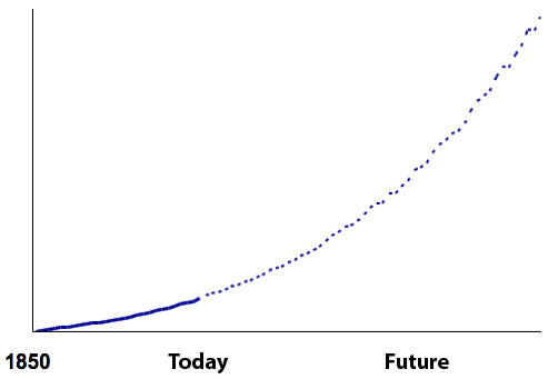
Example of an impossible profile for the world oil production.
The extractible amount of oil would be infinite.
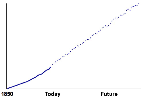
Another example of an impossible profile for the world oil production.
The extractible amount of oil would also be infinite.
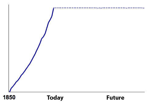
Even a production that would be constant forever is impossible.
The extractible amount of oil would still be infinite.
We might actually try all types of production curves, and we will realize that if the curve has to respect an upper limit for the overall amount of oil extracted from the ground (in other words, the cumulated extraction – or production – from -∞ to +∞ has to have an upper limit), then the production curve must start at zero, go through a maximum then decline to zero. It is even possible to mathematically demonstrate this statement.
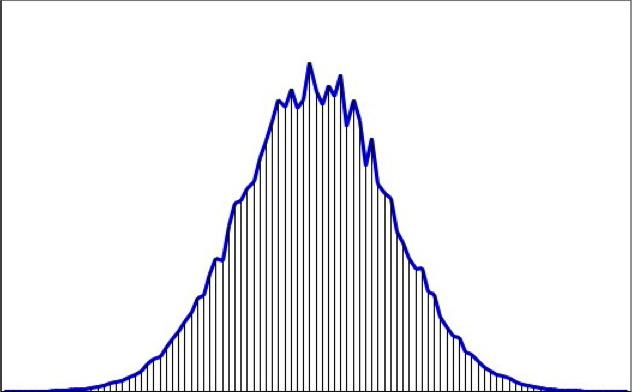
General aspect of a production curve coming from a stock given once and for all, be it an oil field, a full oil province, or the production of any ore or mineral resource coming from a given zone. The horizontal axis represents time, and the vertical one the level of the production.
As we will see below, there might be several “bumps” (in mathematical terms, secondary maximums), but an absolute maximum and a decline to zero at some point are unavoidable.
The overall amount extracted – or cumulated amount – corresponds to the hashed zone below the curve, and it is at most equal to the initial extractible stock. In mathematical terms, this surface is named “integral” of the curve. For oil geologists, this surface corresponds to the ultimate reserves.
Mathematics are sometimes useful ! Here they allow to say that there is no debate on whether the world oil production go through a maximum at some point, then tend to zero. But it does not mean that there is no debate at all, because a number of important questions still have to be adressed:
- Is the peak for tomorrow, or are we still “quiet” (if we don’t care about climate change !) for 4817 years ? (which of course changes a little the time we have to organize a transition),
- After the peak, will we loose half of the output in 10 years, or will we keep an almost constant production for 3 centuries ? (as oil has allowed much of the world we know in Occidental countries, the rate of decline gives the magnitude of the effort we will have to make).
To answer the second question, one has to have the general shape of the production curve for the world, and to answer the first one, one has to know as precisely as possible the total amount of oil that will be extracted from the ground, that is the ultimate reserves.
Would oil production be connected in any way with oil discoveries ?
Everybody might agree that, in order to extract oil from the ground, it helps if you discover it first. This trivilal joke will actually be of great help to answer the two questions above. Because, be it to guess the date of the peak, or the rate of decline after the peak, all starts from this obvious statement: all oil that will come out of the ground has been discovered at some time. The reasoning that comes after is then the following:
- the curve of past discoveries gives the lower limit of all-time cumulated discoveries (we cannot discover less than what has already been discovered, obviously !),
- for any given zone, the more we advance in time, and the more discoveries increase (they cannot decrease !), narrowing the gap bteween the all-time maximum cumulated discoveries and those that have already been made,
- the cumulated production in a zone will be a fraction of the cumulated discoveries, since we cannot extract oil that has not been discovered
- therefore the more we advance in time passes, and the better we know how much oil will be extracted from a given zone, that is the ultimate reserves of the zone.
- it takes time to go from discoveries to production (oil and gas seldom come out of the field the day after they have been discovered), and the delay between discoveries and production tends to stabilize around a given number of years in a given zone (it is the average delay to build the production infrastructure in the zone). As a result the curve of production has a tendancy to have the same general aspect as the curve of discoveries.
On this last point, the most famous example is that of the United States, where production has followed, with an almost constant lag (35 years more or less), the curve of discoveries. This point, noticed by King Hubbert, a Shell geologist, allowed him to correctly forecast, in 1959, the production peak for the US 11 years in advance (which is the reason why the production peak for any oil province is sometimes called the “Hubbert peak”).
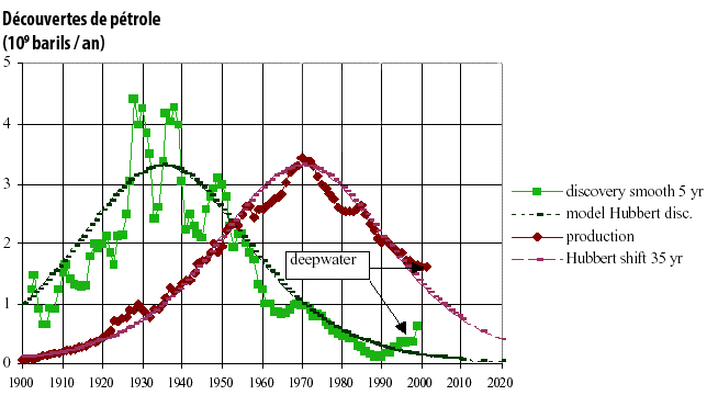
In green with squares: annual discoveries in the US, smoothed (5 year running mean), in billion barrels per year
In black: logistic (bell shaped) curve modelling the discoveries
In red with diamonds: annual oil production in the US, in billion barrels, from 1900 to 2002 (the recent years have not departed from the general shape, with a small contribution from shale oil).
In thin red: bell shaped modelling of discoveries shifted 35 years.
It is easy to see that it matches almost perfectly the production curve. In other terms, a reasonnably good forecast of the production curve can be simply derived from a shift of the discoveries. The longuer the discoveries curve is, the better the forecast on the date of the peak and the decline rate is.
Source : Jean Laherrère, 2003
As explained above, for each oil province in the world, we can look at the delay between discoveries and production, and see that it tends to stabilize around a given value. The graph below gives the example of Norway.
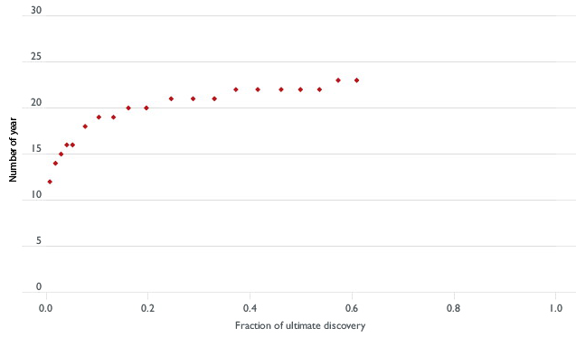
Number of years that separates the discovery of a given fraction of the ultimate reserves and the production of the same fraction of the ultimate reserves (and thus “ultimate discovery” = “ultimate reserves“).
Looking at this graph, we see that 20 years separated the discovery of 20% of the ultimate reserves (which corresponds to the value 0,2 on the horizontal axis) and the production – that is the extraction from the ground – of these 20% of the ultimate reserves. The delay that separated the discovery of 40% of the ultimate reserves and their production was 22 years, and it is again 22 years that separates the discovery and the production of 60% of the ultimate reserves. In this mature basin, a reasonnable conclusion is therefore that the production peaks is located not very far from 22 years after the discovery peak. And it happens that discoveries in Norway peaked just before 1980, and the production peak happened in 2000.
Source : « Transport energy futures: long-term oil supply trends and projections », Australian Government, Department of Infrastructure, Transport, Regional Development and Local Government, Bureau of Infrastructure, Transport and Regional Economics (BITRE), Canberra (Australia), 2009
Now that we have understood the basics of peak forecasting (a peak is mandatory, and its “forecast” is based on the ultimate reserves of the zone – that get better and better known with time – and the delay between discoveries and production) then we can look at what it gives for the world as a whole and various zones taken one by one.
Let’s insist again on a major point: we need ultimate reserves to suggest a date and a production level for the peak, and the amount of ultimate reserves seldom result from an international consensus. Most of the data necessary to perform the calculation is not public, and therefore each expert that has an opinion works with his own dataset, obtained from sources that can be reliable… or not ! But the principe is always the same, and summarized in the graph below.
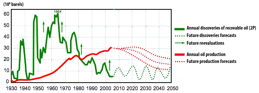
This graph illustrates how to go from world discoveries (in green then in dotted black) to production (in red then in dotted lines of various colours).
Discoveries have strongly declined since the 1960’s, and represent now a small fraction of the production. It did not prevent, though, proven reserves from growing since then, for reasons other than discoveries, probably including… lies ! At the end of 2010, the world had discovered around 2200 billion barrels of extractible oil.
The red curve shows the world production of oil since 1930 and we see that it resembles a smoothed version of the curve of discoveries, with a 45 year shift in time.
What will happen next ?
- For the fields already discovered, technical improvements, better knowledge of the physical characteristics of the reservoir rocks (size, porosity, proportion of oil in the rock, etc), and observation of the past production will lead to a constant reappraisal (generally leading to an increase) of the initial production potential of these fields. This effect is illustrated on the graph by the vertical arrows bearing “future reevaluations”. It means that if the sum of all the initial evauations of the potential production (the 2P value) of the fields already discovered was 2200 billion barrels, we will most probably get a little more at the end of the game.
- Other discoveries will happen, but they won’t represent as much oil as what has already been discovered. Discoveries obey the same law than production: they start at zero, go trough a maximum at some time, then tend to zero, since the overall amount of oil than can be discovered is finite and given once and for all. Incidentally the methods used to find oil naturally lead to discover first the fields that are big and close to the surface. Now, when oil companies find big fields, they are still much smaller than the super-giant fields discovered before 1970. For example, the fields found offshore Brazil represent 20 billion barrels of extractible oil, but froml 1945 to 1970 it was ±40 billion barrels that were discovered each year ! In addition, when large discoveries happen now, they are generally located in very inconvenient places (arctic conditions, deep offshore, etc).
- Depending on the magnitude of reevaluations and new discoveries, the peak is for “right now” or in a decade, but in all cases the cumulated production can never be larger than the cumulated discoveries of extractible oil.
The person that made this graph (Yves Mathieu, then a geologist with Institut Français du Pétrole) considers that from 2010 the world will experience a “permanent technical peak oil”, leading to a plateau that will last until 2020 or 2030 before a marked decline.
Source : Yves Mathieu, Institut Français du Pétrole, 2009
An example of forecast
We will now present a selection of “forecasts” (probably more reliable than any prediction of the winning number at the lottery !) for oil production for the major oil provinces. All the graphs below come from a document (that you can download by clicking here) that has been established by former executives in the exploration branch of oil companies. Therefore they probably give a good hint on what is going to happen, and the effective peak and effective rate of decline will probably be not very far from what is indicated below… in a world that will remain about stable.
Indeed, if we have a thermonuclear war, or the return of slavery to extract the remaining oil as fast as possible, the future production curve will have a different aspect, and the peak might be shifted by on or two decades (but because of these bloody maths, it will happen anyway !).
An increased effort to extract the remaining oil as fast as possible can postpone the peak… while increasing the depletion rate after the peak. At the end of the game, the same amount of oil will have been extracted, but with more important rates at the beginning, and lower rates “after”.
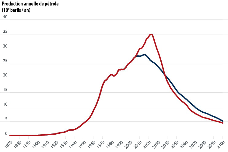
Two possible production profiles for the world with the same amount of ultimate reserves. The red curve assumes a greater production effort in the short term compared to the blue one (which basically means more money invested into production infrastructure and into the relations with stakeholders).
It is easy to see that the red curves goes higher and sustains a rising production for a longer time, but the “price to pay” is a faster descent after the peak and a production that eventually becomes lower (after 2040). The cumulated production (surface below the curve) is the same for the two curves.
Choosing the “right” profile between the two depends on the rate at which discoveries can be produced, which is a matter of investment capacity, of sharing of revenues between the producing state and the oil company, of market price, of relations with stakeholders, and various other things that are not fully predictable.
Symetrically, the effective production might always remain below what is geologically possible, because:
- oil companies lack investment capacities (because they don’t earn enough money, because banks won’t lend as easily as before, because the capital need to extract one barrel becomes too important, etc),
- remaining resources (i. e. the remaining extractible oil) get more and more located in “uneasy” places (permanent wars, terrorism, extremely harsh conditions, etc). Actually this is a subcategory of the previous case, because it puts the cost of extracting part of the oil beyond the economic capacity of companies (for example it is possible to invade a country to access its oil, but if a company has to pay for it then the cost per barrel increases a little !),
- the world enters a permanent recession (among other things because of the lack of cheap energy, but there can be other bottlenecks) and then there is both a decrease of the demand and a decrease of the investment capacity of producers.
- or we have been able to replace oil and gas and coal by other fuels quickly enough to avoid climate change !
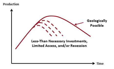
This figure illustrates the fact that the real peak might happen before the geological maximum, if other constrainsts rise strongly before (the author has not imagined that fighting climate change could be among the reasons…).
What follows is therefore to be understood as “the general aspect of what will come next”, but it does not consist in a forecast in the true sense. For the peak, nobody is able to predict the exact year, month, week, hour and the number of cars that will buy gasoline that day ! But these illustrations are precise enough to understand that we should be more aggressive on addressing the issue.
Northern America
We will begin this “trip round the world” with the first province that passed its peak: Northern America. If the peak is behind giving a precise year is less risky, indeed ! But the following forecast also includes the deep offshore from the Gulf of Mexico and the Canadian tar sands.
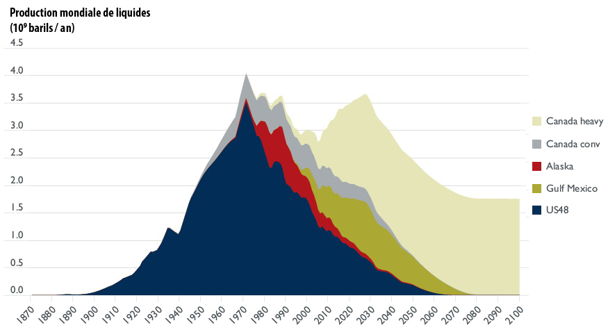
Simulation of the Northern American oil production, in billion barrels per year (one barrel = 159 litres).
In 2011, the world oil production was close to 30 billion barrels.
This simulation (because it is a simulation from 1870 to 2100, based on discoveries and time between discovery and production, and not historical data up to 2008 with a simulation afterwards) reproduces accurately the 1970 peak for the US, the peak in Alaska around 1990, the 1970-2000 plateau for Canadian conventional, and the growth of non conventional (deep offshore and tar sands). This growth should generate a secondary peak around 2030, with a level that will probably be a little below that of the main peak in 1970.
Source : « Transport energy futures: long-term oil supply trends and projections », Australian Government, Department of Infrastructure, Transport, Regional Development and Local Government, Bureau of Infrastructure, Transport and Regional Economics (BITRE), Canberra (Australia), 2009.
The Canadian tar sands could lead to an interesting political consequence: in 2100, the first producer of “liquids” on Earth would be… Canada, with 1,5 to 2 billion barrels per year.
Latin America
In spite of the recent discoveries offshore Brazil, the production of the zone is more or less on a plateau, with a main peak that might be already behind, and a secondary peak, more or less at the same level, that could occur around 2030.
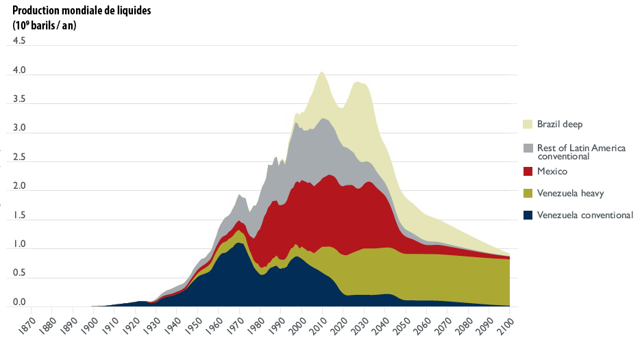
Simulation of the Latin American oil production (including Mexico onshore, but not the Gulf offshore), in billion barrels per year (one barrel = 159 litres).
Venezuela is probably post peak, even with its extra-heavy, and Mexico is not far from its maximum (already pasted or still to come depending on the forescasts). Southern America less Brazil is most probably post peak.
Source : « Transport energy futures: long-term oil supply trends and projections », Australian Government, Department of Infrastructure, Transport, Regional Development and Local Government, Bureau of Infrastructure, Transport and Regional Economics (BITRE), Canberra (Australie), 2009.
With this simulation, in 2100 Latin America would include the second producer of liquids: Venezuela, with one billion barrels per year (that is the maximum utput of the North Sea).
Africa
Most recent oil province, Africa will nevertheless peak pretty soon. It should be a “neat” peak, with a rapid growth to the peak, and a rapid decline afterwards, which is typical of recent discoveries (it is the same for Europe).
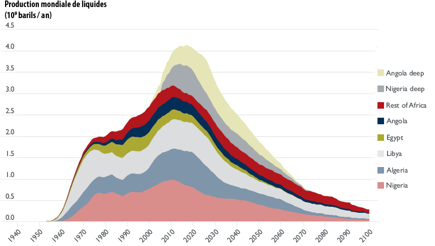
Simulation of the African oil production, in billion barrels per year (one barrel = 159 litres).
The onshore production is at its peak, and the growth reserve, for a decade or so, should come from offshore Angola and Nigeria.
Source : « Transport energy futures: long-term oil supply trends and projections », Australian Government, Department of Infrastructure, Transport, Regional Development and Local Government, Bureau of Infrastructure, Transport and Regional Economics (BITRE), Canberra (Australia), 2009.
Europe
The North Sea, which began its production even later than Africa, has experienced a very fast rise, a maximum clearly marked, and a fast decline afterwards. This decline will be a little slowed by enhanced recovery. With this simulation, Europe should be the only oil province fully depleted before the end of the century.
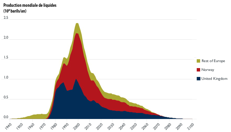
Simulation of the European oil production, in billion barrels per year (one barrel = 159 litres).
The peak is clearly behind !
Source : « Transport energy futures: long-term oil supply trends and projections », Australian Government, Department of Infrastructure, Transport, Regional Development and Local Government, Bureau of Infrastructure, Transport and Regional Economics (BITRE), Canberra (Australia), 2009.
Eurasia
The main producer of the zone is Russia, which has probably passed its main peak in 1987, and is heading to a secondary maximum. China is close to its maximum, with a peak that should occur some time around 2020. The rising production of Kazakhstan and Azerbaidjan will not compensate for the decline of the two key players in the zone.
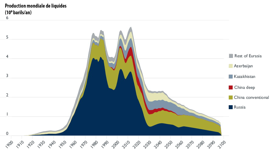
Simulation of the Eurasian oil production, in billion barrels per year (one barrel = 159 litres).
Russia should loose almost all its capacities in a decade and a half !
Source : « Transport energy futures: long-term oil supply trends and projections », Australian Government, Department of Infrastructure, Transport, Regional Development and Local Government, Bureau of Infrastructure, Transport and Regional Economics (BITRE), Canberra (Australia), 2009.
Knowing that the countries of the former Soviet Union accounts for half of European imports (which themselves represent 70% of the European consumption), and that the oil business is one of the main contributors to the GDP of Russia, the decline of oil (and gas later) should trigger major political events in the zone.
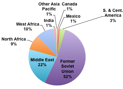
Breakdown of oil imports of the European Union in 2011.
Source : BP Statistical Review, 2012
Far East
Indonesia, still the first producer of the zone, is not an oil exporter any more, following a significant decline since 1990. As for Africa, the growth reserve comes from the deep offshore, and the peak for the zone is estimated to be around 2020. As for the two other zones that have been put in production recently, the subsequent decline will be strong.
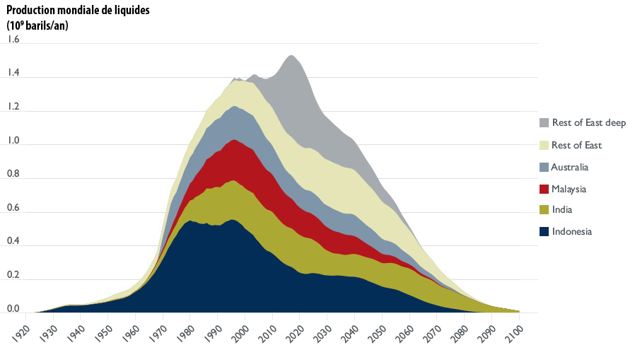
Simulation of the Far East oil production (China is in Eurasia), in billion barrels per year (one barrel = 159 litres).
Source : « Transport energy futures: long-term oil supply trends and projections », Australian Government, Department of Infrastructure, Transport, Regional Development and Local Government, Bureau of Infrastructure, Transport and Regional Economics (BITRE), Canberra (Australia), 2009.
Midlle East
Here comes the “master zone” ! Though it is supposed to contain two thirds of the remaining reserves, its production will also go through a maximum then a decline, and it might well be that we are not far from the maximum. To be more precise, the zone seems to have entered a bumpy plateau, where the absolute maximum can more or less be anywhere, if you give or take a couple hundred million barrels per year.
This “physical” situation might explain why, in 2007 and 2008, while prices kept rising, OPEC countries nevertheless kept saying that the market was supplied well enough, and that it was not necessary to increase the quotas (thus production): the true reason was probably… that they could not produce more. Incidentally, the price since 2000 seems to be a reverse function of the unemployed production capacity of OPEC countries.
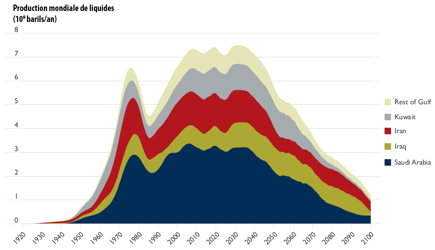
Simulation of the oil production for Middle East, in billion barrels per year (one barrel = 159 litres).
Saudi Arabia will long remain the first oil producer in the world (right now Russia is sometimes ahead, but in a couple years oil production there should begin to decline).
Iran is probably also on a long plateau … if wars don’t periodically impede oil production there.
Irak might be post-peak but could remain almost at the present level until the end of the century, becoming in 2090… the first oil producer of the zone !
Source : « Transport energy futures: long-term oil supply trends and projections », Australian Government, Department of Infrastructure, Transport, Regional Development and Local Government, Bureau of Infrastructure, Transport and Regional Economics (BITRE), Canberra (Australia), 2009.
In this simulation, before the end of the century the Middle East countries would hand over the title of first oil producer in the world to… Northern America, ending the story of oil in the place where it begun !
Planet Earth, for almost all liquids
The simulation we have used here is based on a regional approach of discoveries, allowing to deduct a regional production. To get a world total for production, it is therefore necessary to sum up all the regional results, and then we get the graph below.
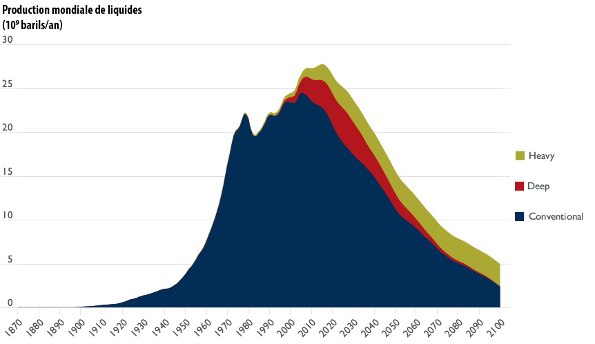
Simulation of the world production of oil, in billion barrels per year (one barrel = 159 litres).
The peak for conventional oil might be behind us already (middle of the 2000’s), but the rise of non conventional (deep offshore and extra-heavy or tar sands) puts the peak for “all oil” still ahead.
Source : « Transport energy futures: long-term oil supply trends and projections », Australian Government, Department of Infrastructure, Transport, Regional Development and Local Government, Bureau of Infrastructure, Transport and Regional Economics (BITRE), Canberra (Australia), 2009.
Planet Earth, for all liquids
What we generally call “oil” used to be essentially crude oil, but with time a number of other things have become technically recoverable and are now included in “oil”, so that now it is more appropriate to use the term “liquids” for this ensemble. These liquids include:
- conventional oil, that is enclosed in a reservoir rock, and produced onshore, or with less than 500 metres of water under the rig,
- oil enclosed in a reservoir rock and produced offshore with more than 500 metres of water under the rig (deep offshore),
- liquids produced from extra-heavy oil or tar sands,
- liquids obtained from gas production. “Natural gas liquids”, also called “condensates”, designate mostly propane, butane and pentane. They are generally present in the form of gas in the field (let’s recall that the main molecule in a gas field is methane), but at ground temperature and under the pressure of several bars they turn into liquids. Propane and butane are sold as LPG. As these molecules are smaller than those found in “regular” oil, some experts include them in liquids when discussing future oil production, while others don’t (did you say comparing figures was easy ?). They are individualized in the simulation below.
- liquids obtained from coal (coal to liquids),
- liquids obtained from crops (biofuels),
- Refinery gains. Because, believe me or not, when you feed 1 barrel into a refinery, you get 1,05 barrel of oil products ! This apparent miracle is not one: refining oil includes breaking long molecules into shorter ones, more saturated in hydrogen (hydrogen production is a standard process in modern refineries, where it is used both to saturate the gross output of distillation and to remove sulfur from oil products). This job of “cutting molecules in pieces” leads to a increase in volume, that amounts to several % of the incoming oil. This refinery gain depends on the quality of oil and generally increases when oil is heavier.
For the first three categories (conventional oil, deep offshore, and tar sands) we have seen the big picture above. For natural gas liquids (condensates), we can expect their production to follow… that of natural gas, for which we have a general idea below (no discrimination by regional production).
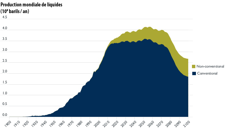
Simulation of the world production of gas liquids, on the basis of past and future discoveries, with the discrimination between conventional and non conventional, in billion barrels oil equivalent per year.
Source : « Transport energy futures: long-term oil supply trends and projections », Australian Government, Department of Infrastructure, Transport, Regional Development and Local Government, Bureau of Infrastructure, Transport and Regional Economics (BITRE), Canberra (Australia), 2009.
If we include the last contributors (CTL, biofuels, refinery gains) then we can have a general idea of the full production of liquids.
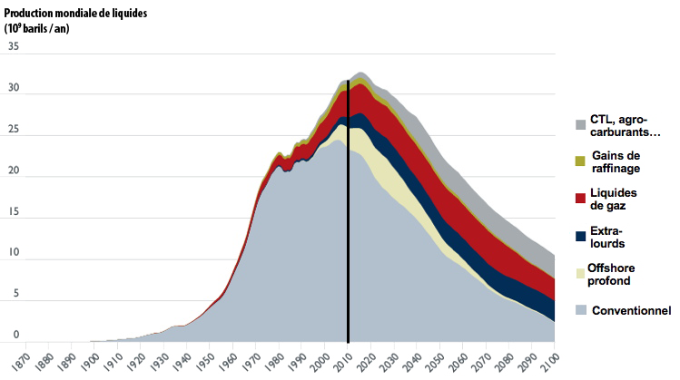
Simulation of the world production of liquids, with the contribution of each type.
The vertical black line corresponds to 2010. With this simulation the historical maximum should happen somewhere near 2020, which is something commonly admitted among “technicians” of the oil production. The very optimistic forecasts are generally based on mere prolongations of the past made by economists, without any kind of thorough technical analysis. What remains a hot topic among technicians is the exact date of the peak, and the decline rate afterwards.
The main sources of differences between forecasts made by technicians are:
- the fraction of oil that will ultimately be recovered from the identified fields,
- the speed at which companies will develop extra-heavy oil and other substitutes (biofuels, gas liquids, etc).
Nobody really counts on a new cycle of major discoveries.
Source : « Transport energy futures: long-term oil supply trends and projections », Australian Government, Department of Infrastructure, Transport, Regional Development and Local Government, Bureau of Infrastructure, Transport and Regional Economics (BITRE), Canberra (Australie), 2009.
Other forecasts do exist… but existing does mean being possible !
Of course, oil production has been the subject of a large amount of forecasts, and we give below a selection of other ones.
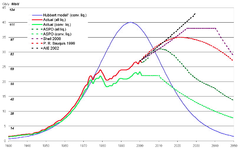
Simulation of the world oil production (or all liquids production, then including natural gas liquids,extra-heavy oil, biofuels, etc), in million barrels per day or billion barrels par year (left scale), for various sources:
- the blue curve corresponds to a “theoretical production” for conventional oil that would have happened with only geological constraints (no political or economical constraints) and ultimate reserves in the 2200 billion barrels range. The peak would then have happened in 1990. The real production (light green) has followed the same path until 1974, and since then has significantly departed from this theoretical curve,
- forecasts for the “all liquids” production made by Pierre-René Bauquis, former Total head of strategy and planification, by ASPO for conventional oil and all liquids, and by Shell.
- “AIE 2002” is the reference scenario of the International Energy Agency in 2002, much more optimistic than the previous curves… and that had been contradicted by facts since then.
Source : Pierre-René Bauquis, Total Professeur Associés, 2008
Production peak… and imports peak!
The above discussion highlights the fact that oil production is not going to decline everywhere at the same moment and at the same rate. But for countries that are highly dependant on imports (such as European countries) there is another element to remember: exporting countries can have a peak in production with a domestic demand that goes on rising for a while. In such a case their exports decline much faster than their production.
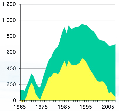
Oil production of Egypt from 1965 to 2008.
The green area corresponds to the domestic consumption, and the yellow area to what can be exported.
The decrease of the fraction that was exported has been much faster that the decrease of the production.
Source: BP Statistical Review, 2009
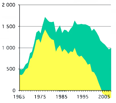
Oil production of Indonesia from 1965 to 2008.
The color code is the same than for the left graph.
Exports no longuer exists, and have been replaced by… imports ! This situation led this country to quit OPEC, to which it belonged before.
Source : BP Statistical Review, 2009
In Europe, we are already experiencing the consequences of this rising domestic consumption of oil exporters (and political leaders of these countries will not be in a hurry to discourage domestic consumption as long as it remains below the production). If the world production of oil is stable (what is the case since 2005), and the domestic consumption of producers goes on rising, it means that for importers the available oil is decining. We have passed our “peak of imports” ! And in Europe this goes along with a decline of domestic consumption, so that our continent is going to be the hardest hit of all industrialized countries.
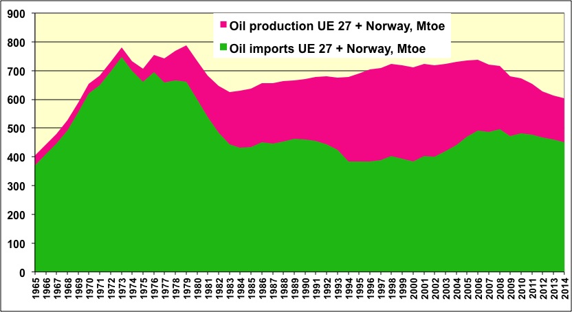
Oil supply in Europe (European Union + Norway), in million tonnes per year.
The pink area represents the domestic production (mainly the North Sea), that peaked in 2000.
The green area represents imports, that peaked in 1973, then went through a secondary maximum in 2007, as a result of the quasi-stabilization of the world production since 2005.
The European supply is now in decline, and lost 15% between 2006 and 2012.
Source : BP Statistical Review 2014
So, for us Euorpeans, if the “end of oil” is not for tomorrow (this expression should be banned from the media !), moving as fast as possible towards a world with less and less oil should be a top priority right now.
If we take into account the population factor, then the combined oil and gas availability per individual will come sooner than the global production peak, as the graph below illustrates.
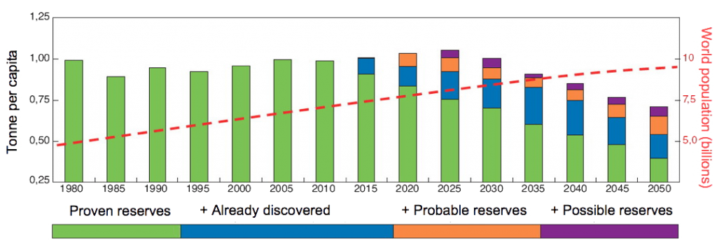
Average availability of hydrocarbons (oil and gas) per capita, from 1980 to 2050.
The figure for a given year is simply the division of the production of oil and gas for that year – with a breakdown by nature of reserves – and the world population for the same year. There is a “turning point” in 2020, or 2025, which corresponds to the time at which oil production has peaked and gas production comes to a plateau.
Source : Yves Mathieu, Panorama IFP 2010.