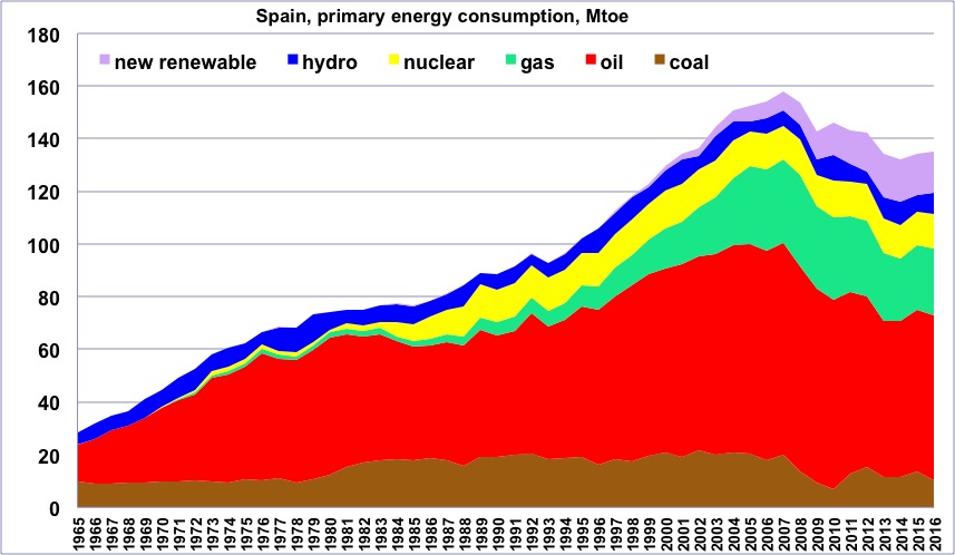
Primary energy consumption in Spain, wood excluded, 1965 to 2014, in million tons oil equivalent.
(one ton oil equivalent = 11600 kWh).
One will notice the rapid increaseafter 1980 (when other European countries remained about constant), the large share of oil, and the spectacular decrease that began in 2007 (before the economic crisis). “New Renewable” = all renewable energies except wood and hydroelectricity.
Author’s compilation on primary data from BP Statistical Review, 2015
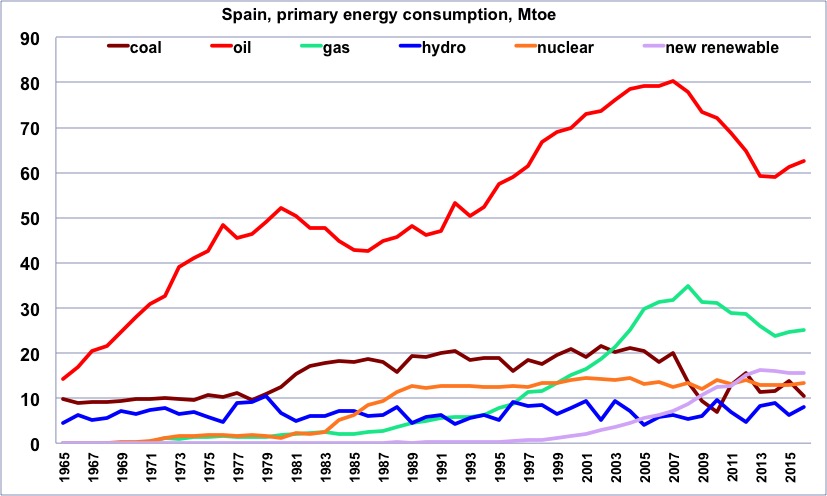
Same as before, but with one curve per energy.
One will notice the sharp decline of oil from 2007.
Author’s compilation on primary data from BP Statistical Review, 2015
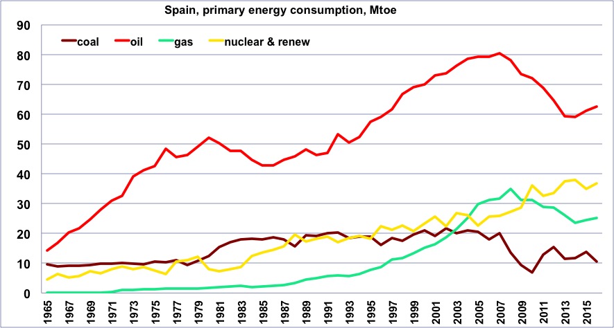
Same as before, but with a curve that totals all “non fossil” production (“non fossil” is anything except coal, gas and oil, and is therefore the sum of nuclear and renewables).
Author’s compilation on primary data from BP Statistical Review, 2015
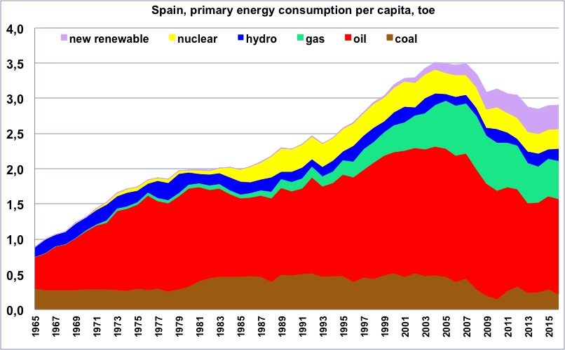
Primary energy consumption per capita in Spain, wood excluded, from 1965, in tons oil equivalent.
(one ton oil equivalent = 11600 kWh).9
“New Renewable” = all renewable energies except wood and hydroelectricity.
One will notice that the maximum happened in 2007.
Author’s compilation on primary data from BP Statistical Review, 2015
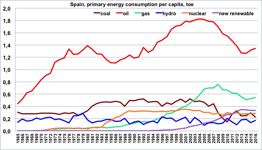
Same as before, but with one curve per energy.
Author’s compilation on primary data from BP Statistical Review & World Bank, 2015
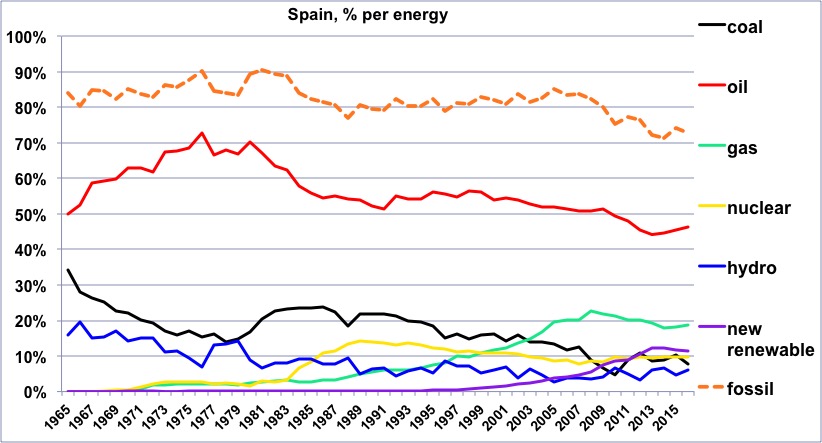
Share of each energy (wood excluded) in the Spanish consumption since 1965, and share of the fossil fuels.
One will notice that the share of oil has remained very high after the oil shocks.
Author’s compilation on primary data from BP Statistical Review, 2015
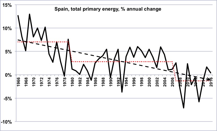
Annual change of the primary energy consumption in Spain (wood excluded) since 1965.
In the long term, the growth rate has been declining, then has recently turned into a decline rate (for those that are not afraid, it means that the second derivative of the Spanish energy consumption has been negative on average for the last 45 years).
Author’s compilation on primary data from BP Statistical Review, 2015
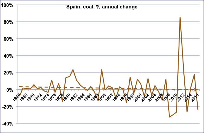
Annual change of the coal consumption in Spain since 1965.
The long term trend is a slow growth, with a high “rebound” during the last years.
Author’s compilation on primary data from BP Statistical Review, 2015
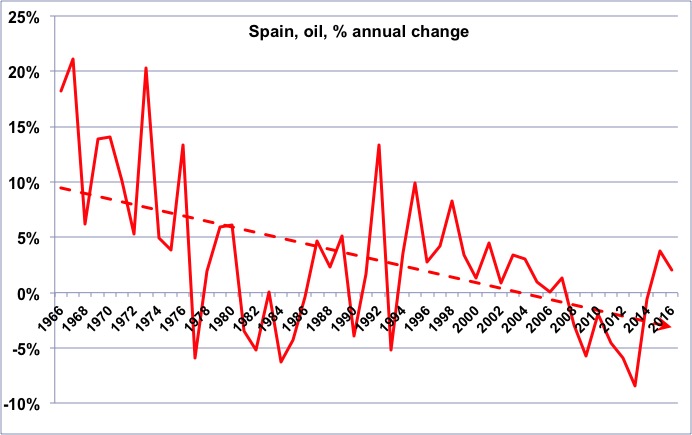
Annual change of the oil consumption in Spain since 1965.
As for other European countries, we have turned from a declining growth rate to an increasing decline rate.
Author’s compilation on primary data from BP Statistical Review, 2015
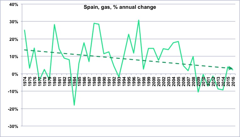
Annual change of the gas consumption in Spain since 1965.
Author’s compilation on primary data from BP Statistical Review, 2015
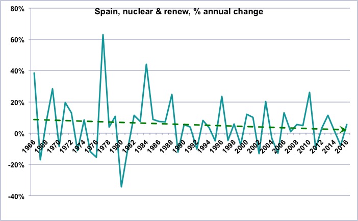
Annual change of the “non fossil” (wood excluded) consumption in Spain since 1965.
One will notice that the growth rate of these “non fossil” energies is globally declining, which means that the “new renewables” (wind, photovoltaic, biogas, biofuels, geothermal, etc), which do increase, nevertheless fail to allow for a growth rate that was that of nuclear and hydro a couple of decades ago.
Author’s compilation on primary data from BP Statistical Review, 2015
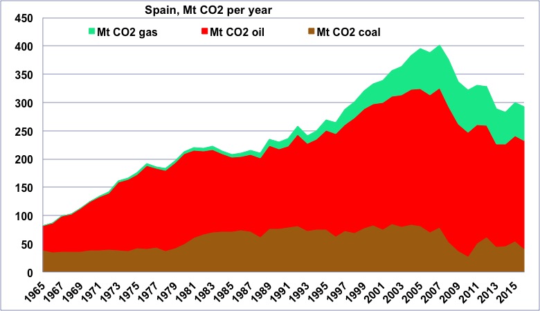
CO2 emissions coming from fossil fuels in Spain since 1965, in million tonnes.
One will notice the share of oil.
Author’s compilation on primary data from BP Statistical Review, 2015
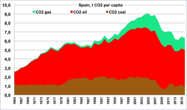
CO2 emissions per capita coming from fossil fuels in Spain since 1965, in tonnes.
One will notice that the maximum happened in 2005.
Author’s compilation on primary data from BP Statistical Review & World Bank, 2015
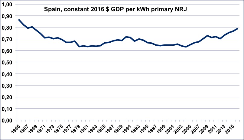
Evolution of the energy efficiency of the Spanish economy since 1965 (constant dollars of GDP per kWh of primary energy).
When the value is increasing, it means that the economy is becoming more efficient. Contrary to what has happened in many Western countries, this term has degraded since 1965, but on the other hand it was exceptionnally high 50 years ago.
Author’s calculation on primary data from BP Statistical Review, 2015, and World Bank, 2015
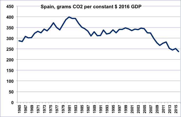
CO2 efficiency of the Spanish economy since 1965 (grams of CO2 per constant dollar of GDP).
When the value is decreasing, it means that the economy is emitting less per unit of GDP. One will notice that the value has not changed much over half a century, and that the main improvement happened… because of the oil restriction that began in 2007.
Author’s calculation on primary data from BP Statistical Review, 2015, and World Bank, 2015
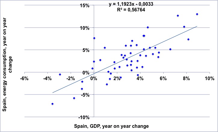
For the 1965-2014 period, annual change of the Spanish GDP (horizontal axis) vs. annual change of the Spanish energy consumption.
The regression means that for a 1% growth rate of the GDP there is a slightly over 1% growth rate of the energy consumption.
NB: “decoupling” would mean that the dots would always be in the lower right part of the chart.
Author’s calculation on primary data from BP Statistical Review, 2015, and World Bank, 2015
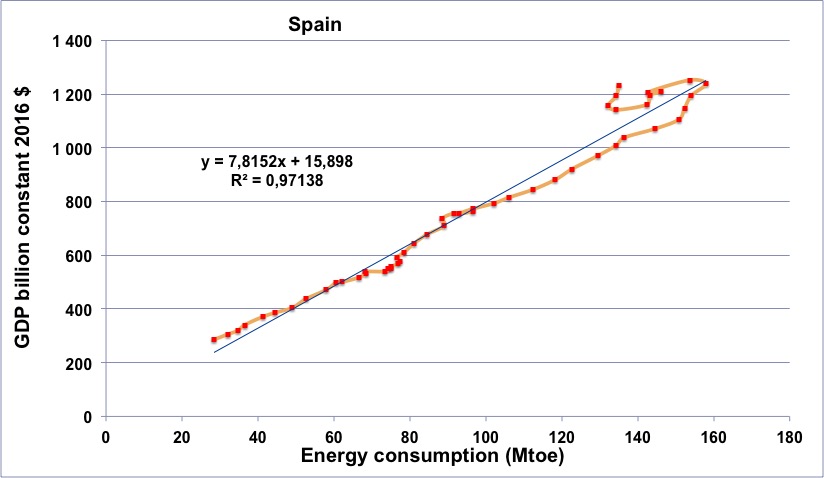
Spanish energy consumption (horizontal axis) vs Spanish GDP (in constant billion dollars) for the period going from 1965 to 2014 (the orange line begins in 1965, at the lower left, and then the dots follow a chronological order going roughly up and right).
The shocks of 1974, 1979, and 1990 are hardly visible, and the fact that the energy efficiency that has remained constant is clearly visible here (the dots follow an almost perfect line). But the reverse in 2006 is particularly brutal, and the fact that the curve “turns to the left” clearly indicates that energy has slowed down before the GDP.
Author’s calculation on primary data from BP Statistical Review, 2015, and World Bank, 2015
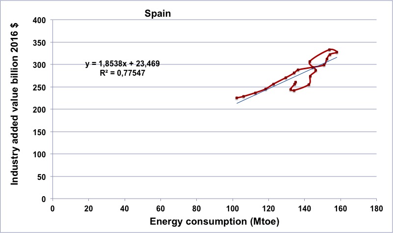
Spanish energy consumption (horizontal axis) vs Spanish industrial output (in constant billion dollars) for the period going from 1970 to 2014 (the brown line begins in 1965, at the lower left, and then the dots follow a chronological order).
The “reverse trend” after 2007 is particularly severe.
Author’s calculation on primary data from BP Statistical Review, 2015, and World Bank, 2015
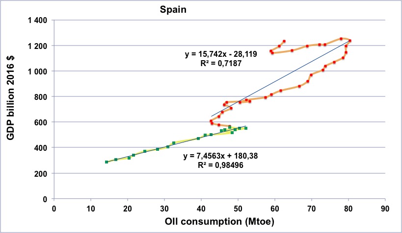
Spanish oil consumption (horizontal axis) vs Spanish GDP (in constant billion dollars) for the period going from 1965 to 2014.
Green dots with yellow line: 1965 to 1982.
Red dots with orange line: 1983 to 2014.
Following the oil shocks, the “oil efficiency” of tyhe GDP has increased for about 10 years, then it has resumed as before. The “arch to the left” after 2006 is particularly large, with a slow but constant decrease of the GDP after this year.
Author’s calculation on primary data from BP Statistical Review, 2015, and World Bank, 2015
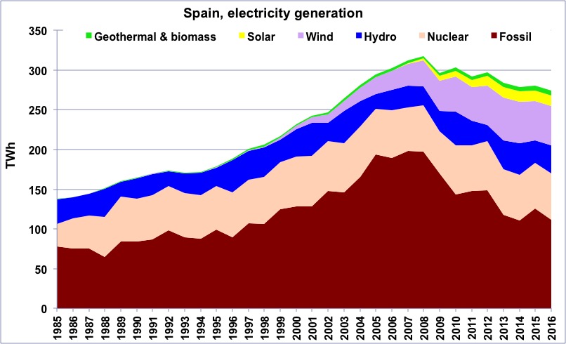
Electricity generation in Spain from 1985 to 2014, in billion kWh.
Source: BP Statistical Review 2015
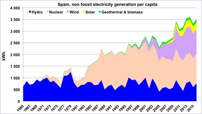
“Non fossil” electricity generation per capital in Spain since 1965.
“Geothermal biomass” gathers geothermal and electricity generation from biogas and wood (biogas represents the largest fraction). This “non fossil” generation represents 60% of the total generation in Spain.
Author’s compilation on data from BP Statistical Review