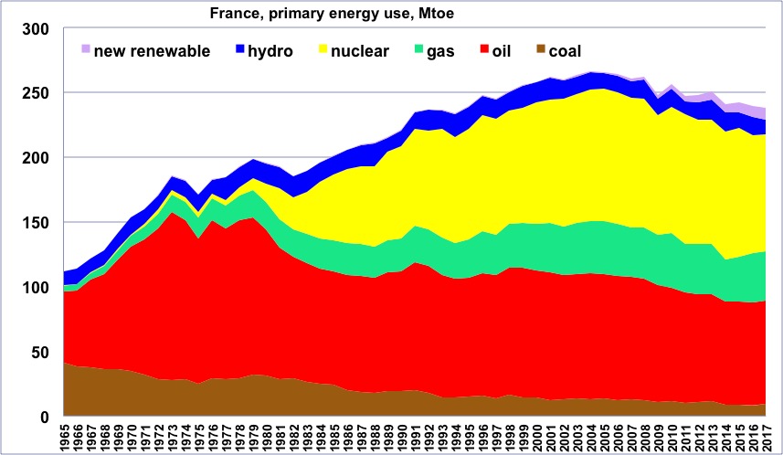
Primary energy consumption in France, wood excluded, from 1965, in million tons oil equivalent.
(one ton oil equivalent = 11600 kWh).
One will notice that the maximum happened in 2004, before the economic crisis that begun in 2007. “New Renewable” = all renewable energies except wood and hydroelectricity.
Author’s compilation on primary data from BP Statistical Review, 2015
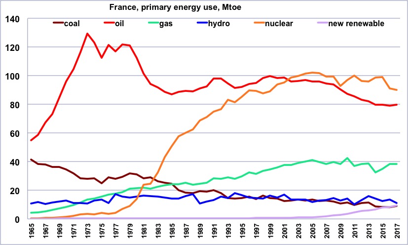
Same as before, but with one curve per energy.
One will notice that oil started declining in 2000, and gas in 2005, though at a slower rate.
Author’s compilation on primary data from BP Statistical Review, 2015
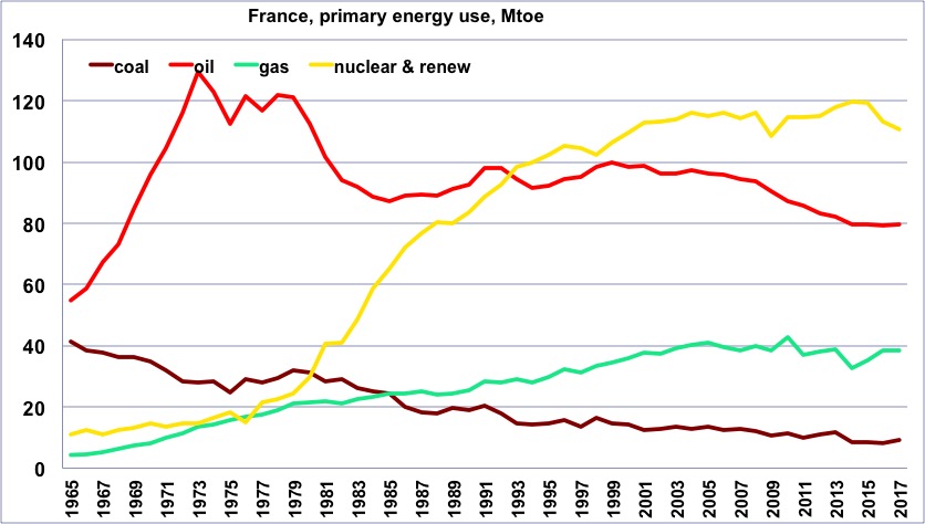
Same as before, but with a curve that totals all “non fossil” production (“non fossil” is anything except coal, gas and oil, and is therefore the sum of nuclear and renewables).
Author’s compilation on primary data from BP Statistical Review, 2015
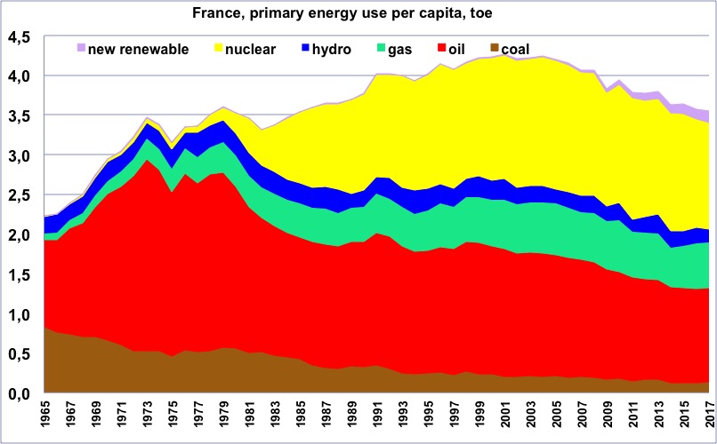
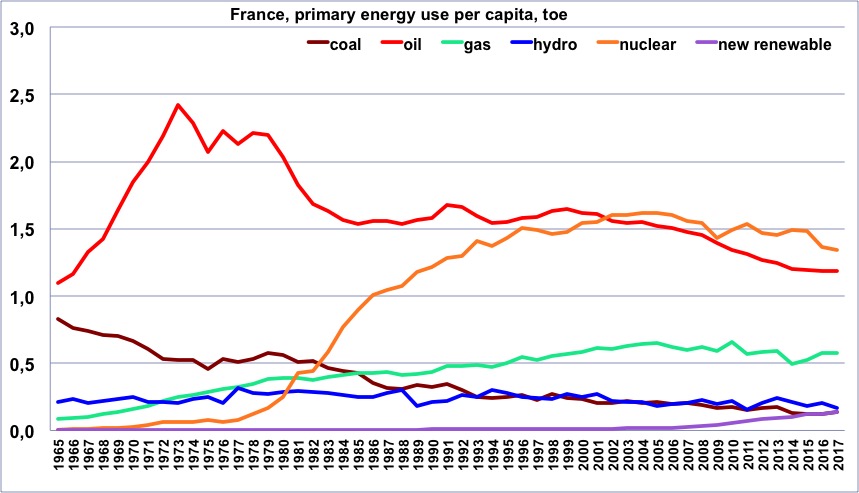
Primary energy consumption per capita in France, wood excluded, from 1965, in tons oil equivalent
(one ton oil equivalent = 11600 kWh).
“New Renewable” = all renewable energies except wood and hydroelectricity.
One will notice that the maximum happened in 2000.
Author’s compilation on primary data from BP Statistical Review, 2015
Same as before, but with one curve per energy.
Author’s compilation on primary data from BP Statistical Review & World Bank, 2015
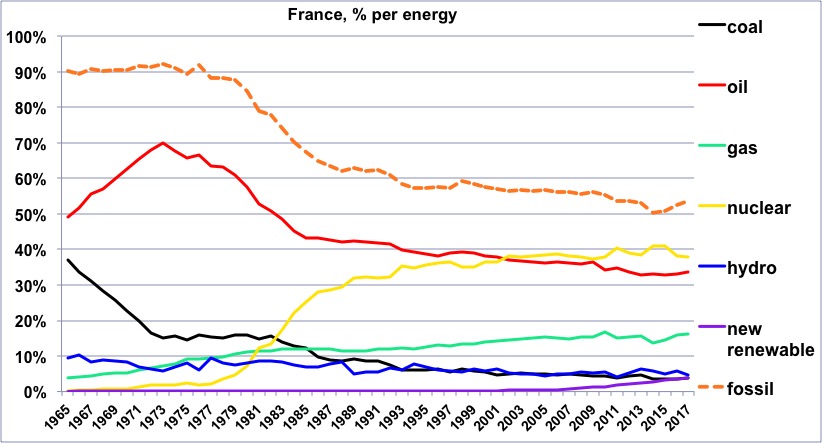
Share of each energy (wood excluded) in the French consumption since 1965, and share of the fossil fuels.
One will notice that the share of fossil fuels is basically the “reverse” of the share of nuclear.
Author’s compilation on primary data from BP Statistical Review, 2015
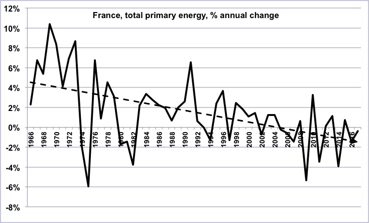
Annual change of the primary energy consumption in France (wood excluded) since 1965.
In the long term, the growth rate has been declining, then has turned into a growing decline rate (for those that are not afraid, it means that the second derivative of the French energy consumption has been negative on average for the last 45 years).
Author’s compilation on primary data from BP Statistical Review, 2015
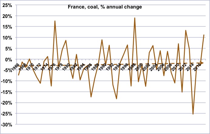
Annual change of the coal consumption in France since 1965.
The long term trend is that of a continuous decline, but the decline is slower now than what is used to be.
Author’s compilation on primary data from BP Statistical Review, 2015
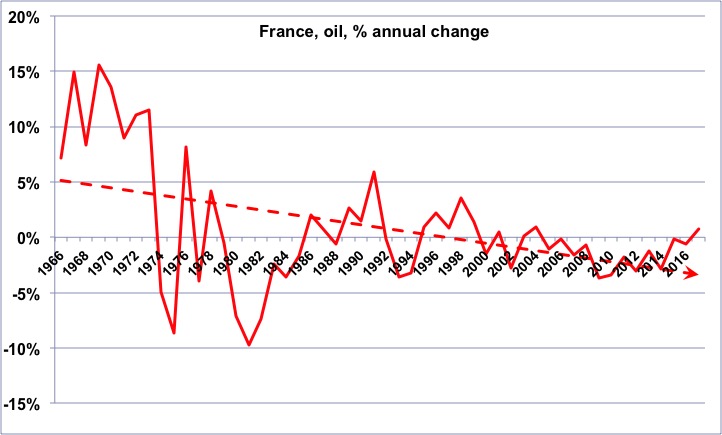
Annual change of the oil consumption in France since 1965.
As for energy as a whole, we have turned from a declining growth rate to an increasing decline rate.
Author’s compilation on primary data from BP Statistical Review, 2015
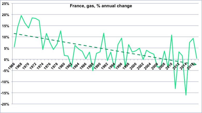
Annual change of the gas consumption in France since 1965.
Author’s compilation on primary data from BP Statistical Review, 2015
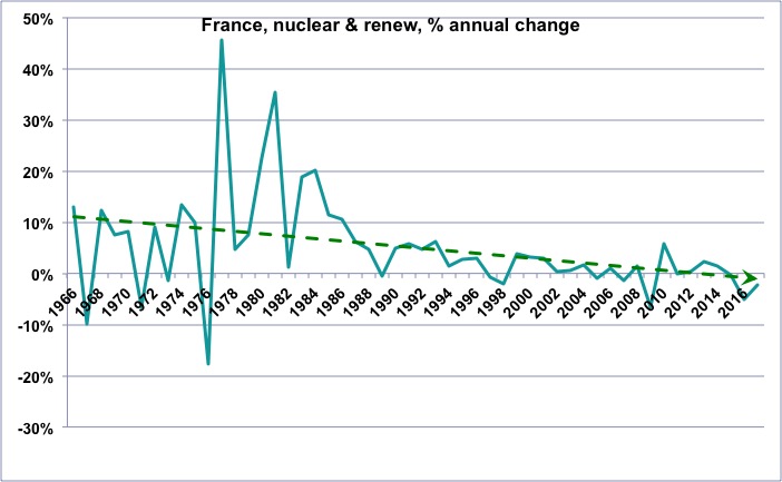
Annual change of the “non fossil” (wood excluded) consumption in France since 1965.
One will notice that the growth rate of these “non fossil” energies is globally declining, which means that the “new renewables” (wind, photovoltaic, biogas, biofuels, geothermal, etc), which do increase, nevertheless fail to allow for a growth rate that was that of nuclear and hydro a couple of decades ago.
Author’s compilation on primary data from BP Statistical Review, 2015
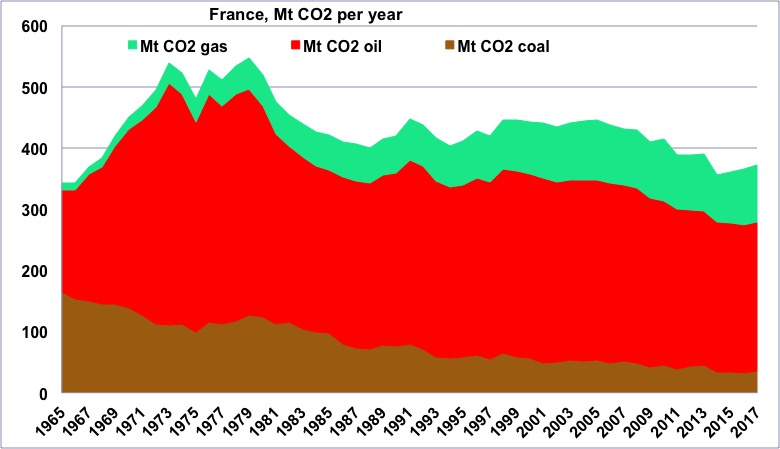
CO2 emissions coming from fossil fuels in France since 1965, in million tonnes.
One will notice that the maximum happened just before the first oil shock.
Author’s compilation on primary data from BP Statistical Review, 2015
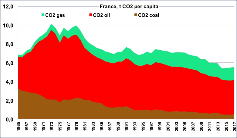
CO2 emissions per capita coming from fossil fuels in France since 1965, in tonnes.
One will notice that the maximum happened just before the first oil shock.
Author’s compilation on primary data from BP Statistical Review & World Bank, 2015
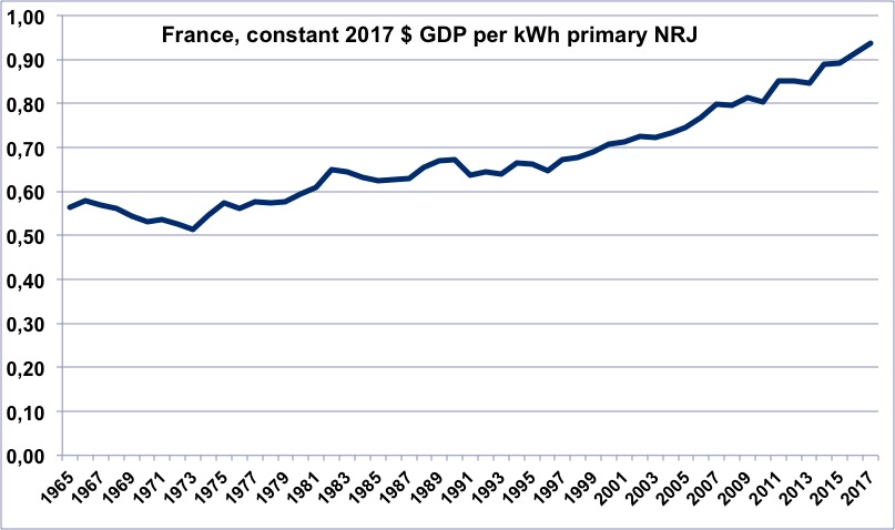
Evolution of the energy efficiency of the French economy since 1965 (constant dollars of GDP per kWh of primary energy).
When the value is increasing, it means that the economy is becoming more efficient. This curve is very much alike what it is for the US, with two periods of rapid increase separated by a flat evolution of a little more than 10 years.
Author’s calculation on primary data from BP Statistical Review, 2015, and World Bank, 2015
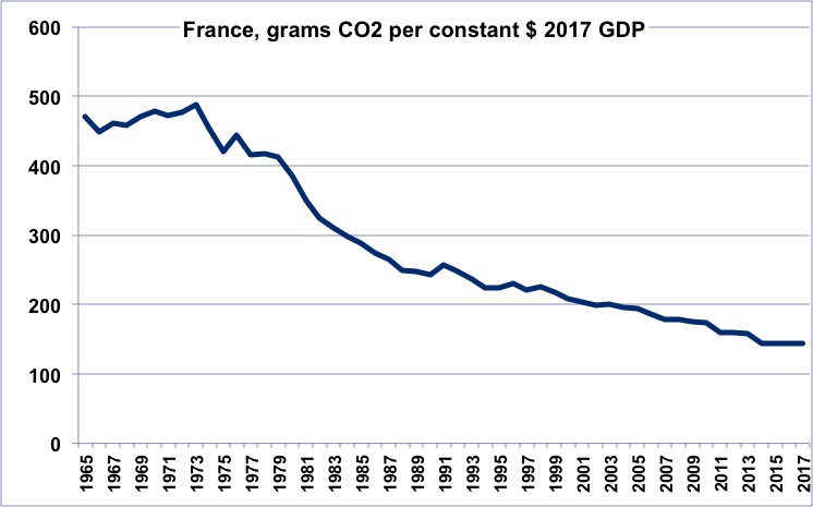
CO2 efficiency of the French economy since 1965 (grams of CO2 per constant dollar of GDP).
When the value is decreasing, it means that the economy is emitting less per unit of GDP. The rapid decrease after the first oil shock results from energy savings (in buildings for example) and the buildup of nuclear power plants. The present value is less than half of what it is for the US.
Author’s calculation on primary data from BP Statistical Review, 2015, and World Bank, 2015
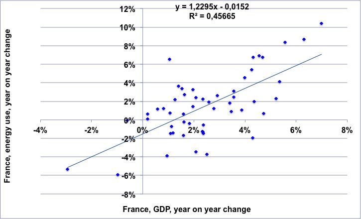
For the 1965-2014 period, annual change of the French GDP (horizontal axis) vs. annual change of the French energy consumption.
The regression means that for a 1% growth rate of the GDP there is a slightly over 1% growth rate of the energy consumption.
NB: “decoupling” would mean that the dots would always be in the lower right part of the chart.
Author’s calculation on primary data from BP Statistical Review, 2015, and World Bank, 2015
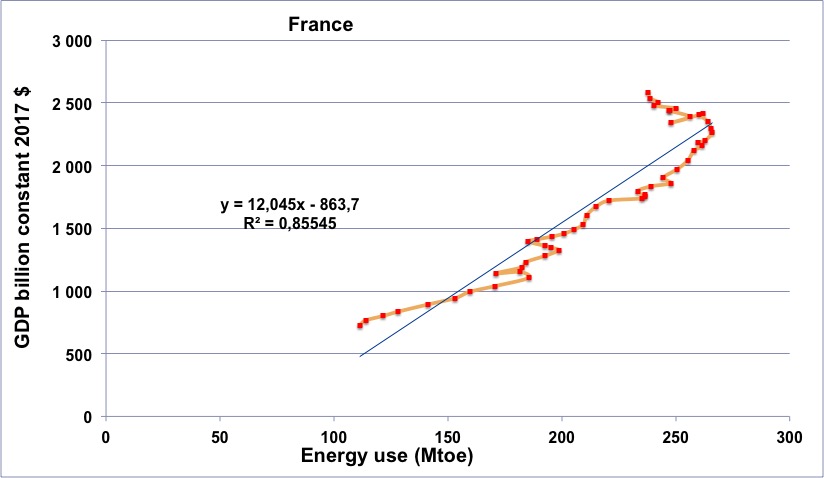
French energy consumption (horizontal axis) vs French GDP (in constant billion dollars) for the period going from 1965 to 2014 (the orange line begins in 1965, at the lower left, and then the dots follow a chronological order going roughly up and right).
One will notice that the curve goes through a series of “turns to the left” in 1974, 1979, 1990 (first Gulf War), and from 2006, with a decrease of the GDP for several years in the last case.
Turning to the left means that first the energy supply decreases, than the GDP changes, which excludes the possibility that the energy consumption decreases as the sole result of an economic crisis coming from some other reason.
Author’s calculation on primary data from BP Statistical Review, 2015, and World Bank, 2015
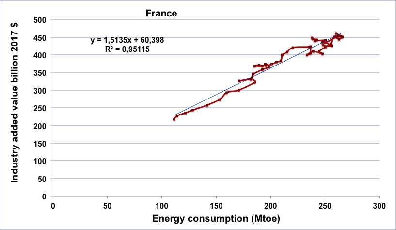
French energy consumption (horizontal axis) vs French industrial output (in constant billion dollars) for the period going from 1970 to 2014 (the brown line begins in 1965, at the lower left, and then the dots follow a chronological order going roughly up and right).
One will notice that the curve goes through a series of “turns to the left” in 1974, 1979, and from 2006, with a decrease of the Industrial output for several years in the last case. Turning to the left means that first the energy supply decreases, then the Industrial output changes.
Author’s calculation on primary data from BP Statistical Review, 2015, and World Bank, 2015
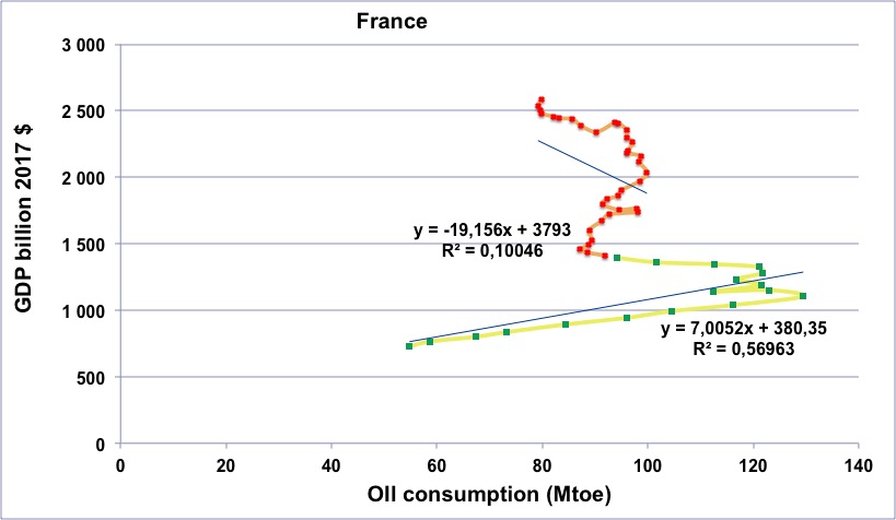
French oil consumption (horizontal axis) vs French GDP (in constant billion dollars) for the period going from 1965 to 2014.
Green dots with yellow line: 1965 to 1982.
Red dots with orange line: 1983 to 2014.
From 1974 to 2007, France has more than doubled its GDP in spite of a decrease of its oil consumption, which is unusual among Western countries. We nevertheless have the “arch to the left” after 2006.
Author’s calculation on primary data from BP Statistical Review, 2015, and World Bank, 2015
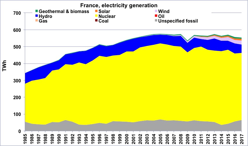
Electricity generation in France from 1985, in billion kWh.
Source: BP Statistical Review 2015
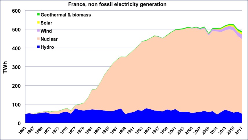
“Non fossil” electricity generation per capital in France since 1965.
“Geothermal biomass” gathers geothermal and electricity generation from biogas and wood (biogas represents the largest fraction). This “non fossil” generation represents 90% of the total generation in France.
Author’s compilation on data from BP Statistical Review