In order to know how a temperature evolves, the first thing is… to be able to measure it. It may seem (very) obvious (!), but it is indeed a very serious limitation when we adress the evolution of the mean temperature over the ages, because a mean value is meaningful only if we have enough individual values and if these values are comparable, and both these conditions are not that easy to satisfy when we go back a couple of centuries.
Depending on the period we are interested into, there are various ways to measure or reconstitute temperatures that reigned then.
It is generally considered that before 1850 there were not enough thermometers in the world, and they were not accurate enough, so that a mean value could be simply derived from the observations. Even after 1860, and for a certain time after that date, there were not that many ground stations where temperature was measured, and the ocean was very poorly covered.
Lastly, the way to measure the temperature was not the same everywhere. In one place the temperature would be measured at 9 AM when elsewhere it would be measured at 11 AM, resulting in a comparison between values not easy to do (and therefore calculating a mean value was not possible with the raw data). Here’s another example, for the ocean: one boat would measure the temperatue of the content of a bucket of water pulled onboard, when another one would look at the temperature of the water pumped by the engine (at the time of steam machines, of course) in the admission pipe: that did not necessarily led to the same result !
Even with direct measurements, it is therefore necessary to “correct” the raw values in order to render them coherent one with another. Taking the same examples as above, if it can be established (by a station doing both) how the temperature measured at 9 AM and the one measured at 11 AM (in a given place) compare, or if it can be established (by a boat doing both) how the teemperature of the water compares depending on the method to measure it, it is then possible to “correct” the various series to make them comparable.
Even today, such “corrections” are necessary when the thermometer is changed, when the station is moved (from a place to another in a city, for example), when the hour of reference is changed, etc.
If we represent how the mean value (actually the double mean: geographical, over the surface of the whole planet, and temporal, over a full year) of these temperature measurements evolved since 1860 for the northern hemisphere, we get the below curve, which is indeed a interesting first indication.
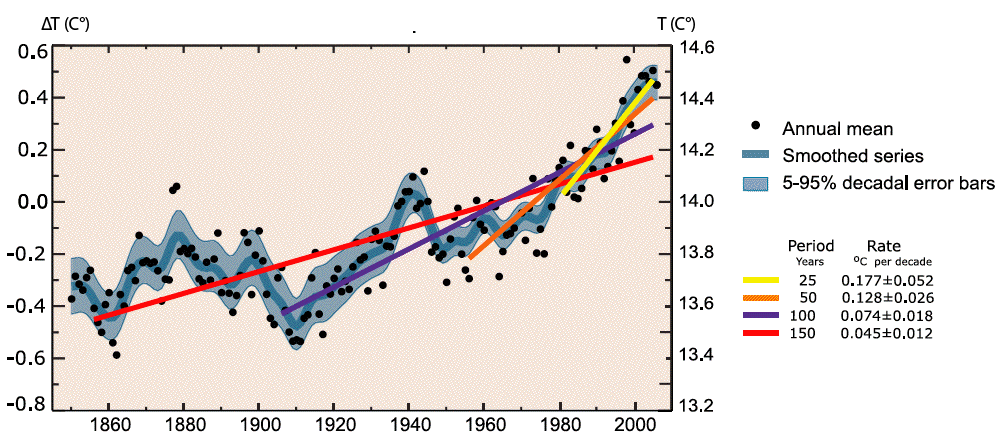
Evolution of the average near ground temperature since 1850, obtained from direct measurements of the temperature..
The left vertical axis represents the difference (in ° C) between the mean value of a given year and the mean value for the whole period 1961 to 1990 (because the reference values for climate parameters are generally calculated over a thirty year period).
The 1961-1990 average actually refers to a double mean: geographical, over the whole planet, and temporal, over the whole 30 year period. The right axis gives the man annual temperature in absolute figures (which is roughly 14,5 °C at present times).
- The black dots give the annual values (or more exactely the best estimate of the annual value), which means, for example, that the year 1860 was probably colder by 0,35 degree celsius than the 1961-1990 average, this deviation from the mean being 0,55 °C for 1861, etc.
- The thick blue line is the 10 year running mean of the black dots values, and the grey zone that surrounds it the “error range” (95% confidence interval).
- The coloured lines represent the linear trends on various time intervals, the corresponding rates (°C per decade) being mentioned below the lines. This rate significantly increases with time.
The relative decrease between 1945 and 190 is most probably the result of the important local pollution that accompanied the intense industrial activity of that period, this local pollution (particularly SO2) having a “cooling effect” on the climate.
From IPCC, 4th Assessment report, 2007
The above mentionned reasons explain why the temperature increase, qualitatively non debatable, is given with an error margin when it comes to quantitative values : it is considered that the average near ground temperature has increased by 0,75 °C ± 0,2 °C since the beginning of the 20th century. This curve also shows that all the warmest years since 1900 are concentrated in the last decade.
Observations also allow to get details on the regional pattern of this increase, for the last 25 years.

Average decadal temperature increase by zone for the period 1979 to 2005, for the surface (left map) and the troposphere (right map), that is roughly the first 10 km of the atmosphere from the ground.
Grey boxes correspond to insufficient data to establish a trend, roughly polar regions (be cautious not to confuse them with light blue boxes !).
What has already happened has the same pattern than the future predicted change :
- a rise which goes faster over continents than over oceans (because oceans have a higher thermal inertia),
- a rise which goes faster when latitude increases, and in particular a faster rise near the Poles (where there is sufficient data) than near the Equator,
- a rise which goes faster in the Northern hemisphere (compared to the Southern Hemisphere), first of all because there are more continents, and on second hand because sea-ice melting (something that doesn’t happen as much near the Antarctic) generates a positive feedback: sea water absorbs much more sun rays than sea ice, and when (and where) sea water replaces sea ice, the surface heating tremendously increases.
From IPCC, 4th Assessment report, 2007
Other recent observations are available:
- exactely as it is expected for the future, ground temperature have risen more at night than at day (over the continents):
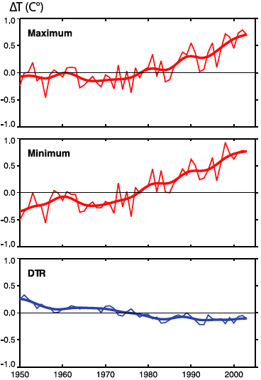
Top graph: evolution of the daily maximum for 71% of emerged land (it is thus a double mean: over 71% of land, and over the year).
Middle graph: same for the daily minimum. The vertical axis represents the deviation from the average for the period 1961-1990.
The bottom blue line represents the evolution of the diurnal temperature range (DTR), that is the difference between the maximum and the minimum daily temperatures, for the same 71% of emerged land.
This diurnal range has decreased by half a degree (roughly) since 1950, meaning that maximum and minimum temperatures, “on average”, got closer.
From IPCC, 4th Assessment report, 2007
- Precipitations have changed, in a constrasted way, but here also in good accordance with what is expected for “later”,
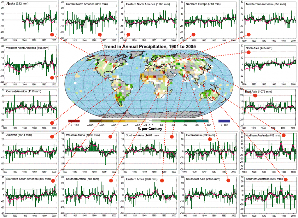
Trend in annual precipitations, 1901 to 2005
The central map represents the variations over the century, and with percentages (100% means that precipitations double, -100% that they totally vanish) of the regional precipitations. Boxes are shaded when there is no sufficient data to establish a trend.
The other graphs represent time series of the regional precipitations since 1900, expressed in % of deviation from the 1961-1990 average. The zone and the reference average are both given in the title of the graph (for example the graph on the bottom right is for Southern Australia and the average value for annual precipitations is 580 mm).
There is a significant increase for Nothern zones (Northern Europe, Alaska, Northern Asia…), a significant increase for Southern Asia or the Mediterranean Basin, but for a number of places there is no obvious trend at the moment.
From IPCC, 4th Assessment report, 2007
- As a consequence, dryness land also varied with time (which is a major point for the ecosystems future):
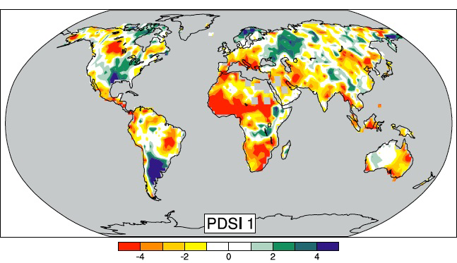
Evolution from 1900 to 2005 of the Palmer Drough Severity Index (in short PDSI), an index used to evaluate the moisture – or the absence of moisture ! – of the soils.
Red and yellow zones have underwent a drying of the soil, whereas in green and blue zones the moisture in the ground has increased on average.
From IPCC, 4th Assessment report, 2007
- Northern hemisphere sea-ice summer extent has decreased:
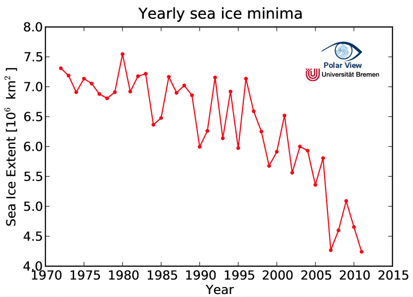
Evolution of the summer minimum sea-ice extent in the Artic ocean from 1970 to 2011, in million square kilometers.
We see basically an acceleration since 2000.
Source : Université de Brême
And before?
Before the “thermometer era”, it is still possible to reconstitute the average temperatures. As they cannot be directely calculated, they are deducted from other measures, called “proxies” in the jargon of the scientists. These proxies must allows a temperature reconstruction, of course, but must also allow a date reconstruction, what is indispensable to follow the evolution of the temperature in time.
There are three main methods to obtain such a result, depending on the era we are looking at and the type of result we are interested in.
Trunk trees
The first method uses tree trunks, or more exactely tree rings. Through the analysis of these tree rings for the last century and a half, for which we also have temperature and rainfall records directely obtained from instruments (what is called “instrumental data”), researchers (whose specialty is called dendrochronology) have established that there was a good correlation between the average temperature on a regional scale and either the width, or the density, of the tree-rings. Actually, when we mention the density, it is more precisely the latewood density, that is the density of the part of the treering that grows the latest in season.
Analysis have shown, indeed, that this latewood density was well correlated to the average temperature that exists in the spring and the summer of the year of growth. It is then possible to prolongate the correlation before 1850 (that is before the existence of instrumental data) to deduce, from what is observed in treerings, the effective temperature and precipitation conditions at the age of the analyzed sample.
The informations obtained through this method are however perturbated by various effects, among which:
- trees grow better when they are young (their “belly-growing” aptitude decreases with age, a characteristic that would be marvellous for us !), and therefore the treering width decreases with age, whatever climatic conditions are encountered,
- tree growth is positively influenced by the increase of atmospheric CO2, which is a recent phenomenum.
It is therefore necessary to suppress the “noise” induced by these processes in the raw data obtained, to get a signal containing only what we are interested into (that is variations induced by temperature and/or pluviometry change). In order to achieve this result, a mathematical treatment is done to the raw data, which consist in supressing all the low frequency signals in the data, because the tree growth or the modification of the atmospheric CO2 are such “low frequency” phenomena : they do not rapidly vary from one year to another (contrary to the instant climatic conditions, which can vary a lot from one year to another). But by doing so we also loose the signal of low frequency climate changes, that is precisely the changes that take a century or more to take place (and the most interesting ones for us !).
There are apparently recent methods that allow to keep track of the slow climatic changes, but whatever method is used there is always the need for a treatment of the raw data and it induces of course an error margin.
One of the great strenghts of dendrochronology is, on the opposite, that it allows to date precisely the sample on which the analysis is performed (by counting the number of rings). This can be done on living or dead trees, because it is possible to join end to end trunks of various ages through the correspondance of ring patterns from one trunk to another. As soon as two trees are (or were) alive for periods that overlap, the same patterns can be found for the same years and that allows to establish a correspondance between trunks, and therefore that allows to get series that go back to several thousands years.
Even though, the results obtained through this method represent best what happens during spring and summer (the tree growth in winter is generally not that significant !), and that is not necessarily well correlated to the yearly average. Presently it is precisely the case: in the nrthern hemisphere, winter temperatures are more rapidely rising than summer ones.
Various authors have come up with various results, qualitatively corresponding (below).
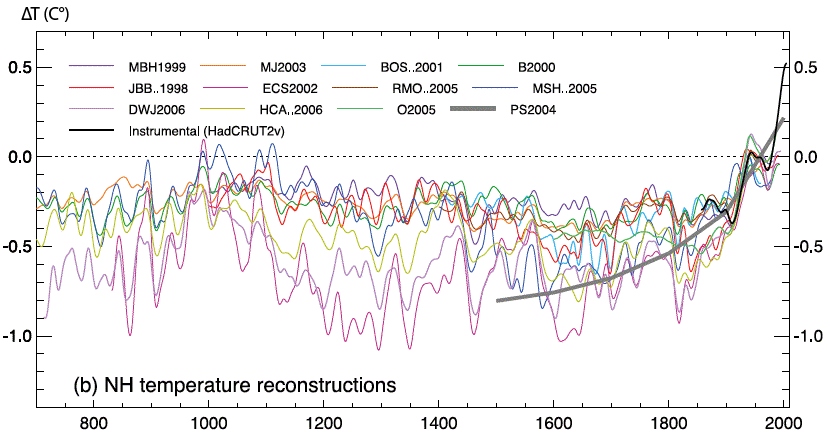
Reconstitution of the yearly average of the northern hemisphere temperature since 700.
The horizontal axis gives the year, and the vertical axis, graduated in degrees, represents the difference between the mean value of the given year and the mean value for the whole period 1961 to 1990.
The various authors and publishing dates are mentionned on top of the diagram.
The instrumental records (the ones of the first diagram, further up this page) are also represented, in black, from 1860.
It is easy to notice that the evolutions described are qualitatively convergent, and coherent with what we know of the Northern hemisphere climate by other means, particularly through the analysis of ancient documents :
- the “medieval optimum” is clearly visible , which corresponds to a period warmer – and therefore more favorable to agriculture, but not to be assimilated to the massive increase we are perhaps about to experience ! – than the rest of the Middle Ages, around year one thousand (it’s in 982 that Erik The Red settles Greenland, where agriculture became possible at that time). Yet this temperature increase did not equally affect all the regions on earth, and seems to have mostly happened other the northern Atlantic and its shores.
- we also find the trace of the “little ice age”, a cooling of Europe that culminated in the XVIIth century, during which temperatures significantly fell over the Ancient Continent. (but there is still a debate on wether the phenomenum equally affected other parts of the world ; it indeed seems that it mainly happened on the Northern Atlantic).
- and finally the sharp increase since 1900 is clearly visible, just as the relative cooling after the World War (the Second one, not the First !).
From IPCC, 4th Assessment report, 2007
This method based on treering analysis does not allow to go back in time very far: the oldest trees on earth are “only” several thousands year old (not that bad ! I probably won’t make it to that age…) and dead wood has an annoying tendancy to decay and not kindly wait for reaserchers in a perfect conservation state. And, of course, the less samples are available, and the less precise the result is. In the facts, this method is restricted to a relatively recent past: a couple of thousands years.
Corals
A second method for guessing how the weather was a long time ago is based on corals. Just as the trees’ growth depends on the climatic conditions, corals’ growth depends on the sea water temperature. And it is also relatively easy to attribute a date to every sample, either by counting rings, or through isotopic analysis (see frame below).
What is isotopic analysis ?
As stated elsewhere in these web pages, what fundamentally characterizes a chemical element (iron, carbon, hydrogen…) is the number of protons it has in its nucleus, also called the atomic number (and which is equal to the number of electrons that surround the nucleus and determine the chemical properties, for all that chemical reactions are is an exchange of electrons !). For example hydrogen is composed of atoms that have exactely one proton, carbon is composed of atoms that all have exactely 6 protons, never one more, and never one less (otherwise we have another element).
Some readers might recall old new from college, that is the table of Mendeleiev, that gives the element we are looking at depending on the number of protons that are in its nucleus.
But every element has, in general, several isotopes. The various isotopes still have the same number of protons (otherwise they would be other elements !), and therefore the same number of electrons (their chemical properties are therefore also the same), but each have a different number of neutrons. For example, every atom of carbone has 6 protons, but the various isotopes have different number of neutrons :
- the carbon 12 has 6 protons and 6 neutrons (and is the most common isotope),
- the carbon 13 has 6 protons and 7 neutrons, and represents roughly 1,1% of all terrestrial carbon,
- the carbon 14 has 6 protons and 8 neutrons, but is instable (radioactive). It is formed in the higher atmosphere through the bombing of neutrogen nucleus by secondary neutrons brought by cosmic rays.
But the important thing is that the mass of an atom increases with its number of neutrons. It is therefore easy to deduce from what preceeds that the more neutrons an isotope has and the heavier the atom will be. Hence for any physical process (for example evaporation) or chemical reaction (for example combustion), light isotopes will react a little faster than heavy isotopes.
The capital point for us is then that this “sorting out” is more efficient when the ambiant temperature is low. In other words, the lower the temperature, the higher the proportion of “light” isotopes will be found in the result of the process. On the opposite, the higher the temperature, and the higher the proportion of heavy isotopes will be found in the result.
Let’s take an example: water is made of hydrogen and oxygen. Oxygen has always 8 protons, but has three isotopes that contain respectively 8, 9 and 10 neutrons. When water evaporates, the fraction of “heavy” isotopes of oxygen (and particularly oxygen 18, the one with 10 neutrons) found in water vapor is going the same way than the temperature: if the temperature is higher, there will be a higher proportion of oxygen 18 in the water vapour.
This applies also to hydrogen, that has two stable isotopes (“normal” hydrogen, with just a proton, and deuterium, with one proton and one neutron) : the higher the temperature where water evaporates, and the higher the proportion of deuterium in the water vapour.
There are devices that allows to know what is the proportions of the various isotopes of a given element (iron, hydrogen, thorium…) in a sample. These devices are called mass spectrometers, and the analysis performed with them is called mass spectrometry.
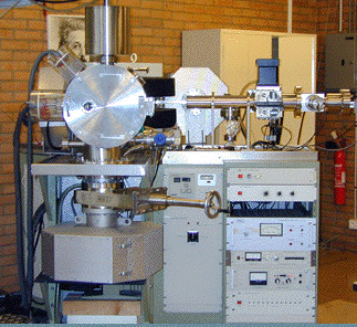
A mass spectrometer
Photo taken on the web site of the Institut de Physique du Globe, Université Paris 6 Jussieu.
Finally, the isotopes that are radioactive, and for which the proportion diminishes with time, provide us with a clock (carbon 14 is the best known example, but there are many others). When we can know what was the proportion of the radioactive isotope at the time of the constitution of the sample, we can deduce, from the proportion that remains, when the sample was formed.
Isotopic analysis is therefore of incomparable use because it helps to determine two major informations for the study of past climates: the age of any sample that contains a radioactive isotope, and the temperature that existed at the time of its formation.
Ice
After tree rings and corals, a third proxy used to get some information on past climates is the ice, of ice caps or of continental glaciers. As explained above, the proportion of the various isotopes of hydrogen or oxygen in the ice allows to reconstitute the temperature at the time when the snow (that will eventually transform into ice) fell.
Indeed, when the surface temperature of earth globally rises, water vapour contains a higher proportion of heavy isotopes, and this higher proportion will be found in the snow that falls on the Antarctic or on Greenland, and eventually in the ice that is formed with that snow.
So all we have to do (!) is extracting an ice core from the Antarctica (or the Greenland) ice cap, take samples of that core all along its lenght, determine how old is every sample, and measure, for each of the samples, the proportion of heavy isotopes of oxygen or hydrogen it contains. That allows to know how the temperature evolved all along the period covered by the core.
As the polar ice caps are very thick, this method allows to go back in time pretty far (a couple of hundred thousand years for Antartica), but there is a problem of attribution of date for the oldest parts of the core, because the only way to know the age of every sample is to obtain it through an ice flow model (up to now the age of the ice cannot be obtained by direct measure within the ice).
A hole in the ground
A fourth method to reconstitute ancient temperatures is called “borehole thermometry”. The principle is to measure directely the temperature all along a hole bored either in the ground or in a polar cap. Indeed, the temperature below the surface depends on the surface temperature that there was in the past, and on the speed of downwards propagation of this temperature. Every substance conducts heat more or less, and therefore the temperature in the first hundred meters below the surface changes slowly with time, being under the influence of the surface temperature that slowly has repercussions below, in addition to the geothermal flux coming from further down.
With appropriate computations (don’t ask me !), it is possible to deduct from the measures the evolution of the average temperature above the hole. Of course this method can be used with the hole made when extracting an ice core.
Such borehole thermometry has been performed in 600 places around earth, but it is considered that the indications are only valid for the last 5 centuries. In addition, land use change at the place of the hole is suceptible to perturbate the validity of the measures.
Marine sediments
For even more remote periods, it is also possible to analyze marine sediments (see the page on marine currents). It is then possible to investigate back in time for several tens of millions years, and that still allows to guess the average temperatures then !
Of course, the further we go, and the lower the resolution. When working on marine sediments a couple of million years old, for example, it is not possible to obtain better than average conditions over a couple of millenia. In the same way, the ice core analysis does not allow to obtain better than average values over a couple years.
Nevertheless, this is more than enough for our purpose here.
Then what ?
If we compile all the results these various methods yield for the last millenium, here’s what the evolution of the average temperature over the northern hemisphere probably was:
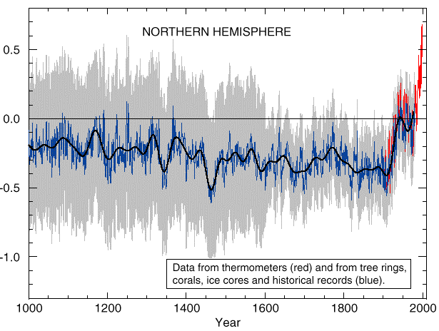
Evolution of the average temperature of the northern hemisphere for the last millenium.
As indicated above, the blue line corresponds to the yearly temperature means, deducted from various “proxies”.
The red line corresponds to direct measurements. Actually both these these curves represent the “most probable value” for each year, and the error range surrounding this value is representent in shaded grey. It means that the real value may have been anywhere in the grey bar for one year, and that the real curve may have taken place anywhere in the grey zone.
The thick black line represents the mobile average, over 40 years, of the most probable values.
Source: Climate Change, the scientific basis, IPCC, 2001.
This curve shows two important things:
- the 20th century temperature increase is clear, and does not seem to be a continuation of the previous tendancy, that was rather stability, if not a slow cooling,
- but the magnitude of this recent warming is comparable to the error range for older measurements. This led some people to say that it is not possible to rule out that this 20th century increase is only the consequence of natural variability.
Is it possible to “say something” regarding that second point ? Before anything, it is necessary to understand that it is paradoxically easier to predict that temperatures will rise in the future, as a result of our present behaviour, than to guarantee that the past rise is – at least for a significant part – a result of our past emissions.
To take a simple comparison, that some might even find a little over-simple, let’s imagine that we find, in a kitchen, a pot of warm water on the stove. The water may be warm because it was poured warm in the pot, because the stove already heated it, or because of both. But, even if no-one if able to determine why the water is warm, it can be predicted without doubt that the water will warm on if it is left on the stove.
For our climate, it is exactely the same: without additional evidence (but there is some ! I discuss it below) the additionnal heating deriving from the enhanced greenhouse effect is just one of the possible cause for the past rise, but, just as for our pot of water, it is not necessary to be definite about this point to be sure that the climate will change in the future under the influence of a continuous increase of this greenhouse effect.
There is indeed a robust conclusion, which is that as long as the atmospheric concentration of CO2 increases, global temperature will increase later. The question for the past is to know whether this rule has already come into application or if it is not yet the case. And before we look at the answer, let’s just say that if the recent increase is a pure result of natural variability, it is more bad news than good news: it means that in the future we might face a rise due to natural variability plus a rise due to the increasing greenhouse gases emissions.
But let’s get back to the main question: is the temperature rise of the 20th century at least partially the consequence of our behaviour ? Have we already become a “climatic agent” ? Here’s the evidence that suggests that we are at least partially at the origin of “something” :
- the rise is pretty sharp, especially the one that takes place after 1970, though no major modification of one of the main “natural” factors determining climate has been noted during that period (see evolution of the climate in the past).
- the pattern of this increase is particular: the temperatures have risen more quickly during the night than during the day, and more quickly during the winter than during the summer for temperate countries. The most coherent explanation with this pattern is an increase of the greenhouse effect. Indeed, this effect “traps” terrestrial radiation, which happens all day round and is almost constant in intensity, when solar heating is null at night and much lower in the winter. The greenhouse effect has therefore a higher influence on temperatures when there is no sun (night and winter), what is consistant with the observed trends. On the opposite, an increase of the solar energy, for example, would probably lead to maximum temperature increases … when the sun is shining, that is in summer and during the day.
- the magnitude of the warming is quantitatively consistant with the additionnal greenhouse effect we have generated, but fails to be when only natural variability is taken into account.
This is why, since the 2001 report, the IPCC stated that no climate model is able to reproduce the temperature rise of the second half of the 20th century if it leaves apart the human induced greenhouse gases emissions.