It is well know that a number of greenhouse gases have long been in the atmosphere. CO2, for example, has been in the air for a couple billion years ! Methane has been emitted by swamps since anaerobic bacteria live in them, and that has probably lasted for a couple hundred million years. What, then, allows to conclude that humanity bears whatsoever responsibility in the recent – and undisputed – atmospheric increase of these gases ? In this case, scientists will work like a (good) magistrate : they back their conclusions on a body of facts and indications, and progressively sort out any cause that cannot explain what is observed.
Even over a short period, the atmospheric CO2 concentration rapidly increases
Since the end of the 50’s, 1957 to be precise, systematic measurements of the atmospheric CO2 concentration have taken place in various places around the world, the most famous of them being Manau Loa, in Hawai. Why Hawaï, if not to surf all day ? Because to have relevant measurements one needs to avoid being close to a large source of CO2 such as a main city, a heavily industrialized region, etc. The observatories that came after Manau Loa are all located on remote islands, or on boats.
Since then, it has been observed that the CO2 concentration in the air increased each year, and recently other measurements have shown that the oxygen concentration is evolving in a remarkably symetric way, decreasing a little every year also (don’t worry, it does not make the air unbreathable !), and for one molecule of CO2 appearing in the atmosphere, a molecule of oxygen disappears, which strongly backs the idea that the CO2 increase is due to combustion.
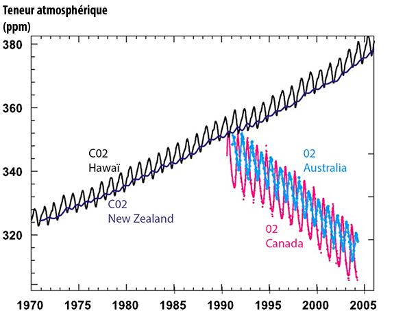
The upper black curve represents the proportion of the atmospheric CO2 measured in ppm (parts per million or ppm ; 1 ppm = 0,0001%) at Mauna Loa, Hawaï.
The upper dark blue curve (that seems “embedded” in the black curve, and “oscillates” the same way, only with a smaller amplitude) represents the same, measured at Baring Head, New Zealand.
The lower amplitude of the measure performed at Baring Head comes from the fact that most of the biomass lives in the Northern Hemisphere, where it generates a seasonal change in the atmospheric CO2.
In rough terms, during the spring and summer, when the vegetation is growing, the dominant flux is CO2 being absorbed by the vegetation (and hence a diminution of the atmospheric CO2), when in autumn and winter, the dominant flux is coming from the decay of dead organic matter (including leaves that fell in autumn) and the respiration of plants and micro-organisms. The mixing of the air between the two hemispheres requires a year or more, so that the variation taking place in the northern hemisphere is not instantly seen in the Southern hemisphere.
When it comes to the annual average, the difference between the two hemispheres becomes marginal, and the trend is exactely the same : a fast increase, up to 380 parts par million of CO2 in 2006.
Cyan and pink curves at the bottom represent the variation of the oxygen content of the atmosphere, also in ppm (the reference value is a mixing ratio with nitrogen). The pink curve comes from samplings done at Alert, Canada (82°N) and the cyan from samplings taken at Cape Grim, Australia (41°S). The correlation with the CO2 curve is striking.
Source : IPCC, 4th assessment report, 2007
And not only did it increase, but it did so a little more each year (graph below). There is, therefore, an acceleration in the increase which is clearly perceptible over a time scale – several decades – which is ridiculous compared to the time constants of most of the natural cycles.
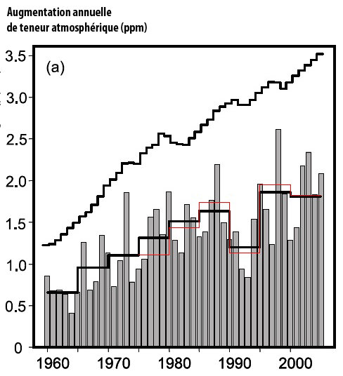
Grey bars show the annual atmospheric increase of CO2 – in ppm – in the measurements of the Scripps Institution of Oceanography.
The increase is clearly greater each year (on average), going from 0,5 part per million of CO2 circa 1960 to 2 ppm per year (4 times more) at present times.
The black and grey bottom curves give the 5-year average of the Scripps value (black) and NOAA values (red).
The upper black curve represents (in parts per million) the atmospheric increase that would happen if all the CO2 resulting from fossil fuel use remained airborne.
The difference with the actual increase corresponds to the uptake by sinks.
Source : IPCC, 4th assessment report, 2007
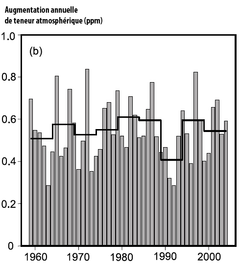
Fraction of the CO2 emitted each year that remains airborne (0 = 0%, 1 = 100%).
This fraction remains quite stable near 50%, with an anomaly in the early 1990’s, when the CO2 emissions increased fourfold between 1960 and 2005.
This is a result of the increase of the uptake by sinks, but one might wonder if it will last.
Source : IPCC, 4th assessment report, 2007
Measuring the CO2 atmospheric concentration over a long period of time
Over the recent past, the case is settled : the atmospheric CO2 is increasing, is even increasing faster and faster, at the same pace than oil, gas and coal combustion, while the atmospheric oxygen is decreasing in corresponding quantities. This is quite a good hint already that we have a role in this situation, but in order to know with certainty whether our industrial civilization is definitely involved or not, we must know what was the situation before 1750.
But before 1750 (and even some time after that year) there was no instrument allowing to measure directly the proportion of CO2 in the air, or the proportion of methane, or the proportion of anything else. As none of our ancestors had the good idea to store a sample of the atmosphere somewhere for us, how did we do ?
We have been lucky in this case : where there are large ice caps, mother nature has provided in the same time a natural mechanism for recording past atmospheric compositions. On these caps, it always freezes, so that the snow that falls does not melt but slowly transforms into ice under the pressure of the snow fallen after. During that transformation of snow into ice, the air that surrounds the snow flakes gets progressively imprisonned into the ice under the form of small bubbles.
Those bubbles are therefore a testimony of the period at which the snow fell (actually there is a little lag, but it can be determined so that it is possible to find a way out).
As a result of this process, an ice cap (in Antarctica, or in Greenland, or even a mountain glacier) is composed of ice that gets older when one bores deeper, and, with every layer of ice there are little air bubbles, as old as the ice, that can yield precious information about the composition of the atmosphere at the time they were formed.
With modern techniques, it is possible :
- to bore into the ice and extract in a clean way (without contaminating it with ambiant air) what is called an ice core, that is a long cylinder, about 10 to 20 cm in diameter, and that can be several km long (from the surface to the underlying rock ; of course this core is extracted by little bits),
- to attribute an age to every part of this ice core,
- to analyse the composition of the air trapped in the ice all along the core, in order to reconstitute the proportion of greenhouse gases from ancient times.
Boring holes into ice caps and analyzing them later in order to determine what past climates looked like is the job of paleoclimatologists.
As the deepest layers of the Antarctic ice cap are several hundred thousands year old (the record is presently held by an ice core coming from the Vostok base, and goes back to 400.000 years), one now understands that it is possible to have some hints – the closer we are to present times, the more accurate the results are, of course – on what happened since then.
So what?
The first conclusion that can be drawned from these analysis is that for all the “natural” greenhouse gases, the atmospheric concentration has increased exponentially since 1750 (graph below).
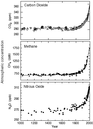
Proportions of the main greenhouse gases in the atmosphere (more exactly in the troposphere) since 1750.
Since 1958 the values derive from direct measurements in the air ; for previous years they derive from analysis performed on the ice cores. For the CO2 graph the various symbols (plain circles, empty circles, triangles, etc) refer to measurements made in various ice cores.
NB : ppm means “part per million”, 1 ppm = 0,0001% ; ppb = part per billion, that is 0,0000001% : a thousand times less ! it can be seen that greenhouse gases do not need to be present in huge quantities to have a determining effect.
Graph taken from IPCC, 2001
Carbon Dioxyde(C02)
Another major conclusion is that the CO2 concentration in the air has stayed the same for the 10.000 years that preceed 1750, and have never gotten over the 1750 value (280 ppmv, and today we are at 350) fort the 400.000 years that preceed 1750.
Actually, for these 400.000 years that preceed 1750, the atmospheric CO2 concentration has oscillated between 200 and 280 ppmv (graph below).

Atmospheric concentration of carbon dioxide (CO2) over the last 400.000 years.
The vertical axis gives the concentration (in ppmv) and the lower horizontal axis the number of years before present. The upper horizontal axis gives the depth of the ice below the surface. The recent years (that is after 1750) are not shown. It is easy to see that the CO2 has never represented more than 280 ppmv of the lower atmosphere in the recent geological times.
Source: Petit & al, Nature, June 1999
If this evidence is not enough to consider us as the culprits, at least it allows us to be counted among the suspects. What will allow to close the case is the isotopic analysis of the carbon included into the atmospheric CO2.
Isotopic analysis of Carbon
The carbon atom has three isotopes (that means it can be found in the nature under three different forms) :
- the carbon 12, by far the most abundant, has 6 protons (the number of protons is what characterizes an element, no matter whether it is iron, helium or oxygen, and governs its chemical properties) and 6 neutrons (the number of neutrons influences the physical properties, but not the chemical properties).
- the carbon 13, which has 6 protons and 7 neutrons, and is therefore a little heavier than the carbon 12, is a stable isotope (it is not radioactive) and amounts to roughly 1% of the terrestrial carbon, with a slight but noticeable difference between the oceanic and the terrestrial environments : this isotope is a little less abundant among the continents (and therefore in the terrestrial biomass) than it is in the ocean,
- the carbon 14, which has 6 protons and 8 neutrons, is instable (that is radioactive, with a half life of roughly 5.500 years : after 5.500 years half an initial stock of carbon 14 will have disappeared). This carbon is created in the upper atmosphere by the neutrons of the cosmic rays, when they collide wich an atom of neutrogen :
N (7,7) + n → N (7,8) → C (6,8) + p
his carbon, once formed, is oxydized in CO2 and then integrated in the carbon cycle. It can therefore be found a little bit everywhere, but as it will have almost totally disintegrated after several tenths of thousands years, it can’t be found in the fossil fuels, that were formed several million years ago at least.
A consequence of all that is that, depending on where it comes from, the atmospheric CO2 will vary in isotopic composition :
- CO2 emissions coming from the oceans will be comparatively richer in carbon 13 and will include carbon 14
- CO2 emissions coming from the continental biomass will be comparatively poorer in carbon 13 and will also include carbon 14
- CO2 emissions coming from the use of fossil fuels will be comparatively poorer in carbon 13 (especially for coal, less for oil and gas) but will be exempt of carbon 14, as explained above.
t is now observed that the atmospheric CO2 is getting poorer in carbon 14 and in carbon 13. The decrease of the proportion of carbon 13 indicates that the increase of CO2 in the atmosphere can’t come from the ocean (otherwise the atmospheric CO2 would get richer in carbon 13), and the decrease of the proportion of carbon 14 implies – as it is the only possibility – that emissions deriving from the use of fossil fuels contribute to the accumulation of CO2 in the atmosphere.
The never before atmospheric concentrations now reached for the major greenhouse gases, the never before rate of increase now observed, and the confirmation of the contribution of the various sources by isotopic analysis, all this allows us to affirm that mankind – and particularly its “modern” activities – is indeed the primary cause of the increase of the greenhouse gases in the atmosphere.
So we finally hold the culprit : that’s us !
Our responsibility is even more obvious for “industrial” gases that did not exist naturally in the atmosphere prior to the industrial age (the halocarbons). and for which the concentrations are also rapidly rising (graph below).
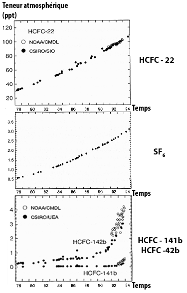
Variations of the atmospheric concentrations for a couple of halocarbons, directly measured in the air. Halocarbons constitute a vast family in which the various gases are generally named with barbarious abreviations not very meaningful to the non initiated) halocarbons HCFC-22, HCFC -141b and HCFC -141b, and sulfur hexafluoride (in parts per trillion) SF6.
Source : IPCC, 1996
If we go back in time further on, there have been previous periods with very high CO2 concentrations, and therefore higher average temperatures, but that probably never went over the present ones by more than 5 to 10 degrees Celsius (let’s recall that the change that we have put in motion could bring a temperature rise of more that 10 °C over a couple of centuries), because the solar activity (that is the amount of energy radiated by the Sun) was a little lower at the time. Anyway we were not born then !
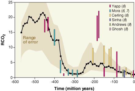
CO2 concentrations since the beginning of the primary era. RCO2 is the ratio between the present concentration actuelle (300 ppm, that is 0,03% of the whole atmosphere) and the past concentrations.
For example, R = 5 means that the CO2 concentration was 5*300 = 1500 ppm, or that CO2 occupied 0,15% of the atmosphere.
It can be seen that the major tendancy during the quaternary era (that started 4 millions years ago) and even of the tertiary era (that started 70 million years ago, and during which mammals developped) was basically a constant lowering of this concentration.
Source : Berner, Science, 1997